
Project Reveal: An Exterior Makeover
Hello, hello! Molly here. While Erin is spending time with her precious Emma and Henry, I (along with the rest of the team) am working on some fun content here for you all to enjoy, so let’s get to it…
As Erin mentioned during the early days of social distancing, we were taking on a few additional e-design projects this spring. A local blog reader reached out to ask for help selecting a paint color for the exterior of her home, and knowing how challenging yet impactful this can be, we thought it would make for a great before/after for the blog!
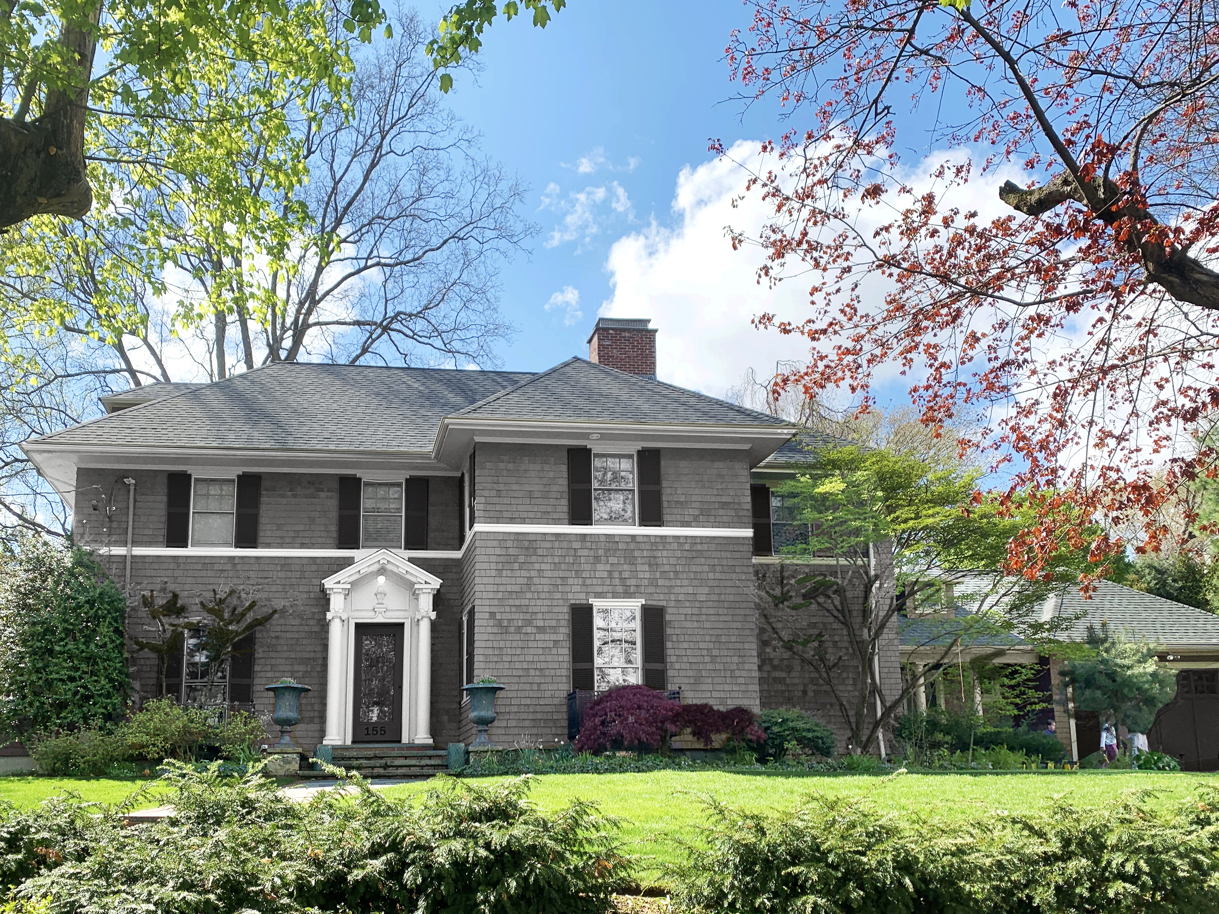
Let’s start with the before:
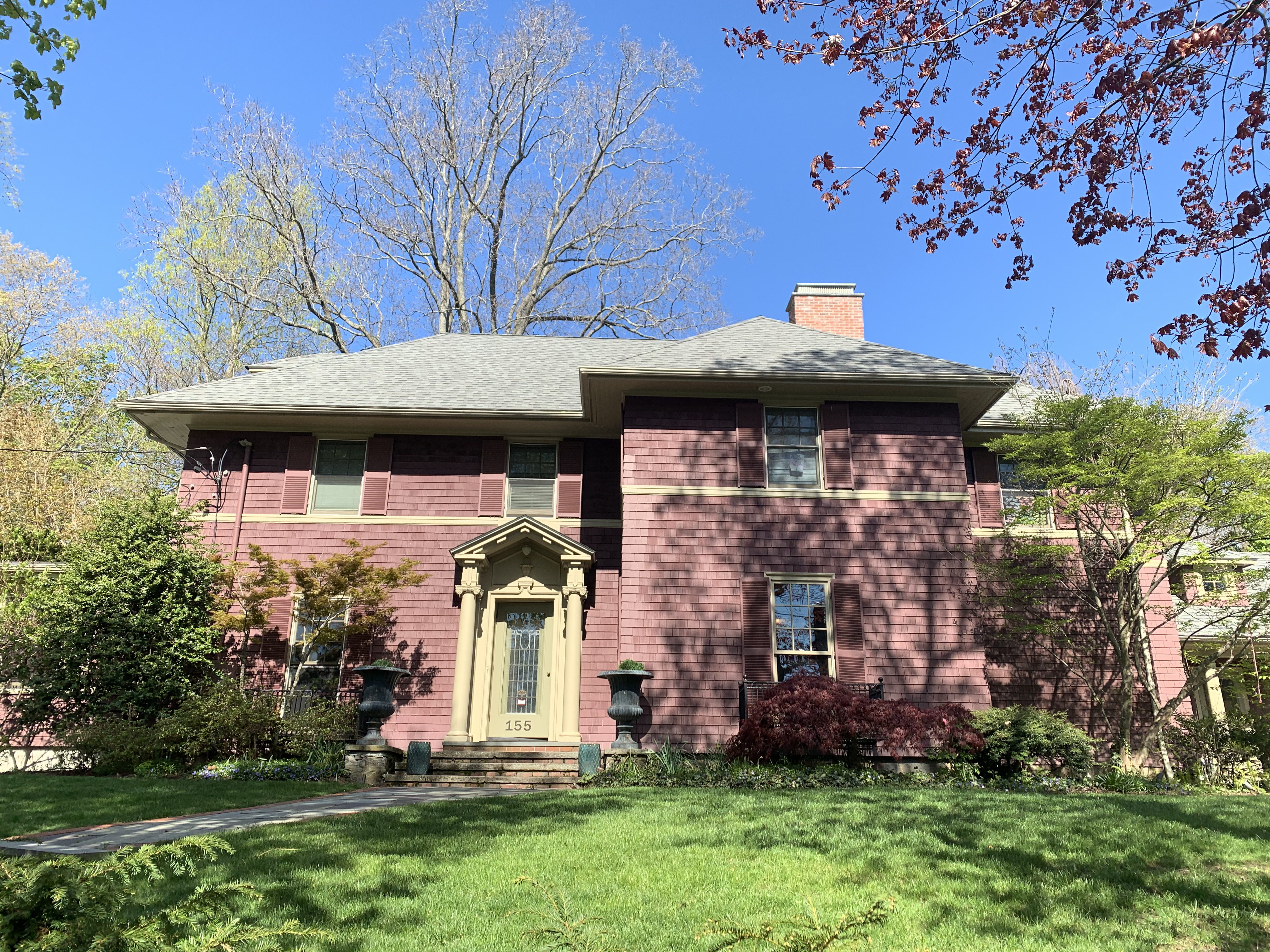
As you can see, they have a beautiful yard and the house had so much potential, but it was looking a bit dated, and we know that making a big change can be so daunting. The client let us know she was hoping for a traditional New England look, and preferred light, blue-ish grays, white, dark blue and black. Generally, she wanted something classic and timeless that would age well, but wouldn’t look like every other house in town.
Based on this, Erin and Eliza put together several color palettes for the client to choose from. Eliza even mocked up a few schemes to make it easier to envision:
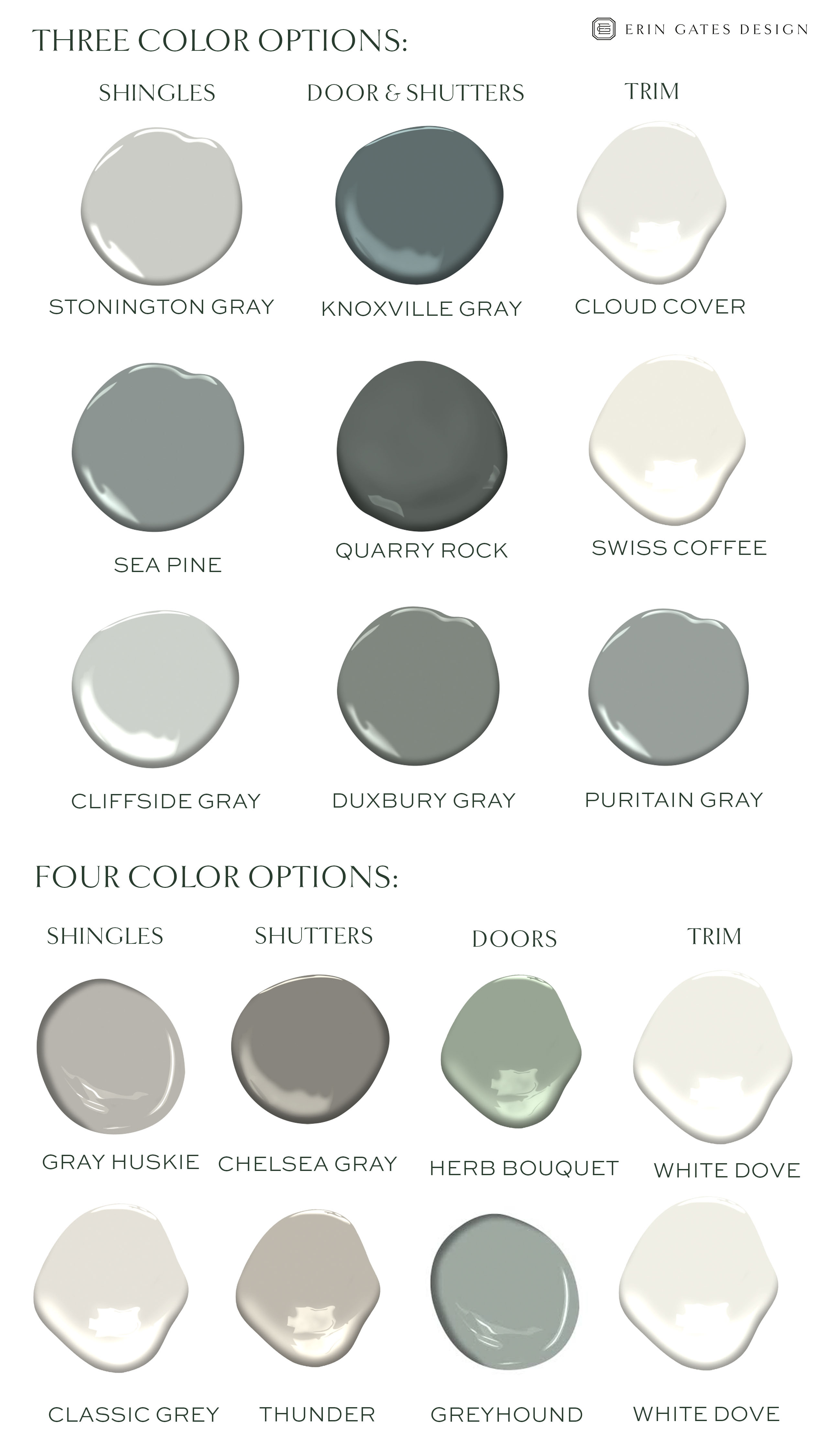

It’s really tricky to get these right on a computer screen (even for a Photoshop Wizard(TM) like Eliza), since so much depends on time of day, sunlight, angle, etc., so we always suggest testing out colors. And that’s exactly what the client did…

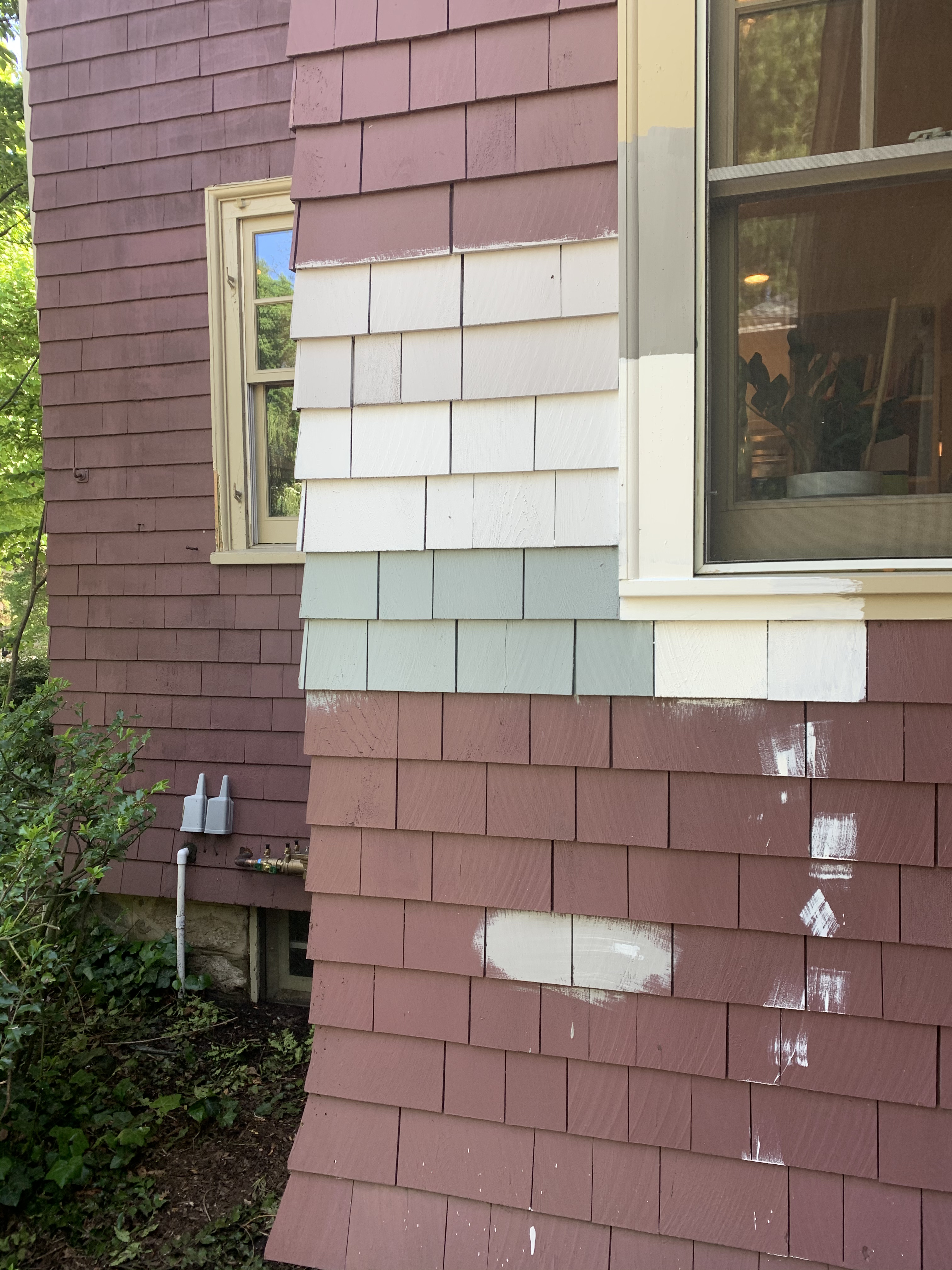
After much deliberation, they finally landed on BM Cape May Cobblestone on the shingles, BM White Dove on the trim and BM Black Tar on the doors & shutters. According to the client, “We tried out probably 12 greys and had such a hard time but in the end, I’m from Philadelphia so Cape May (close to Philadelphia) won out! And it turned out great. I particularly love the Black Tar because it’s dark, but has a bunch of grey to it, like a graphite type color.”
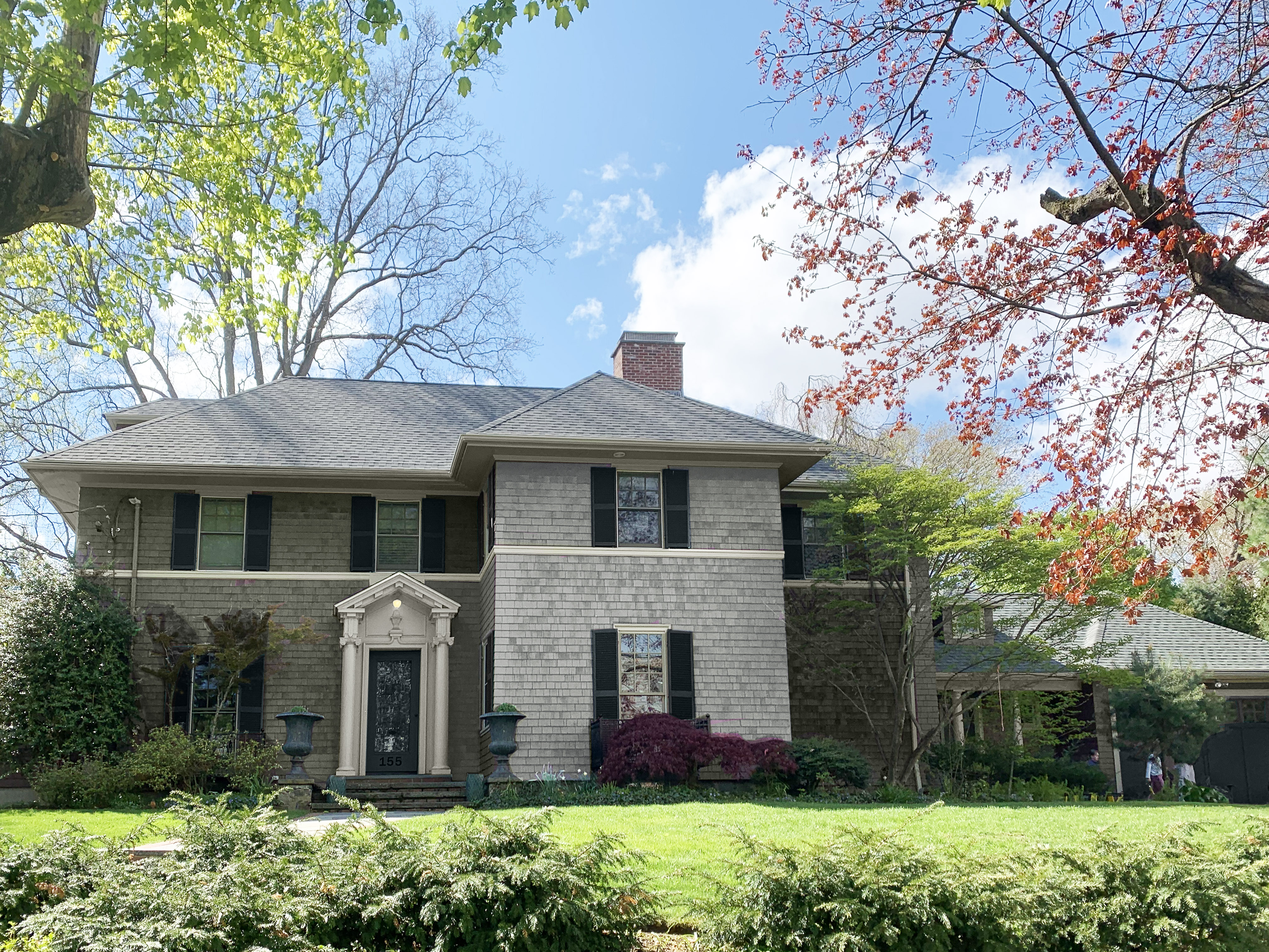
Et voila!

Like a breath of fresh air! We are thrilled with how this came out, and hope that this before/after has inspired you to take the plunge on a big change you’ve been debating. In the meantime, I wanted to share a few of Erin’s ideas to spruce up the exterior of your home without the expense of a full overhaul (some of the links in the older posts might not work – feel free to comment with any questions and I’ll find a replacement for you!)…
Classic but Cool Exterior Color Palettes
Finally, thank you to everyone who submitted their home offices for the next Style Solutions! Keep an eye out for the design by Allison next week. We’ll be doing more of these in the coming weeks, and I’ll make sure to post on Erin’s Instagram if we’re looking for anything in particular.
ExploreEnjoy More
Browse:

Lovely home — but consider painting the front door in high gloss white to blend with its surrounding moldings – and then that whole door area would look twice as large and really stand as the main focal point! Change the house numbers on the door to pewter or silver. Add classic tall, thin black or silver lantern-type outdoor light sconces on each side of the door! The pair of urns would look wonderful in high gloss black with a taller bush in each one! Cheers!
What a difference! Nicely done!
Wow, what a drastic improvement. So pretty and classic. Love it.
What are your (and Erin) Thoughts about painting stone or brick when painting your home. I have California ranch home with bottom portion stone and top half is wood siding painted a similar taupe color. Is it better to just paint the stone and siding same color? Or leave the stone?
Ed
Beautiful home. I would love to know the finishes for each color. thanks!
Well done!!
What. breath of fresh air!
This is a great article but I’d be interested to see the suggestions when the windows are black – would the same color choices apply?
I agree with Patricia and Josie. The old colors made the home “old looking, tired and sad”. Now it is elegant and classic. I hope it makes the homeowners smile as they pull in their driveway each day.
This was an interesting and helpful post. Thanks
I don’t usually comment but I hope the home owner checks comments to see this is STUNNING!!! Incredible and thank you for sharing. I hope they get the feels as they drive up to their “new” home!!
Big thanks to Erin, Eliza and team for all their help with this project. We could not be more pleased with how it turned out, and agree that it makes SUCH a difference. We bought this home about a year ago and it sat on the market for nearly 9 months amidst a very crazy real estate market – we really believe that a large part of that was due to the color. Choosing a the right color felt overwhelming and it was so helpful to have the EOS team giving us direction. It would have been terrible (and costly) to make a mistake! Thank you again, we are so happy with it! It truly feels like a new home.
I’m so so glad you are happy- it looks like your house got Botox! Instantly younger and fresher! :)
Wow! What a difference. I love it!
I know it’s silly but the paint names that mean something to me always end up winning with me too. I just chose York Harbor yellow for a bathroom because of a connection with York Beach, ME.
The before house just looked so sad; so much wasted potential. the after house looks wonderful. Worth all the work to pick just the right colors.
I have a similar color scheme on my house (which is 15 years old) and it IS timeless. And if you ever want a quick change you can just change the color of the front door (my front door was Kennebunkport Green, but painting it black made it pop).
Would love to know criteria check list that designers use to help clients traverse the decision-making process for exterior colors. Seems in my nice mature-trees and woodsy-lots neighborhood, more new builds and renovations are being painted look-at-me colors (even classic white can be a look-at-me-color on a house tucked in a wooded lot). While the homes’ color palettes are well coordinated and even reflect well the design of the home, they live in nature. When I see that consideration, that’s the designer I want to use.
Gorgeous – very classic!
What a fabulous change. It looks like a completely different house. I’m sure the homeowners have to be thrilled.
Paint can be so satisfying and feel so risky. Love how this turned out! Beautiful.