
My Favorite Paint Colors for 2017
Paint colors are always the number one questions you guys seems to have, and I think that’s because picking paint is really difficult! Luckily, repainting rooms isn’t the most expensive or hardest thing to do so taking a risk isn’t as scary as say, wallpaper or a sofa fabric! But you still want to love it and make sure it’s a color that looks timeless, whether it’s fun and bold or soft and soothing.
This coming year I’m seeing a lot of greens, blues and warm-based neutrals. I’m kinda done with cold greys and more into those warmed up with a little brown. I also see dark brown making a bit of a comeback- but in this case, cooled down with a touch of grey or mixed with a smidge of red/purple to make it extra rich!
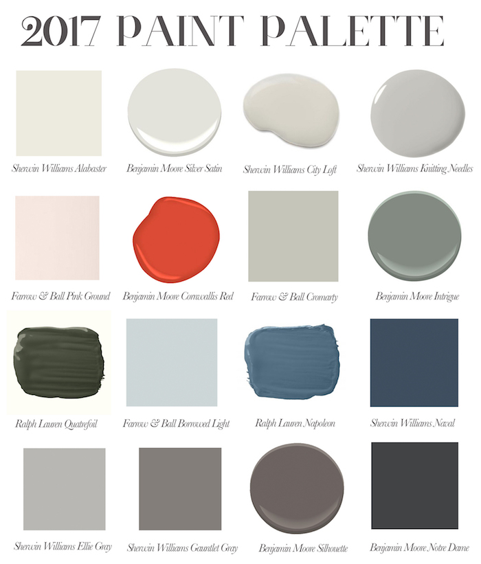
An example of a light, perfect neutral with gray and beige tones (BM Silver Satin as well as SW Modern Gray, BM Balboa Mist, BM Athena)
A light taupe (SW City Loft) is so warm and yet fresh, especially paired with a creamier, but not yellow trim (SW Alabaster).
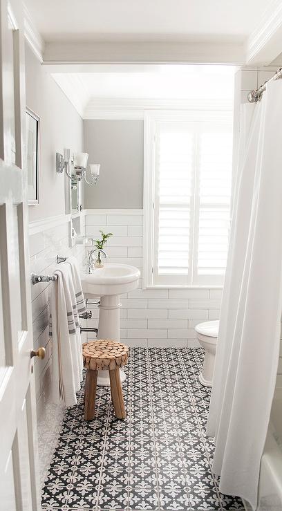
And a medium grey is always useful, like Sherwin William’s Knitting Needles
A grown up pink wall will always delight me- Pink Ground from F&B is a perfect choice (or BM Blanched Coral)
I’m loving complex colors like the green/blue/grey of Ben Moore’s Intrigue.
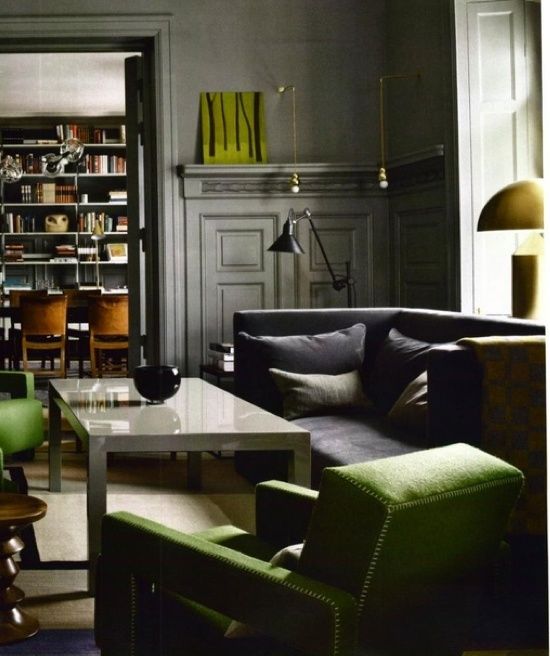
And the moody, library-like deep greens with a touch of grey like Ralph Lauren’s Quatrefoil (perfect to off set gold accents and rich leather).
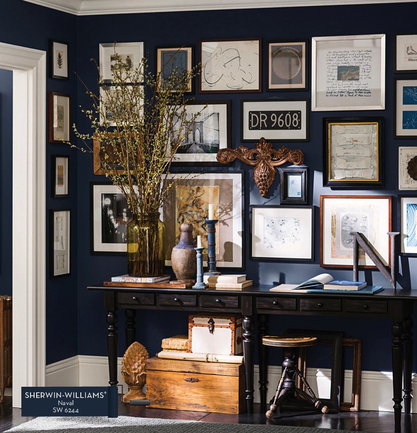
A deep navy is never going to be out of style, and right now Sherwin William’s Naval is a favorite- it’s super dark and rich.
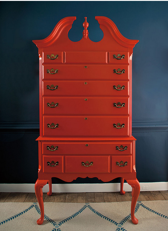
Now I am not a red person, I never use red on walls EVER. But right now I am having a thing for this super crisp, modern orange-y red from the Ben Moore Williamsburg Collection! Who knew!?
Another suprising favorite is this incredibly rich brown with a touch of purple and grey in it, Silhouette from Ben Moore. I think we all want to feel enveloped by coziness right now and this color is like a big bear hug (and pairs well with lots of accent colors like chartreuse, light blue and canary yellow!)
A solid dark taupe is a staple these days- not grey, not brown– but right in between. Like Sherwin Williams Gauntlet Gray. Great for cabinetry and walls!
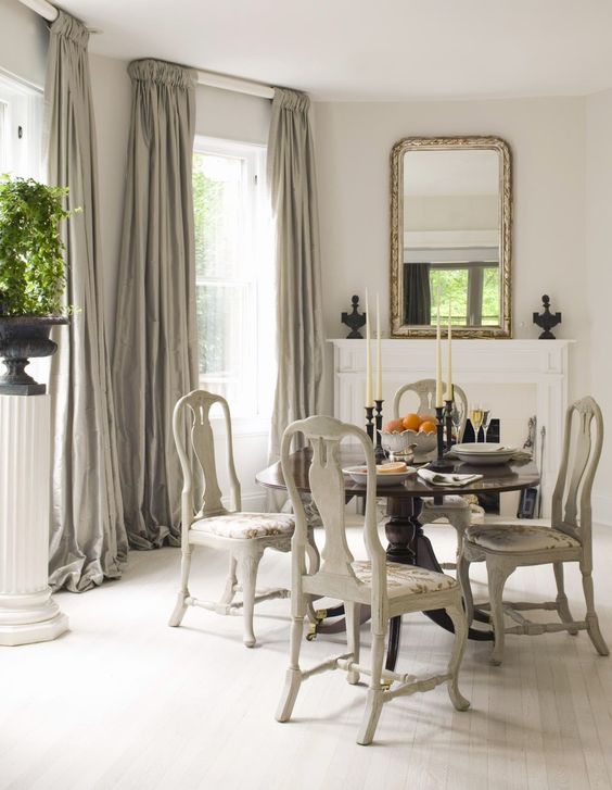
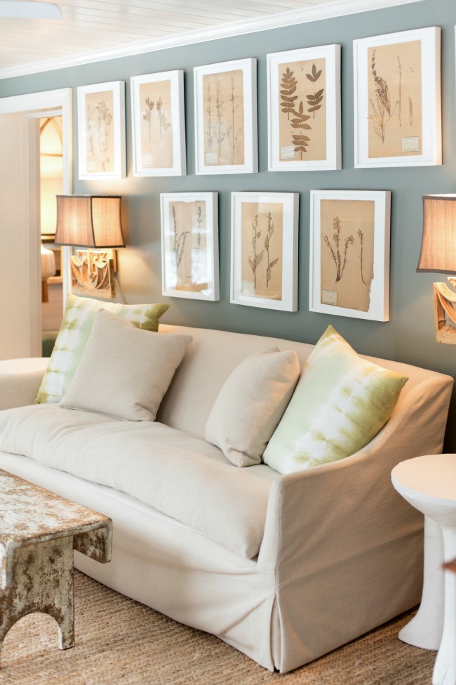
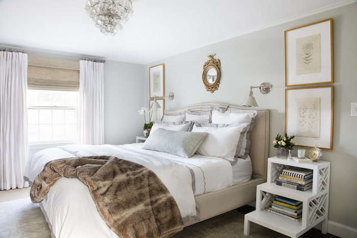
As you saw in my previous post, I repainted my guest room a light grey-green (Farrow & Ball’s Cromarty featured in my palette above). It’s AMAZING. So much depth and such a soothing backdrop to greys, gold and crisp white! And to paint the room I used Paintzen after a trusted fellow Boston design blogger suggested it. YOU GUYS, it’s like Uber for painting your house! It was phenomenal. I went online, filled in info about my room and the paint color I wanted and BAM- a super nice, talented painter showed up days later and did an amazing job for a REALLY affordable price (about $500 for a medium sized bedroom). And I didn’t even have to talk to anyone, which I hate (I have this weird thing about not liking to use my phone for speaking- I won’t even order food on the phone! How weird am I???). But seriously, it’s so amazing for the design obsessed who don;t have a go-to painter and are eager to make a big change on the quick! Give it a try for 10% off with the code ELEMENTSOFSTYLE10!
And please share any current favorite colors you’ve used! It’s great to hear from those who have tried, tested and succeeded! :)
ExploreEnjoy More
Browse:

Can I ask about the bathroom tile? Where can I buy it? The black and white?
All paintings are Beautiful and color combination of these paintings is very good. I decorated my room with Japanese calligraphy painting ordered from Sumigraphy (U-CAN Americas, Inc.). Hope it will help others.
I’m about to repaint my kitchen (been Ben Moore Stonington Gray for about 5 years) to Ben Moore’s Cotswold from the Aura collection. I too am a little over the cooler grays – warming it up!
Pink Ground is GORGEOUS. Now I can’t decide between that and a grey tone I was considering.
– Charmaine
https://charmainenyw.com
Just painted my bedroom Sherwin Williams Vaguely Mauve. It is a grown up dusty neutral. No one can decide if it is gray, lilac, pink, it’s just dusty, light and neutral.
Question, do you ever color match in other brands? If so who has been the most successful in matching? I don’t always love the paint from one brand but like their color.
Love your guest room! Such a lovely color and space. I painted my kitchen ‘s dining area SW Loyal Blue about 2 years ago and it still makes me happy every day, in every light. It’s almost a navy but has a gorgeous richness and depth to it.
Also just did my 10 year old’s bedroom in BM Old Country. It’s a soft pink with a bit of brown and yellow. I was terrified since neither one of us are pink girls. It’s spot : pretty , serene and sophisticated.
Thanks for all the great color inspiration!!
Great color round up! Where is the bathroom picture with SW Knitting needles sourced? Love everything about it and would like to see more pics/sources if possible. Thanks!
I painted our living room (including ceiling) sherwin Williams naval & love it!
I recently painted my guest room/office Lavender Memory from Behr. It looks amazing in the changing light throughout the day. It feels light and energizing!
C2 Elements is a nice grey/green. I also love F&B French Grey.
Our TV room is painted a chocolate brown (Donald Kaufman, DK-15, I think). It is similar to the BM color you posted and does make the room feel cozy. Although skeptical at first, the painter loved it by the time he was finished.
We refinished our basement earlier this year and painted it Curio by Behr and it’s awesome! We get tons of compliments and it’s a shape shifter depending on the light pulling more green, blue, or gray undertones as the light changes. Not to light, not to dark on the color spectrum.
Currently painting our mudroom/kitchen/hallways/living room Campfire Ash also by Behr. Originally thought I would go with BM Edgecomb Gray but pulled more beige than I wanted in our house. Campfire Ash was a more of a warmer light gray.
Pretty sure we used Contemplation by Behr in the Master and it still gives me a relaxed, retreat feel. A darker green/blue and little moody.
Might have to put your guest room green in the mix with the others green/gray/sages currently in the running for our extra bedroom!
I’m mulling over paint colors right now. We’re moving out of our three story brick Tudor into a two bedroom retirement condo. Looking for the right color for a feature wall in our bedroom … maybe that bearhug brown? And the guest room/office … maybe the navy? I want galley style walls in these two spots and I want the art to pop off the walls…
We’ve just wrapped up the renovation of some 17th century apartments in the south of France, and since they’re historically protected, the color of the paint was decided by a French government agency. It was a very pale gray. We are working with that and the colors of the original terra cotta tile floors. Honestly, I love the results. I had wanted a creamy, buttery ecru, but it just looked dirty next to the gray. But what matters most to me is that it’s timeless. I don’t want anybody to look at it and say, “that’s SO 2017!”
I love BM Quiet Moments and Healing Aloe. Beautiful blue/green/grey. I love the color used in your guest room!
Benjamin Moore Simply White!
Literally just painted my own bedroom SW Repose Grey. It’s not too cold, warm, with some purple undertones and I’m IN LOVE. Beautiful choices up there.
My 12 year old daughter’s bedroom is SW Repose Gray. Love it. I am about to go up there and do some touch up where we installed drapery tie backs. I agonized for months over finding the “right” gray that would pair well with cream, navy, and gold decor palette, and this is it.
Thanks for sharing – it’s always good to know color trends. I am totally with you on not wanting to talk on the phone. Just this morning I was griping about the fact that a colleague called and left me a long-winded message about something that could have been resolved in 2 emails (which it later was). Introverts unite!
Benjamin Moore Pebble Beach
Pebble Beach gets my vote too. I used it for the guest bedroom in my mom’s coastal home.
Can you recommend a company for blinds for a home? I
need new custom made blinds.
Erin, I agree about navy, it will always been a go-to for certain people and rooms I am looking forward to painting my husband’s den in our new home a navy. It is a dark color I know I can live with and have lived with in the past. Fun post! Always love hearing your opinions and predictions!
Picked all my colors for my current home online instead of getting swatches since I was short on time and it was a big mistake. I had to repaint two rooms….one of them being the SW Naval. Online its a beautiful blue but I couldn’t help but see a True toddler boy room every time I looked at my dining room. I switched it for Valspar Dutch Licorice which was the color in our old dining room…should have stuck to the originals! two of my favorites were SW white dogwood for my daughters room and SW eider white for an overall color.
Thanks for letting me know about Paintzen! I usually paint myself, but lately have been thinking that I should just hire someone to do all the trim… it’ll take me years to get to it myself. (Thanks for the color recs too!)
My mind is completely blown about Paintzen! We have an open concept row house and the whole first floor needs to be repainted. I had zero idea about how much it would cost so have been procrastinating calling (hate it too!) a painter for an estimate. 2 minutes on their site and I now have a rough idea of the cost and its not bad at all! Of course now I have to pick colors…
Real question though – the original owners painted the rooms slight shade variations in each room. Not so much you would notice unless you were trying to patch up something. Since its a row house it only gets light from the front and back so those rooms were painted a different shade as the interior. Is that something you suggest or should I just pick a color that works well in all of them?
Painted our master in F&B Borrowed Light, it is so serene and beautiful, goes beautifully with grey and gold accents – also have a dark brown antique dresser against it and its gorg. could drink this color its so pretty:-)
That is so funny about not liking to call in take out orders! I make my kids do it, and tell them they’ll be glad they know how to order takeout when they’re on their own! Also, I love the Intrigue color!
Whoops! Meant “can appear pale sage but very sophisticated.”
Have had great success with C2’s Potato Leek (#430) in home office and bedrooms, too. A lot like Cromarty, I think — can appear pale sage but not sophisticated. Love.
Love this post! We hope to be moving in the next few months so this is handy. I really like the SW alabaster.
My bedroom is very similar to your guest rooms color…it’s Pratt&Lambert…need to check the color…but you’re right, it does have a lot of depth. Have had it for 8 years at least and still not sick of it.
I HATE talking on the phone too! I’m so glad I’m not the only one. I have to almost work up the nerve to call people!
Colors are all lovely. Loving that Navy.
i am totally on the hunt for the perfect grey- so thank you! i’m also looking for a good kitchen cabinet color- any ideas?
xo, brittany
i’ve got gift guides on the blog today- holiday jammies!
http://www.notablob.com