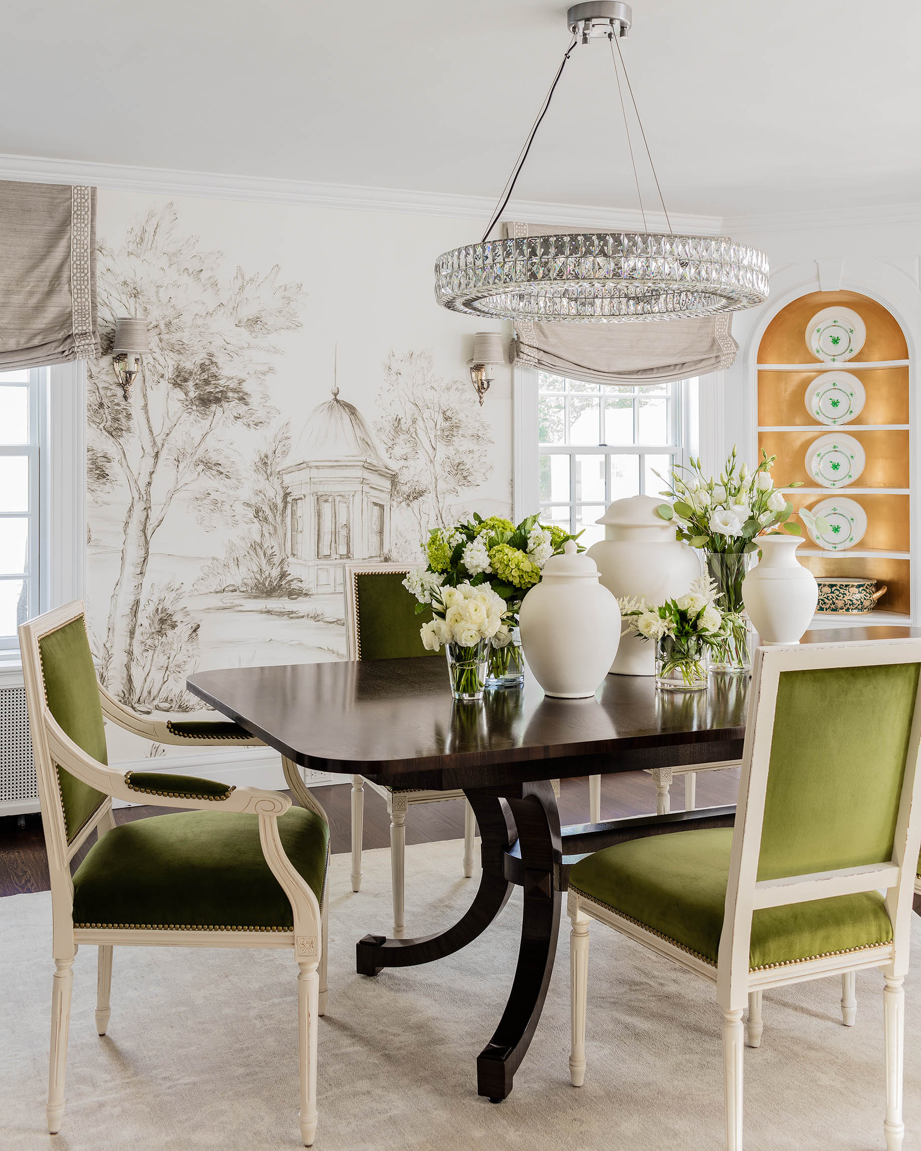

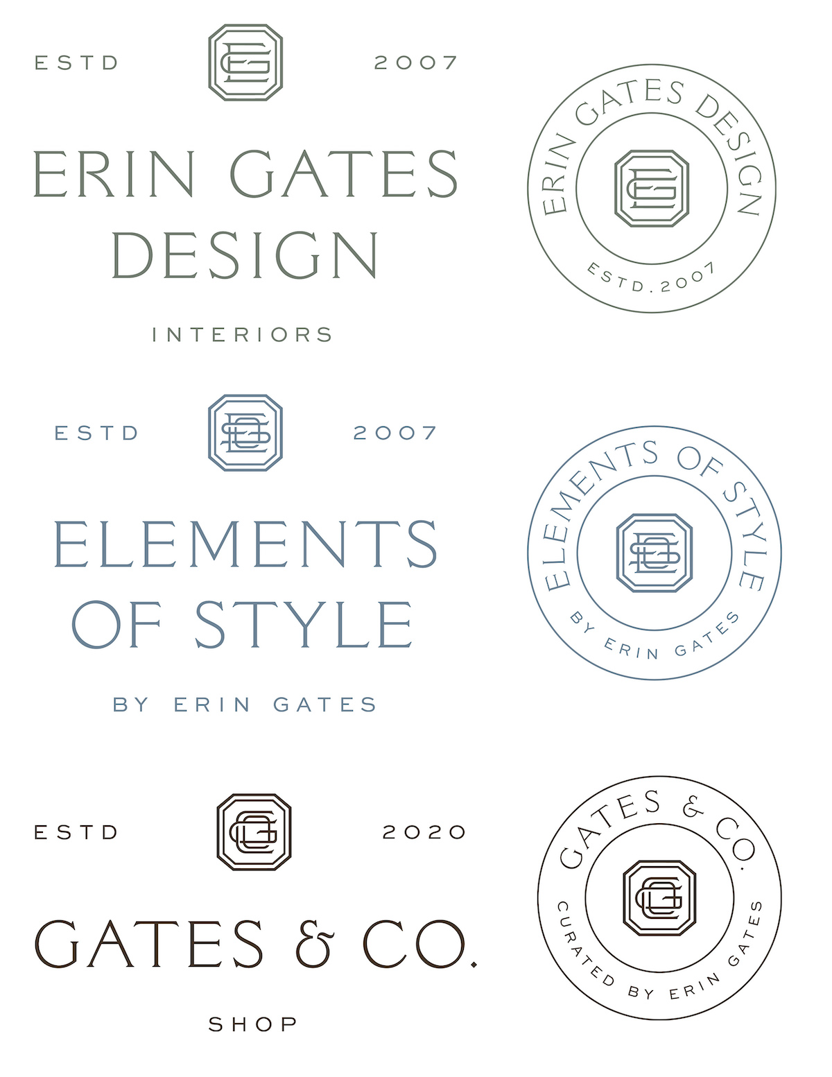
Welcome to Our New Websites!
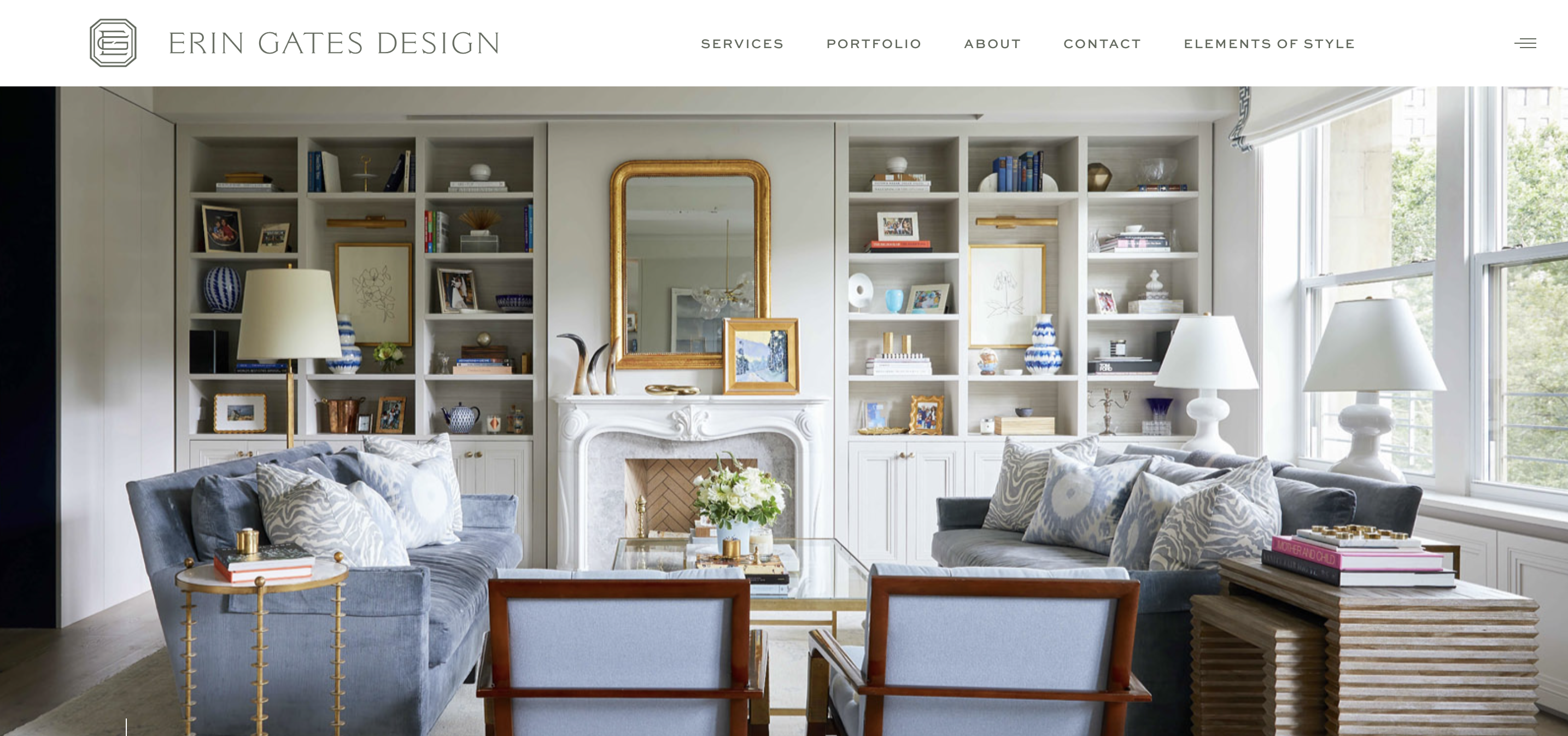
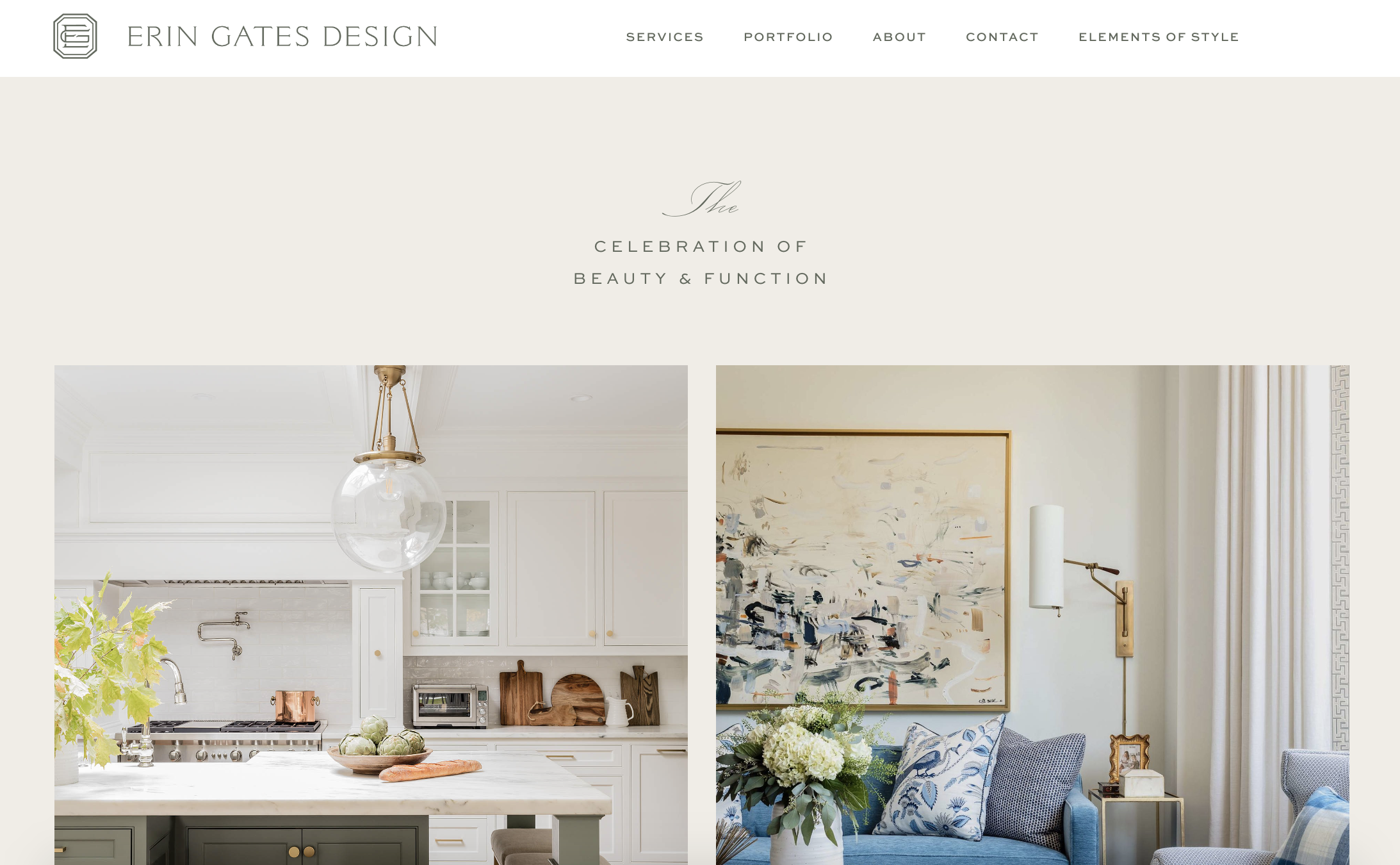
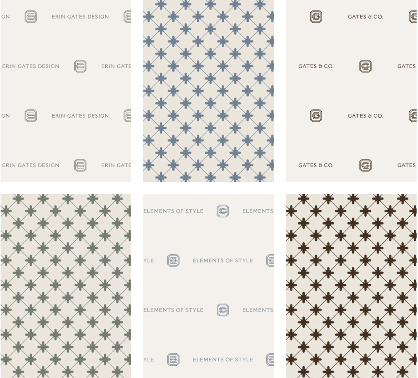
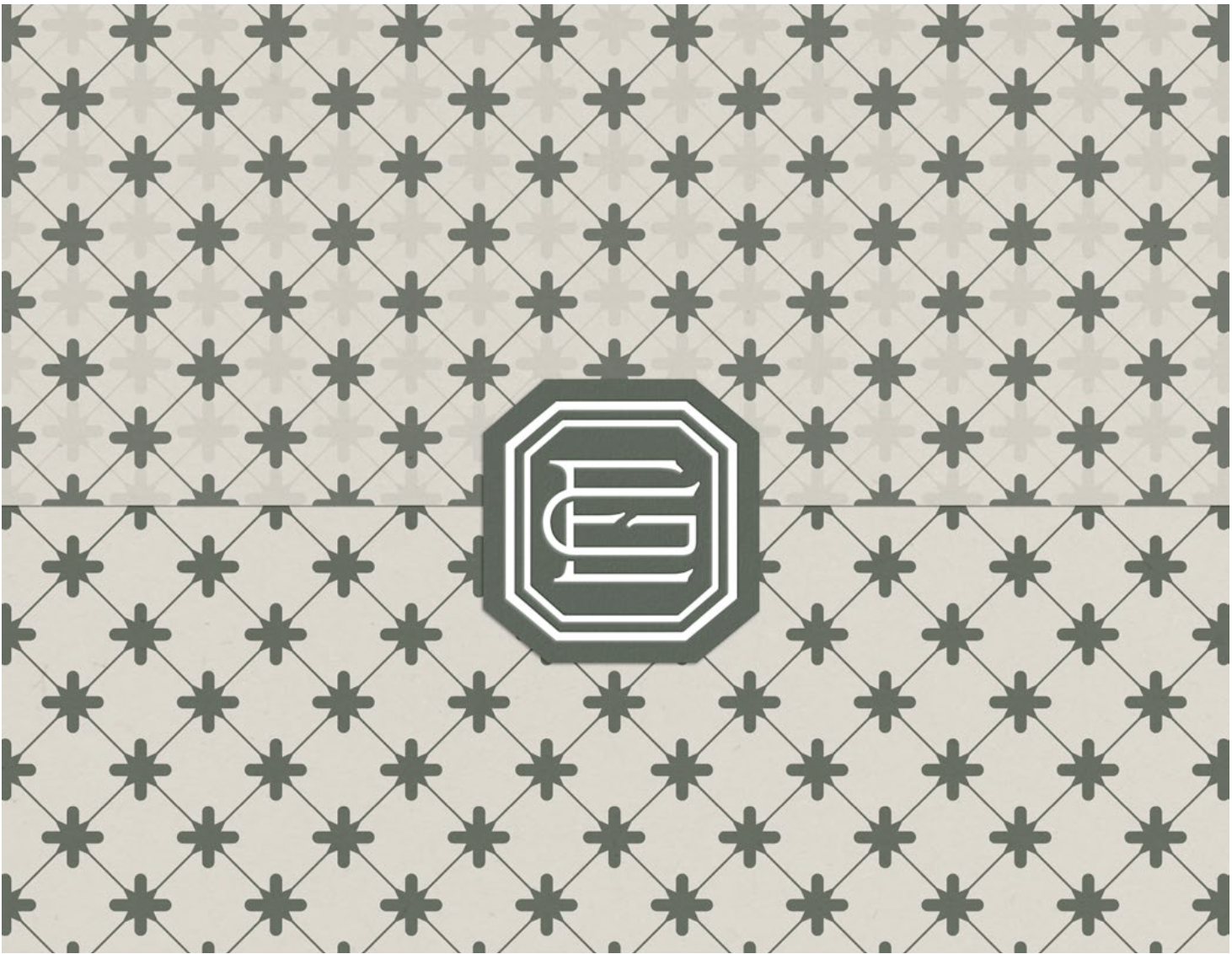
You might be thinking “wait, this looks different”– and it DOES! For the past year we’ve been working with the amazing team at The Malone Agency on refreshed and streamlined branding and websites for all three arms of my business- Erin Gates Design, Elements of Style and Gates & Co! I still loved our original logo we developed years ago, but Ashley refined it and added to it, encompassing all three brands with one cohesive look.
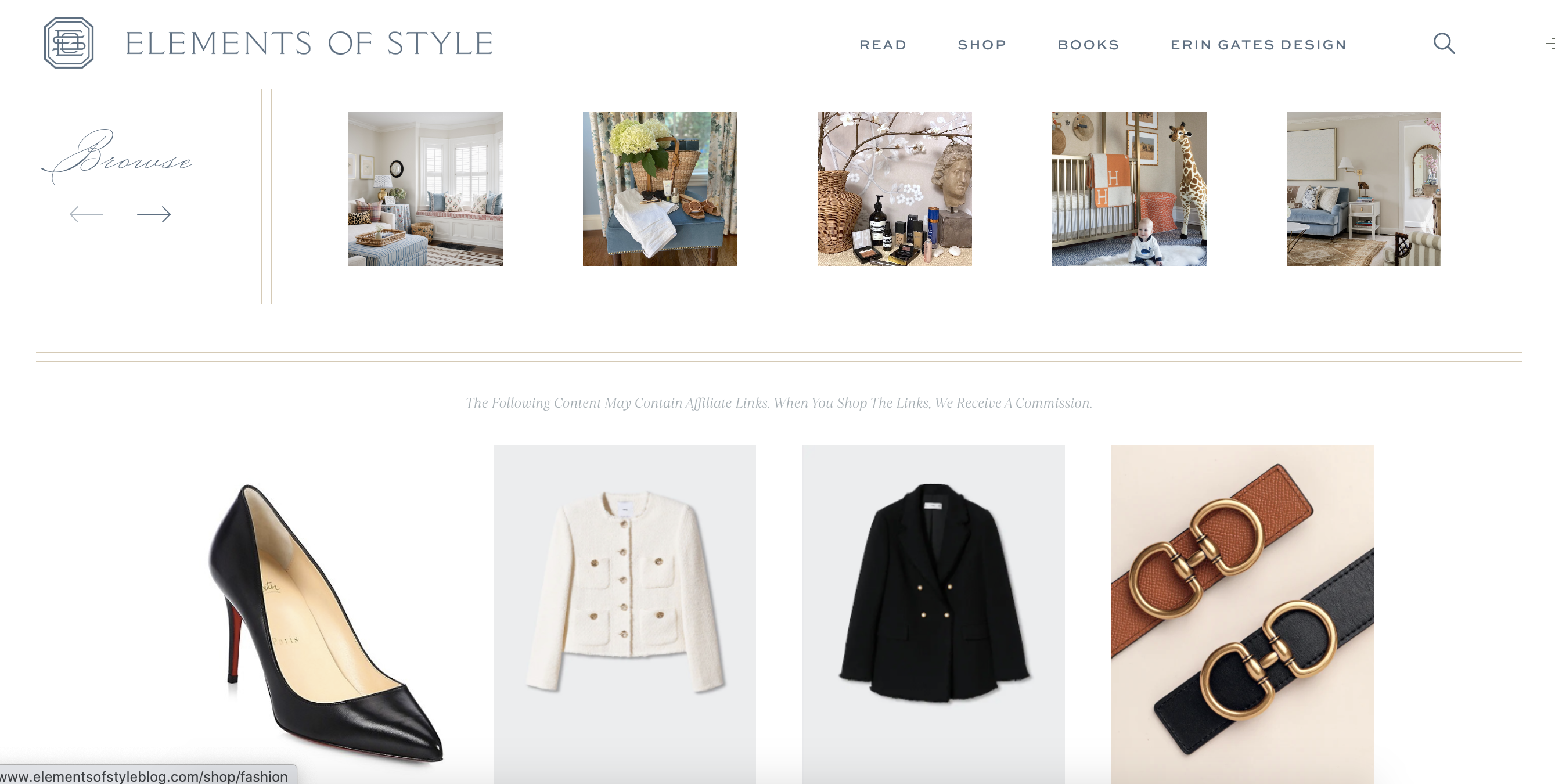
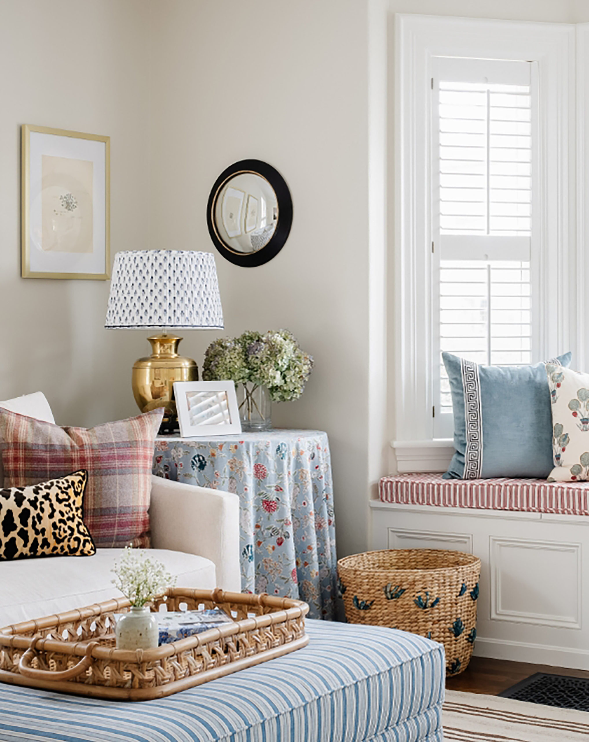
The blog also has a new look and feel with clearer features and ways to find older posts!

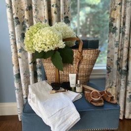
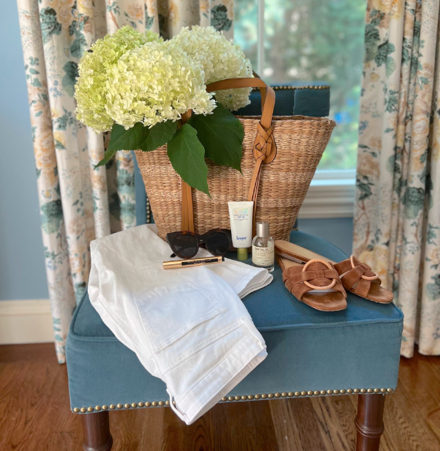
We also have a much easier way to shop things I love and share on Instagram and the blog too:
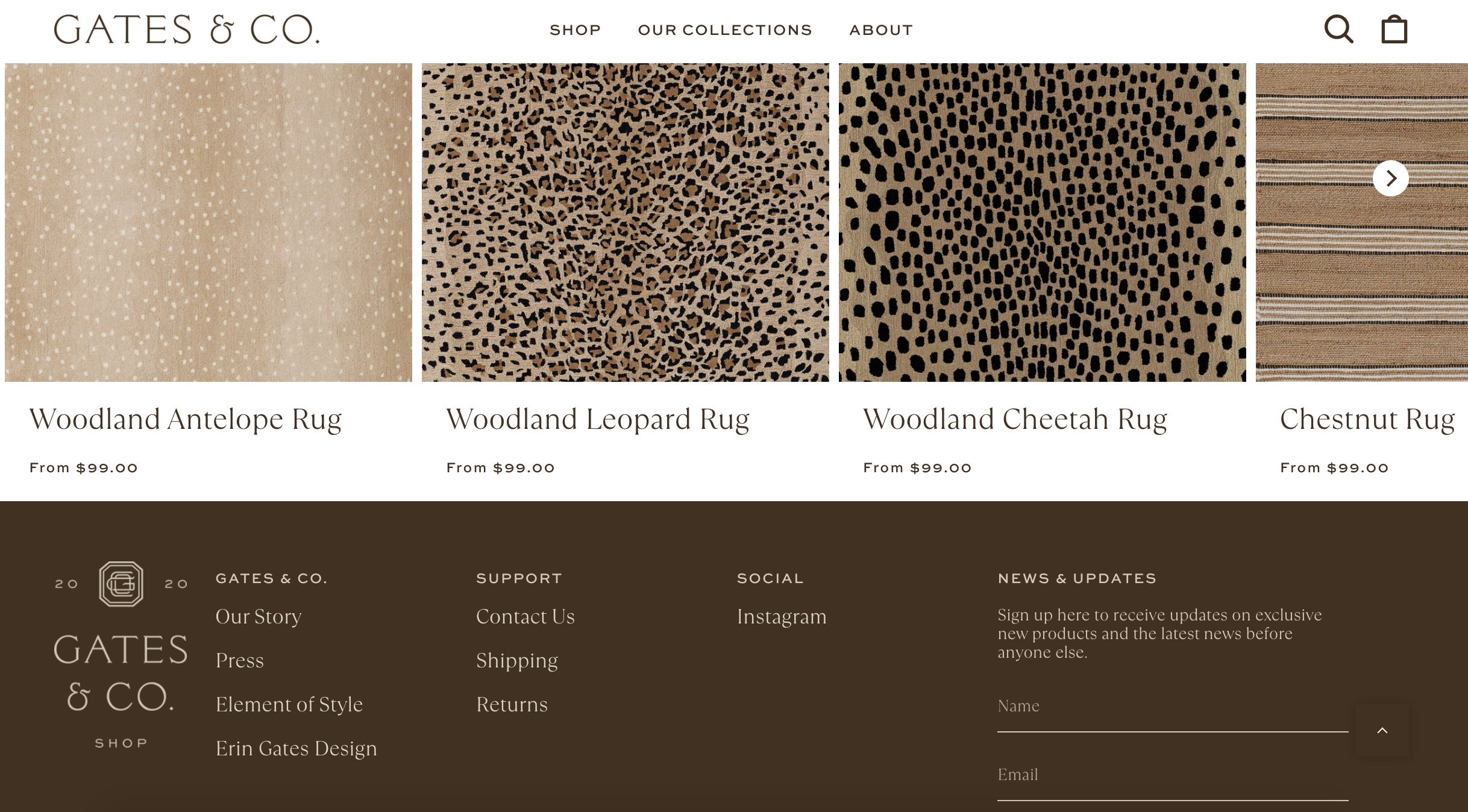
And speaking of shopping, Gates & Co. also got a major facelift!!!

Including a direct way to buy all my licensed products!
I’m so thrilled with how this all looks, functions and feels- sometimes I feel so scattered with everything I do and this now allows all branches of the business to seamlessly connect while maintaining their own unique identities. I hope you like it and please let us know if you come across any glitches or have any questions about the new sites!
ExploreEnjoy More
Browse:

Agree with previous posters – look and feel is terrific but the print is very hard to read. I know you want it to look great – but PLEASE up the contrast and consider switching font types to something more legible like Calibri. https://www.washingtonpost.com/world/2023/01/18/state-department-times-new-roman-calibri/
Looks so great! So impressive everything you do. I agree with the other commenter that it’s hard to read the blog posts on a mobile phone because the font is so light. Otherwise, all fantastic!
It’s beautiful! Congrats!
Erin, your new online presence is sleek and professional. Brava! My only issue is difficulty reading the text due to a much lighter type color. Higher contrast—as close to black on white as you can go—would enhance legibility and help visitors read your thoughtful posts more easily. Congrats and cheers!
Holy cow- this looks amazing! I serve on the board of a small non-profit that is in the midst of updating their website and it is more work and harder than I ever imagined, even for a simple “basic” website. For a website to look THIS good, as well as the accompanying branding, I know how much time, effort, and talent went into it. Congratulations- it’s beautiful!