Good Things Come in Small Packages
I always look forward to the House Beautiful Small Spaces issue as it always gives creative inspiration on how to live in a smaller footprint smartly- or just be more organized and crafty with design! This year I was pretty blown away by one space in particular, a 700 square foot apartment on Park Avenue in NYC owned by designer Amir Khamneipur. No doubt the renovation of this space cost a fortune as it’s all very, very high end (I can’t even imagine per square foot costs)- but there is such genius in the layout and overall design concept that certainly could be translated into a more modest budget.

First of all, super high ceilings and good windows always make a small space feel so, so much bigger. Secondly, painting the entire space (including the crown and baseboard) the same color- particularly a light grey like this will also aid in adding visual square footage. Third, mirrors are your friend- in this case he mirrored an entire back wall to create the illusion of a bigger room. The streamlined drapes in a similar tone to wall emphasizes the ceiling height. Anything too bulky would make the room feel crowded.

INSANE GENIUS- the banquette serve as sofas, a place to eat and entertain AND turn into two twin beds for guests! I mean, brilliant. Also I love that he did not shy away from making a grand statement with the fireplace. Small does not have to mean subtle.

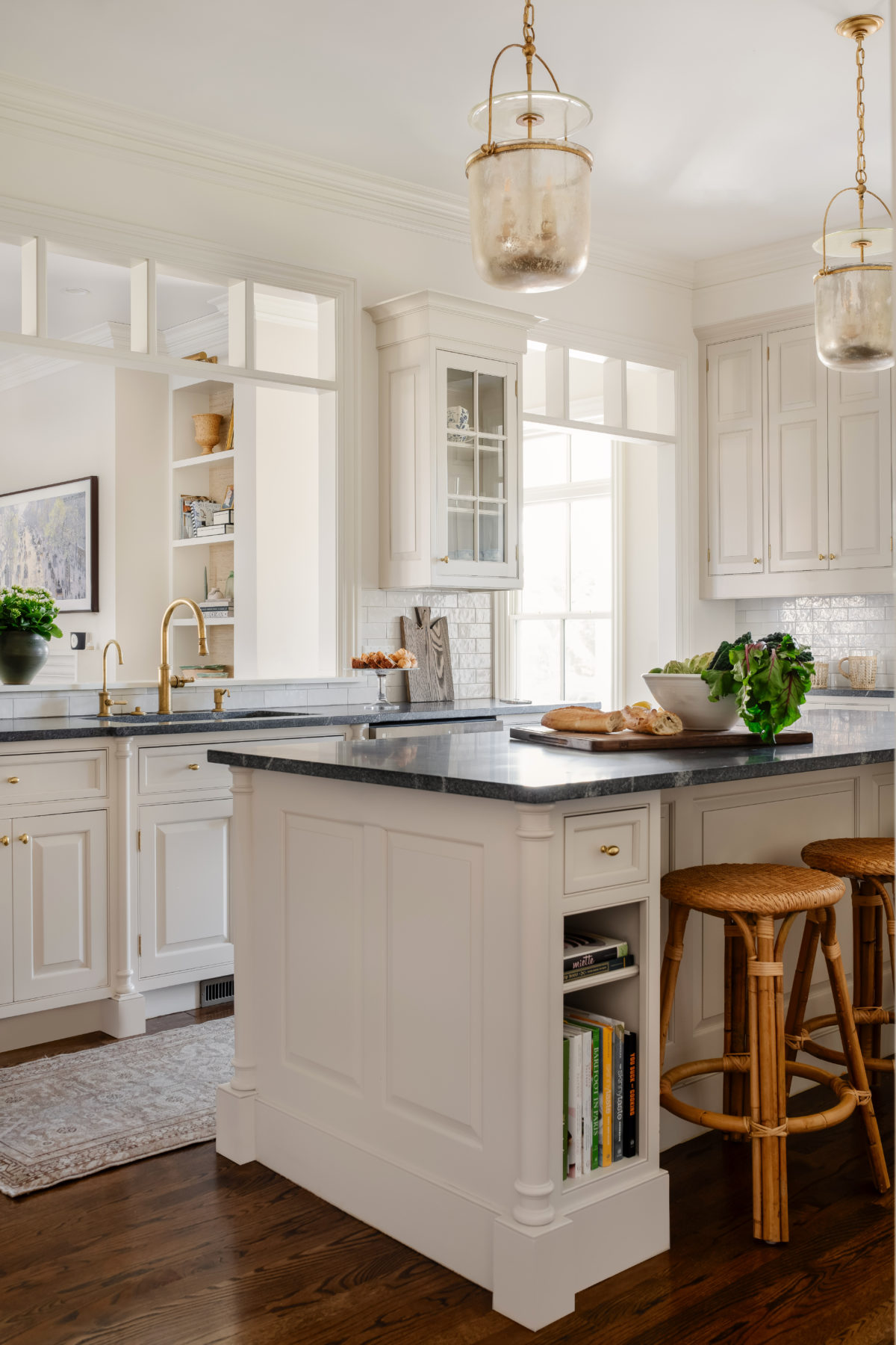
The kitchen has massive amounts of storage thanks to the floor to ceiling cabinets (all painted the same color as the walls to keep things feeling open and seamless). In another genius move that borders on magic- he mirrored the facing panel of the island (set back from the furniture style legs) to make it appear to be a open table, when really there in storage on the other side. A design optical illusion at it’s best (and this guy must buy stock in Windex).

Looking towards the bedroom you can see how the color scheme continues- grey, white, wood and gold. Another large mirror above the bed (which has storage in the base) tricks the eye yet again.

In the “study” there are even more storage cabinets in the same style as the kitchen, and mirrored pocket doors to close off the bedroom for privacy when entertaining. The ladder moves from room to room to access the upper cabinets.

A brilliant use of these tall built in cabinets next to the bed (note the pull out shelf for books and water). And with even more cabinetry in here I am confident this tiny apartment has more storage than my entire house!

The bathroom is sleek with an extra deep mirrored medicine cabinet for linen storage.

Take Aways for Your Own Space:
- one singular paint color makes a small space feel so much better.
- use mirrors to trick the eye into thinking there is more space than there is.
- Keep the color scheme of the decor similar from room to room not only to unify the space but make the decor interchangable.
- Built in cabinetry that utilizes every inch possible is a brilliant investment in a small space. Always go to the ceiling when building in cabinetry.
- Make furniture serve double duty- banquettes are good for this as well as small ottomans/stools, daybeds and accent chairs.
Get the look with pieces like these:
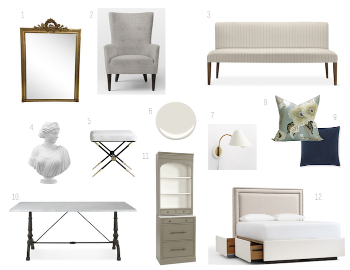
1. // 2. // 3. // 4. // 5. // 6. Ben Moore Light Pewter- a great light grey// 7. // 8. // 9. // 10. // 11. // 12.
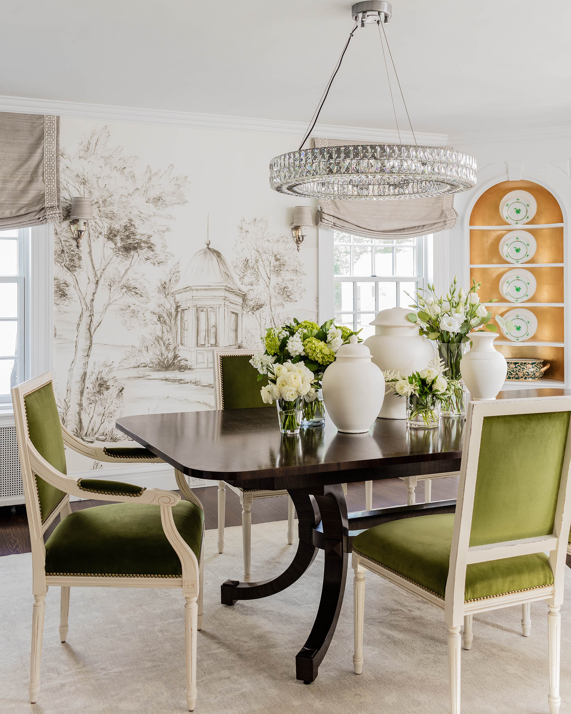

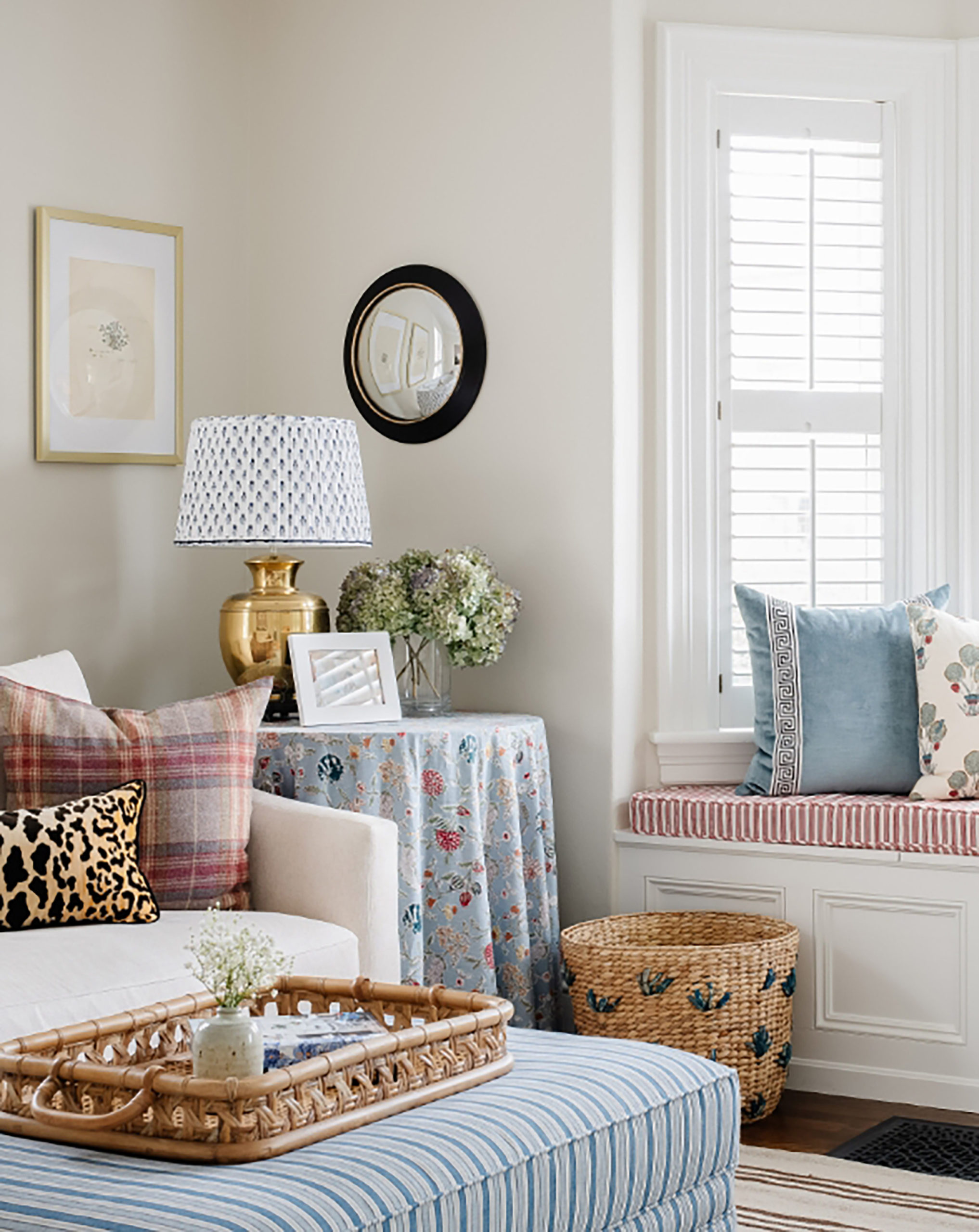

Well thought out and massive inspiration!
I saw this in the latest issue and almost fell out of my chair! Those mirrored pocket doors, the mirrored part of the island, and the functionality of the banquettes – absolutely gorgeous. And i bet it was difficult for the photographer to get a shot w/out his camera in it – it’s truly like you’re seeing it with your own eyes!
I love it! The banquette serve as sofas is the best idea ever. And the kitchen space cabinets. Perfect!
Erin,
Those banquettes that turn into twin beds are genius. Do you have any sources?
Wow this has blown me away! Everything is so gorgeous and well thought out and provides massive inspiration!
Gorgeous, but wow a lot of mirrors. Not sure I want to see that many reflections of myself.
This space is heavenly. Gray is my favorite color for an apartment and with the gold accents, mirrored surfaces, and pull out beds – I’m ready to move in!
Stunning, genius and expensive. And oh yeah… so jealous! Thanks for sharing.
Impressive! For all the reasons you mentioned. So much going on but it looks serene and seamless.
I am currently downsizing from 3k Sq ft to 750. (If all goes according to plan). I am always looking for glamorous inspo. This definitely is beyond beautiful. I really need help with the kitchen. Did they not show it?
If you want to see some other angles of the kitchen, there is a few on this website: https://streeteasy.com/property/1271534-254-pas-4c
This is excellent timing! My husband and I were just discussing what to back our kitchen island with – literally 2 hours ago!!! I just emailed him this – hopefully he will go for the mirrored island back instead of the acrylic panels we were discussing – AMAZEBALLS!!!
Thank you :)
What a lovely tailored space! Beautiful.
I was enthralled with this entire spread. It is so stylish and functional. Definitely a one of a kind.
I love this. Built-in cabinets to the ceiling are so smart and keep a place from feeling overcrowded with too much furniture.
Those twin guest beds are genius.
Ditto the mirror under the island. It took me several minutes of looking to realize where it was.
And of course, you can be on only one ladder at a time, so what’s the use of more than one? More genius decluttering.
The only risk, though is that the far-up cupboards become a stash of unimportant stuff. Seasonal clothing, etc, is logical, but what else can you possibly store? Maybe in that footprint of a home it isn’t an issue because there aren’t really that many high-up cupboards.
Holy mirrors! I definitely thought those were built-ins by the fireplace. I’m so impressed by the optical illusions! This would not fly in my house, there would be nose prints and fingerprints everywhere (dog and babe).