Kitchen Renovation Reveal
One of our longtime clients (whose previous house is featured in my new book- including her super-custom kitchen we helped design) made a surprise move to a new town last year and called us up to help her turn the dated kitchen into something special. She loved the kitchen in her old home, and was sad to leave it, so we had a lot to live up to with this new one! And I think we did! We worked with Haven Builders and Kramers Kitchens on the cabinetry and the results are, as you can see, pretty spectacular. You can shop most of the items we used at the bottom of the post, too!
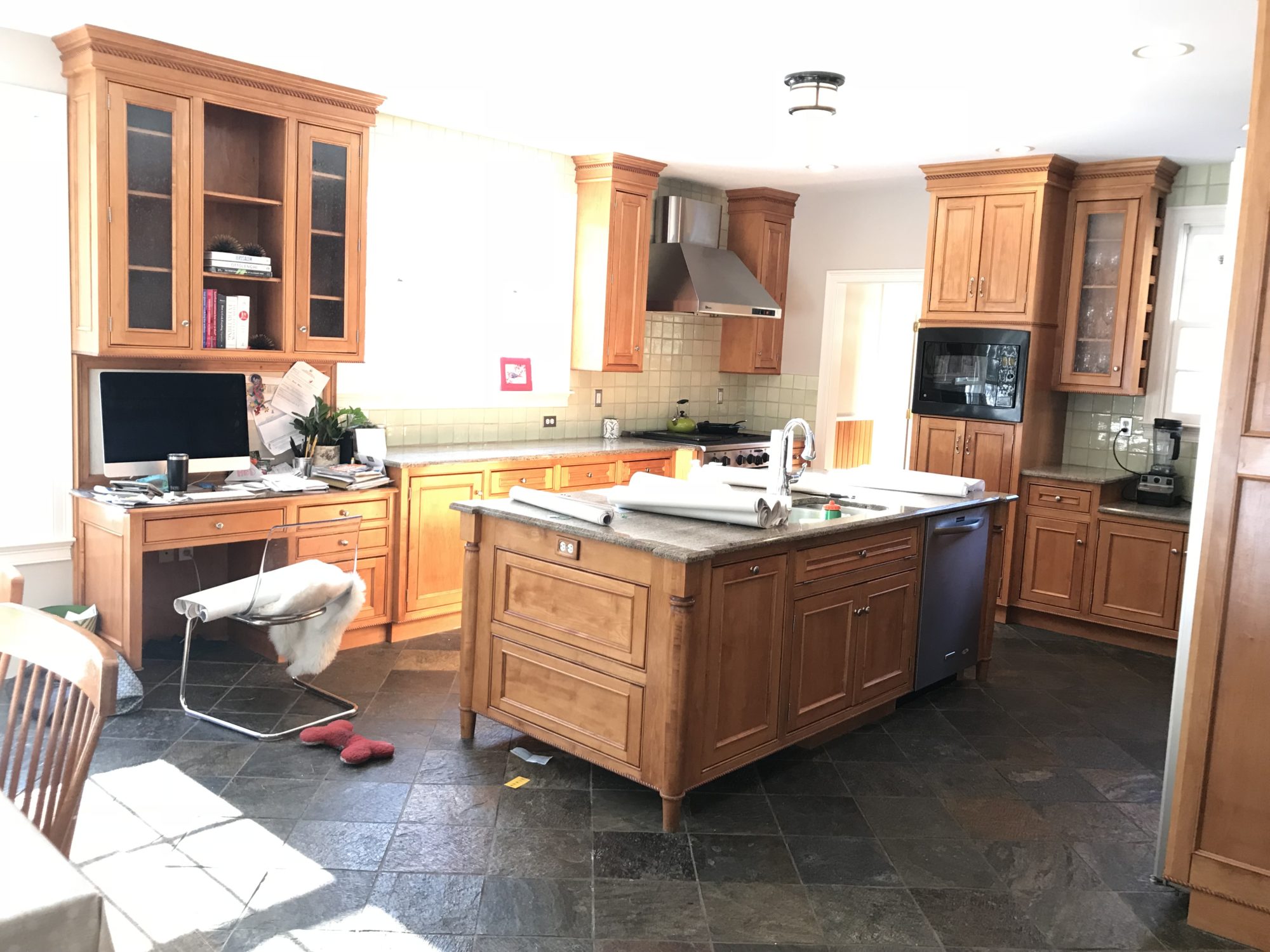
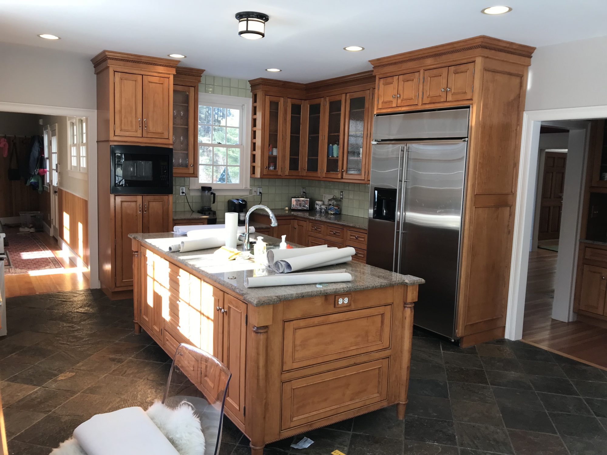
This was the kitchen as is when the house was purchased. The first thing that had to go were those floors! We initially were thinking checkerboard marble, but that was a bit out of budget and concerning because of staining and coldness. Initially we were just going to paint the cabinets as they weren’t a horrible style, and redo the tile, counters, hardware and backsplash, but after figuring out the homeowner wanted to move the sink out of the island and under the window and realizing we’d need a new island, the decision was made to just do all new cabinetry. To minimize spend, we left most everything else where it was, which cut down on the cost of moving plumbing and such.
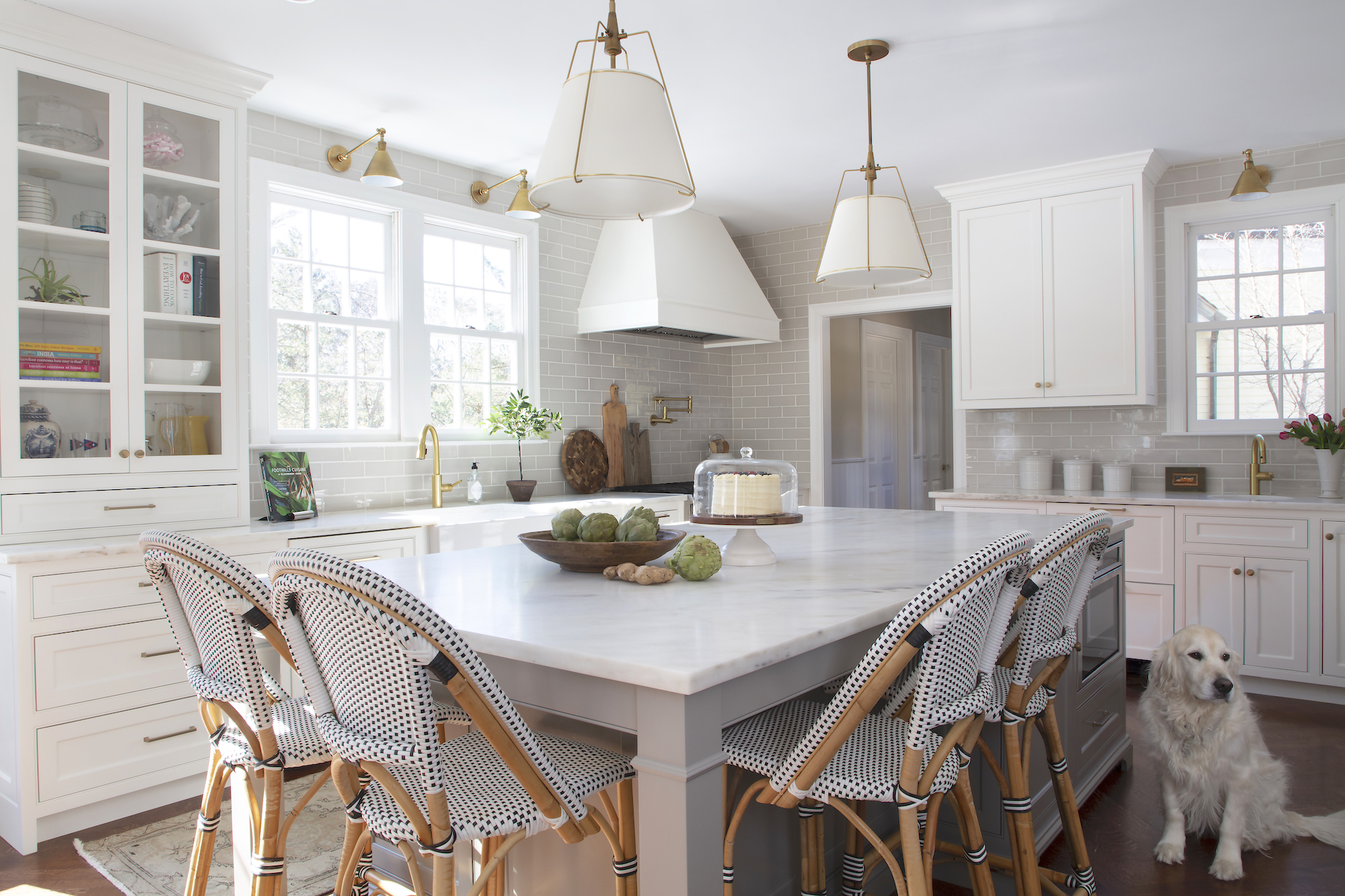
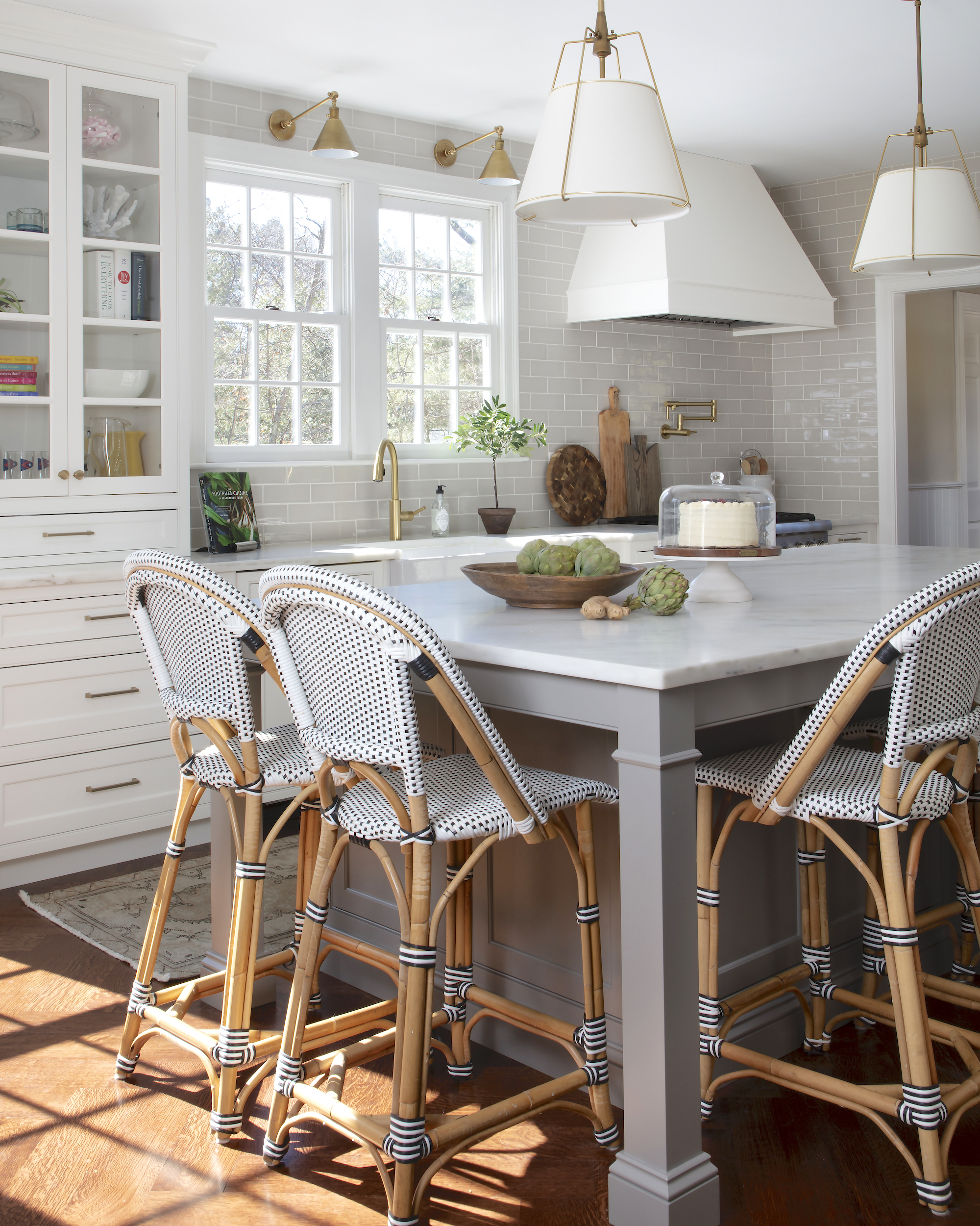
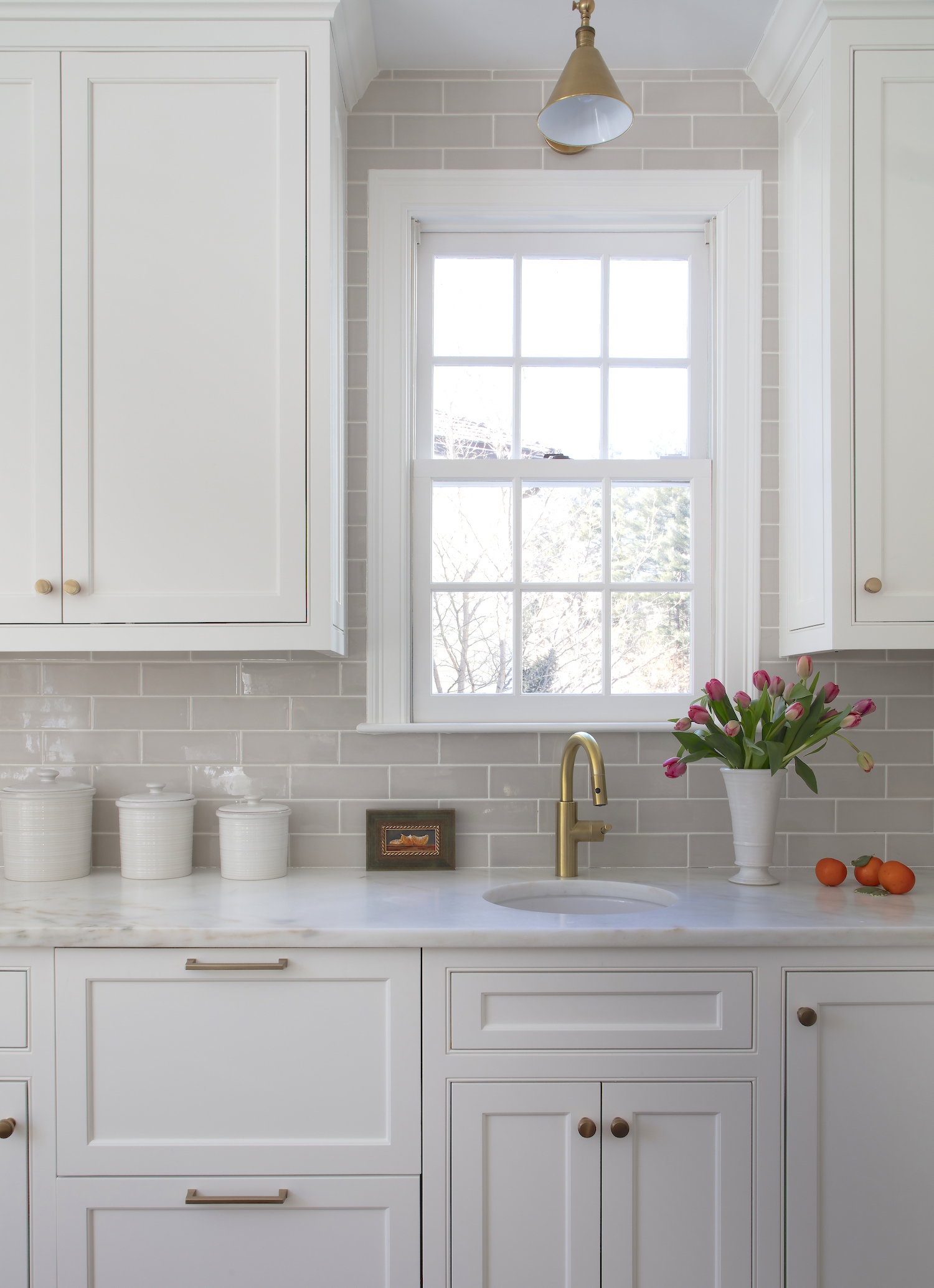
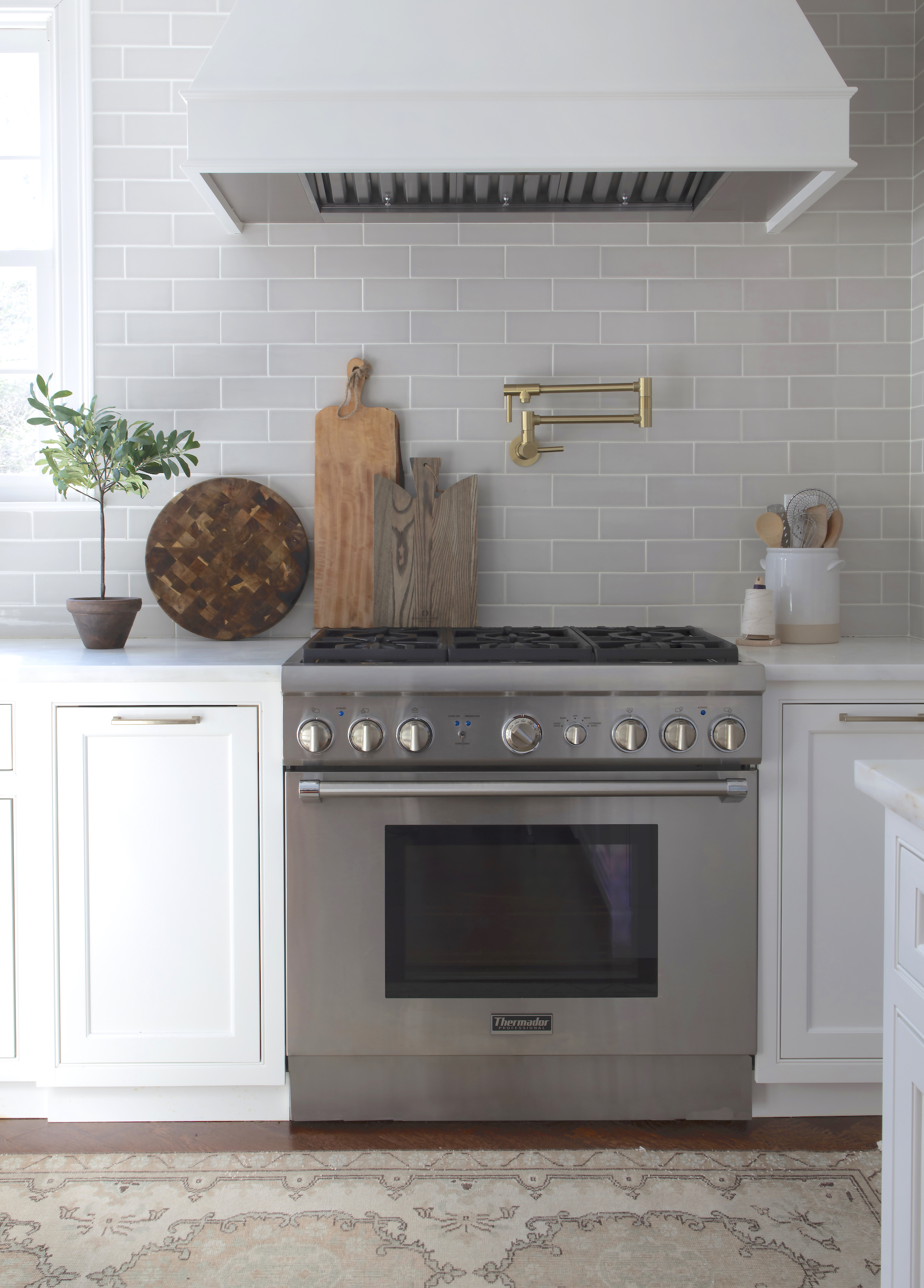
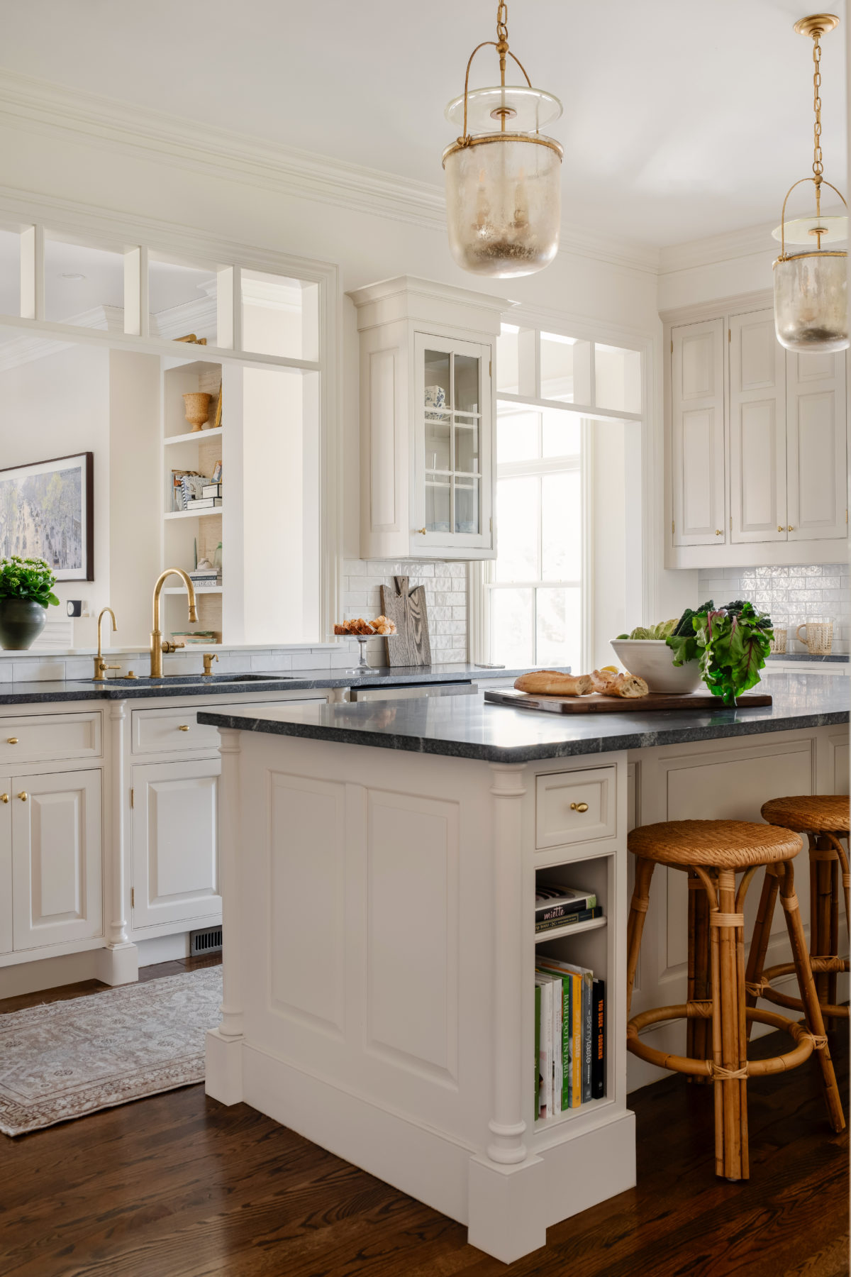
The homeowner has always loved Danby marble so we based the palette off that choice — mixing greys and warm tones to create a bright but warm space. The elongated subway tile running counter to ceiling is such a fabulous tone and mixed with warm brass fixtures really keeps things from getting too cold.

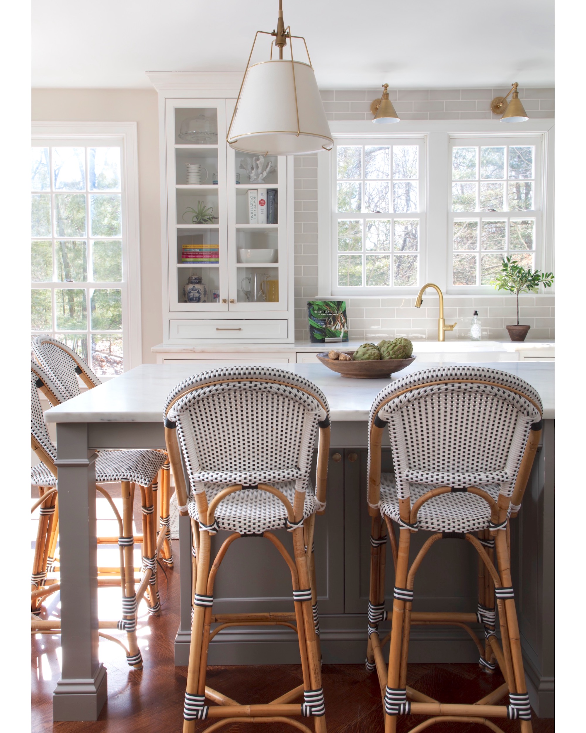
A tiny bar sink was installed under the back window and the hood is simple and tailored.
The floor in the adjacent rooms is a stained fir, and since that was proving to be a softer wood, we did not want to use it in the kitchen, but wanted something that blended rather seamlessly. So we used a harder variety of wood and to trick the eye from noticing that it’s a different species, laid it in a herringbone pattern. Man, did it come out great!
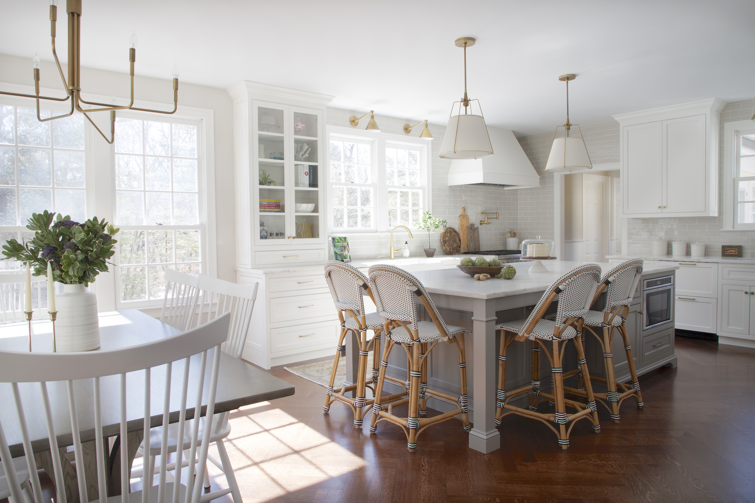
The eat-in dining area was updated with a modern fixture (such a good price for the size) and new table and chairs.
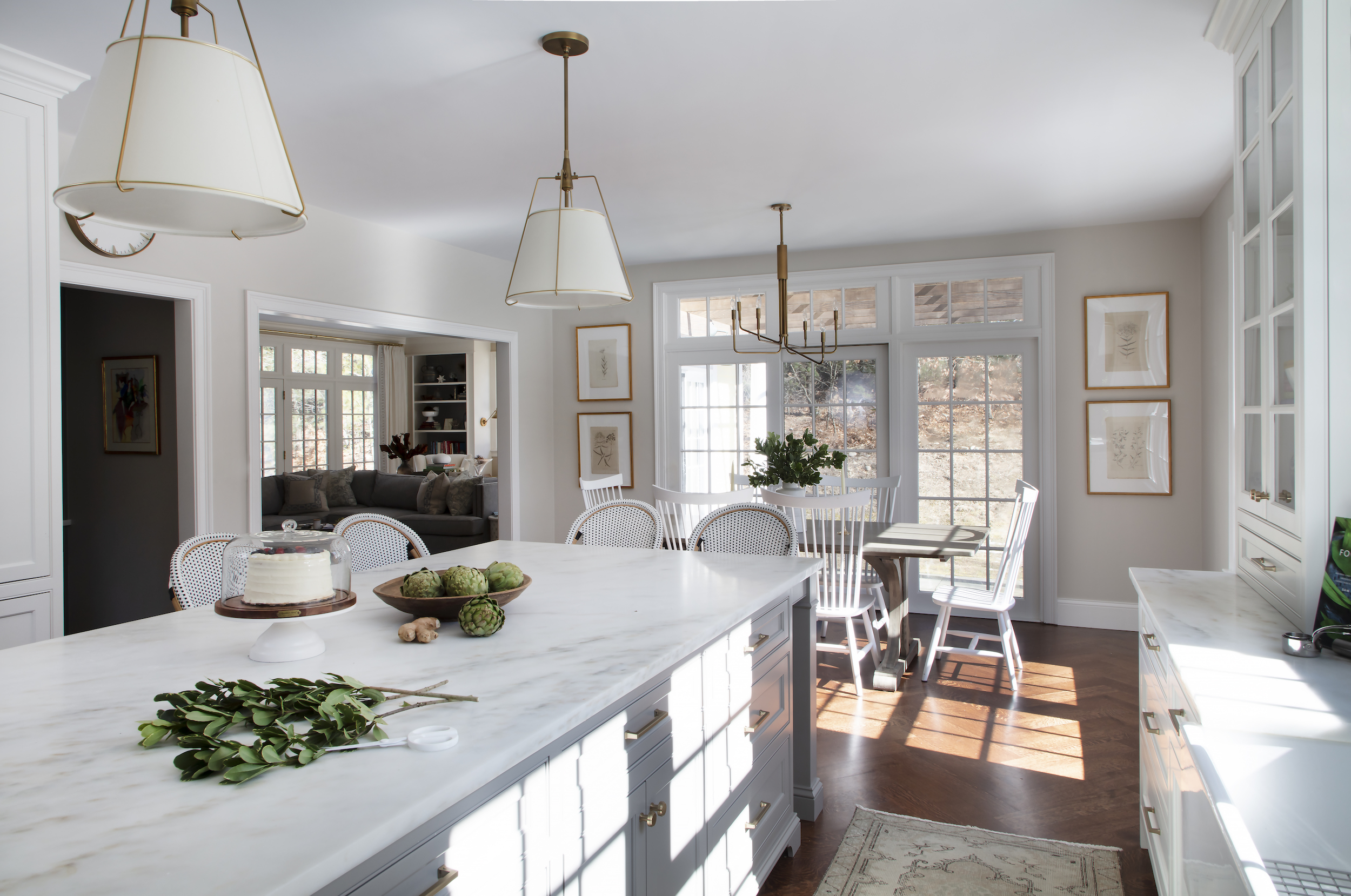
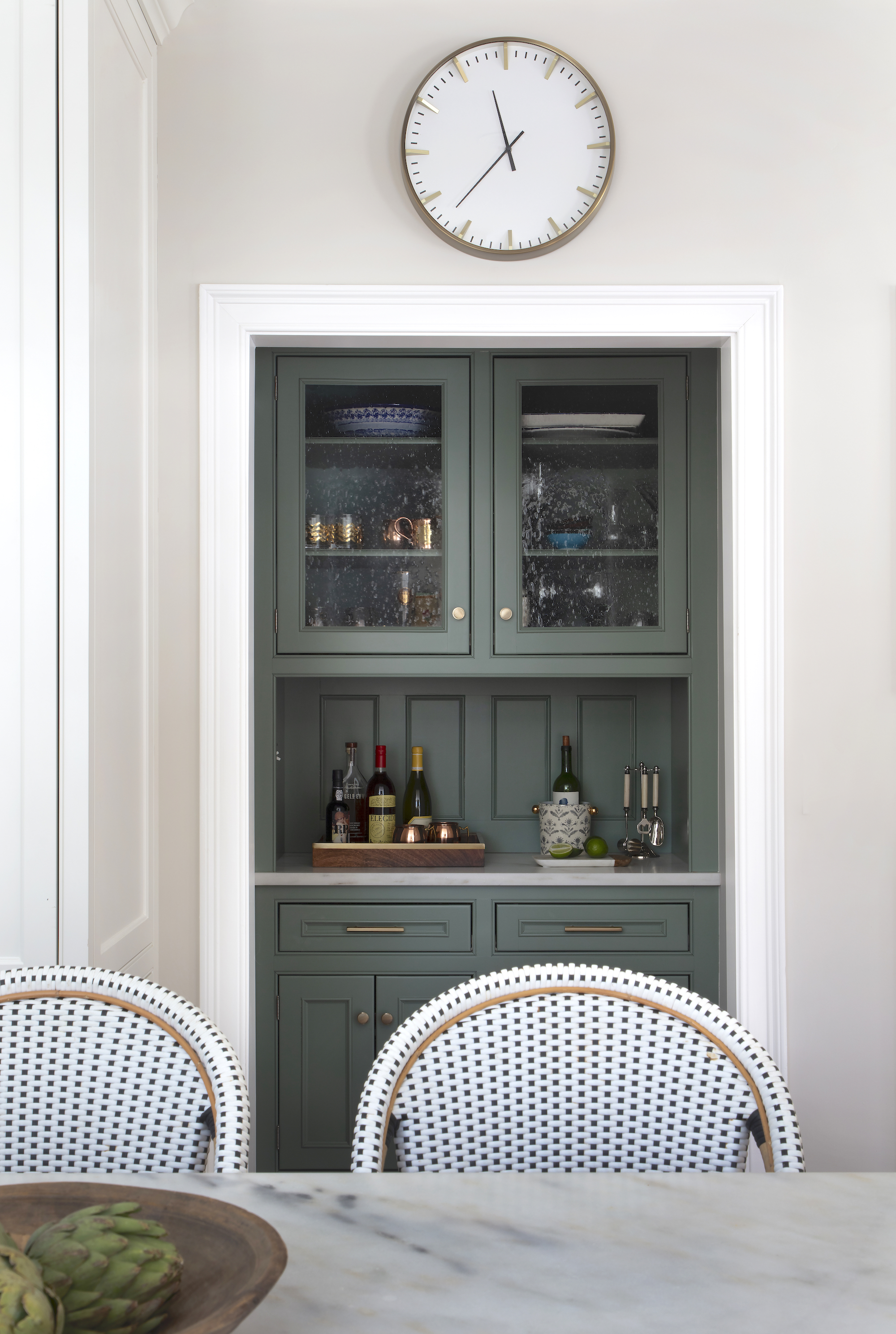
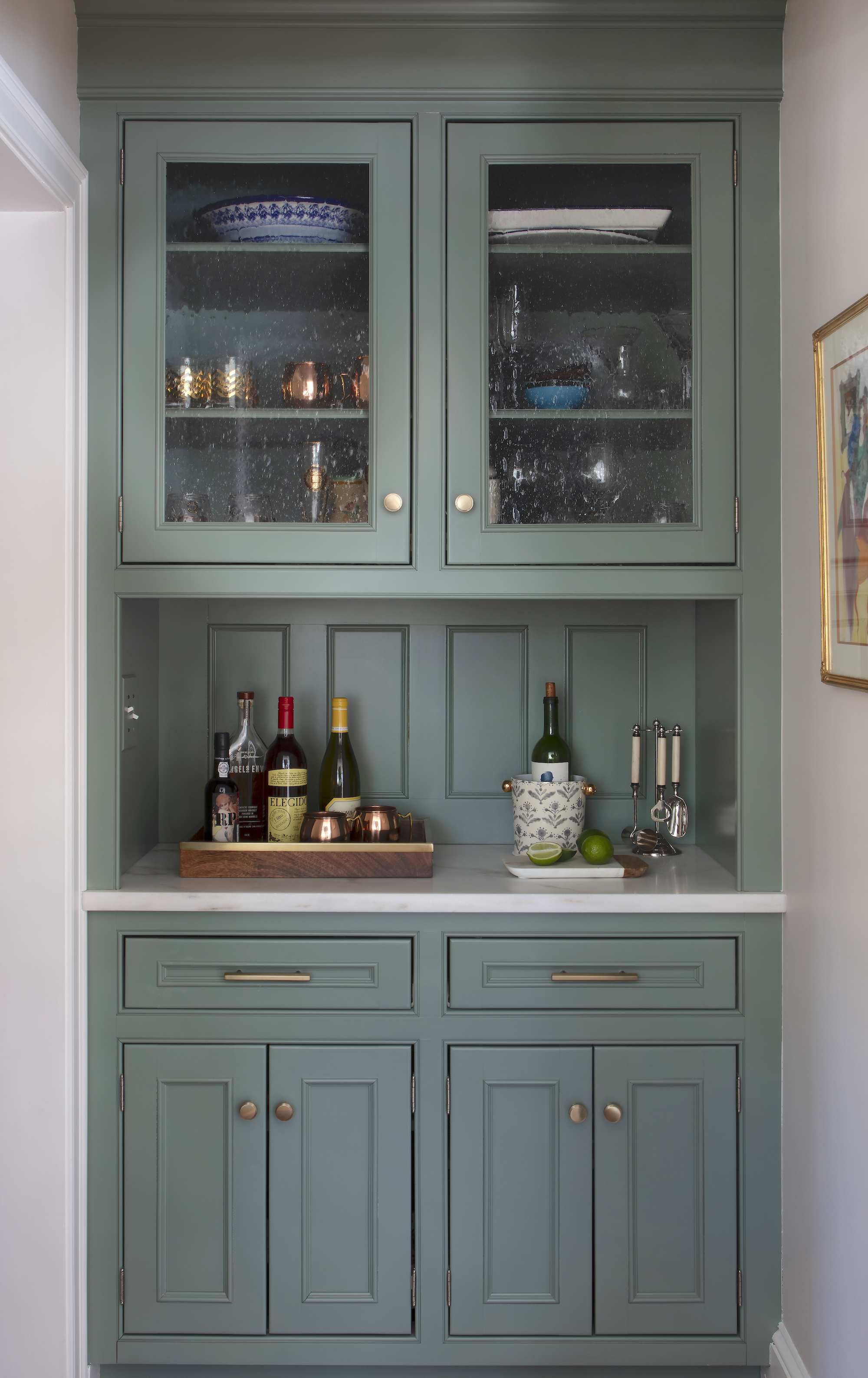
The butlers pantry cabinetry itself was fine, except for the granite top. So we replaced it with Danby and painted the cabinetry this gorgeous green color, Benjamin Moore Garden Oasis. We had planned to replace the glass with brass mesh grilles, but turns out it requires new doors because of the way these were constructed — so for now the glass was left alone.

I love this angle — the lighting all works together so beautifully and is a great mix of traditional and modern. The runner is actually from my house, but you can find similar ones on Etsy (where I got this one).

SHOP THE POST:
**Photos by Sarah Winchester Studios.



link for the clock above the butler pantry?
Simply beautiful kitchen. Your work is timeless. Would you please share the wall color; it is a lovely neutral.
Ditto to ALL of the comments below. gorgeous. Please share the hardware! It is perfect complement to the kitchen!
This is just gorgeous! Another beautiful project, love your work.
Question: what are your thoughts on painting cabinets? I have an enormous kitchen but it’s super dated (looks like the “before” here) and I’m not sure a full scale reno is in our budget right now. I’ve heard that painting cabinets isn’t really great and that the paint often chips and peels rather quickly. What’s your thoughts/experience?
I noticed there were no outlets in all that beautiful tile and on the island. I love that clean look!! Are the outlets hidden under the cabinet bottoms?? Are there outlets on the island? I am going to redo my tile and would love to know how you hide the outlets because that kitchen is designed so well.
Gorgeous kitchen!! Where’s the gold tap from please? Can anything similar be found in UK?
[…] Вас также ждет хоум тур в пляжном стиле в блоге https://www.cocokelley.comideaway/, горшки для цветов из глины от автора блога https://fallfordiy.com, переделка кухни от автора блога https://www.elementsofstyleblog.com […]
Dream-fricking-kitchen. This is so, so good!
Beautiful! Do you mind sharing the island dimensions — that’s the exact island seating arrangement I’m looking to do.
Beautiful kitchen redo. Did you remove all of the recessed lighting? If so, your thoughts on recessed lighting? Thanks
It came out beautiful! Love the green on that butler’s pantry – such a pretty shade!
http://www.erinwalshdesign.com
Beautiful! I’ve preordered your book and can’t wait to get my paws on it!
Maybe I missed this in the post, but was the dishwasher moved as well?
Not quite sure why the disparaging remark about the original slate floors. But, you know, I live rural America, and we don’t get the important memos about what is on trend for kitchen flooring all that often. I have slate floors in my current and former kitchens and love the durability, look and how they hide the dirt fabulously, unlike the requisite rugs (seriously?) you seem to have in all your featured kitchens.
This is stunning, Erin! Would you mind sharing the cabinet paint colors? Congratulations on your new book coming out! Can’t wait to read it!
Who makes the utensil crock in the photos? Farmhouse pottery?
Target!
Beautiful! I love it. And I just got the same drum pendant for over my dining room— so I’m feeling very vindicated! It’s even prettier in real life, I think!
I preordered your new book, can’t wait to read it!
Erin, I was wondering if you could share the paint color on the island. Thank you for sharing the sources on your beautiful work. It is very gracious of you.
Thank you,
Deb
Beautiful! So classic, will never tire of it. Reminds me of a 1941 kitchen cottage make over for myself from a few years ago. I like the garden green as a little departure from the rest of the white. Looks like there’s a microwave in lower cabinets? I did that once to save valuable counter space, but it, for me, proved to be a an impractical decision- hard to see, use, etc. just something to consider for future projects.
Love your blog and your work!
We are moving into a new house in Newton/Waban. The existing kitchen is great from a layout perspective but needs some updating of the countertops in particular. Do you have a vendor that you like for just templating and putting down new countertops? I’m not sure who to go to for that since it’s not a full job. Thanks for any tips!
Love the garden oasis Benjamin Moore paint color for the cabinets. The gold fixtures are perfect. Where do you get your kitchen cabinets locally?
Yes! Would love to know local cabinetry source as I’m in the market …
You. Are. Incredible.
Erin, what a gracious designer you are.
I mean, really. To humbly share your talent, design scope & sources? Go you, but we are the benefactors. I hope I may speak on many of your readerships behalf? It is not lost on us to realize you open your files and expertise when posting a project such as this. To funnel ideas, photos, products and guides is just amazing and helpful.
I support any cent you ever get from product line, books etc., because Lady, you’ve earned it. Takes a super self-possessed and secure designer to trust readership and blog world with personal imprint-thanks for your all the years of posts, sources, education and design help for we design-hopefuls and students of how to be our own home interior gurus.
Kindly,
Dana S.
Minneapolis
My dream kitchen!! I love this so much!!
this is my DREAM kitchen – it’s so beautiful!
You did a lovely job! Is that a plaster vent hood? Did you design it and have it framed out and if so, is that something that the contractors crew can typically do?
Oh my god I LOVE it. It’s exactly my style, and that butler’s pantry color! It’s perfect.
Beautiful job! I actually have the same Crate&Barrel chandelier in my dining room! I had looked for years for a brass mid century (we have danish MCM furniture) chandelier but they were in the thousands and my husband was not in favor of blowing a bunch of money on a light fixture. I found that one, and we both absolutely love it, and it was so affordable! I am definitely pinning this post for our upcoming kitchen remodel!
What is the wall color?
Love how you worked the new wood floor- very clever!
I love that wall clock. What is the source?
its from target … this is the name Raised Marker 16″ Wall Clock White/Brass – Project 62… about 25 dollars)))
Not sure the client bought it herself!
Just lovely. The old kitchen wasn’t bad ( I agree about the need to move the sink), but the new one was beautiful. Hopefully the old cabinets were donated to something like Habitat for Humanity…
What a lovely kitchen. Your work is so classic and timeless – nice job. I don’t know if this would be interesting to the rest of your readers, but I’d love to read a post one day about how you find clients/they find you. I’m sure it’s shifted over the years now that you’ve published a book, but is it referrals from other clients, blog/book readers, local outbound marketing, etc .? I work in marketing so I find that side of business interesting. Thanks!
Gorgeous kitchen! Could you share the tile source please? We are just about to renovate our kitchen and I’ve been looking for a tile in that shade of grey. Thank you so much!
We sourced it through Tiles Plus More in Natick, MA
Would you mind giving us all a reality check on cost? On HGTV, this kitchen would be $20-$30K tops, which we know is pure fiction. I’m guessing it’s actually closer to $100K or more. Am I in the ballpark?
Your guess is closer. HGTV is complete fiction.
love it! Can you share the hardware source? Thanks!
GORGEOUS!!!
And -yes please share the table source- is it one from your line?
It’s from Ethan Allen!
Beautiful kitchen! Can you share where the table came from? Thanks.
Ethan Allen!
Hi Erin – stunning work, per usual! Do you mind sharing the dining area wall color? It’s beautiful.
Yes, please share the wall color and trim color—lovely!