An Unexpected Color Pairing
While the interior design business is most often an excellent way to show off your creativity and unique concepts for a space, a lot of times people play it safe. And I don’t blame them – it’s a lot of money to decorate a room, and it’s scary to make choices that seems really bold and unique. So most of the time, we play things on the more subdued side. The fun part of having a blog though, is being able to have fun making up pretend clients who want to do the bold/ fun stuff! :). I saw these cool mirrors, that double as art, and it got me thinking about a bedroom steeped in tradition with fun modern accents in the unexpected pairing of french blue and golden yellow. I picture this client being British maybe? A confident woman in her 30s perhaps? This would be in a city condo with great historic bones and tall windows (framed with ivory silk dupioni drapes!)
Anyways, a fun exercise for me- and perhaps gets you thinking about making bolder choices in your own home!
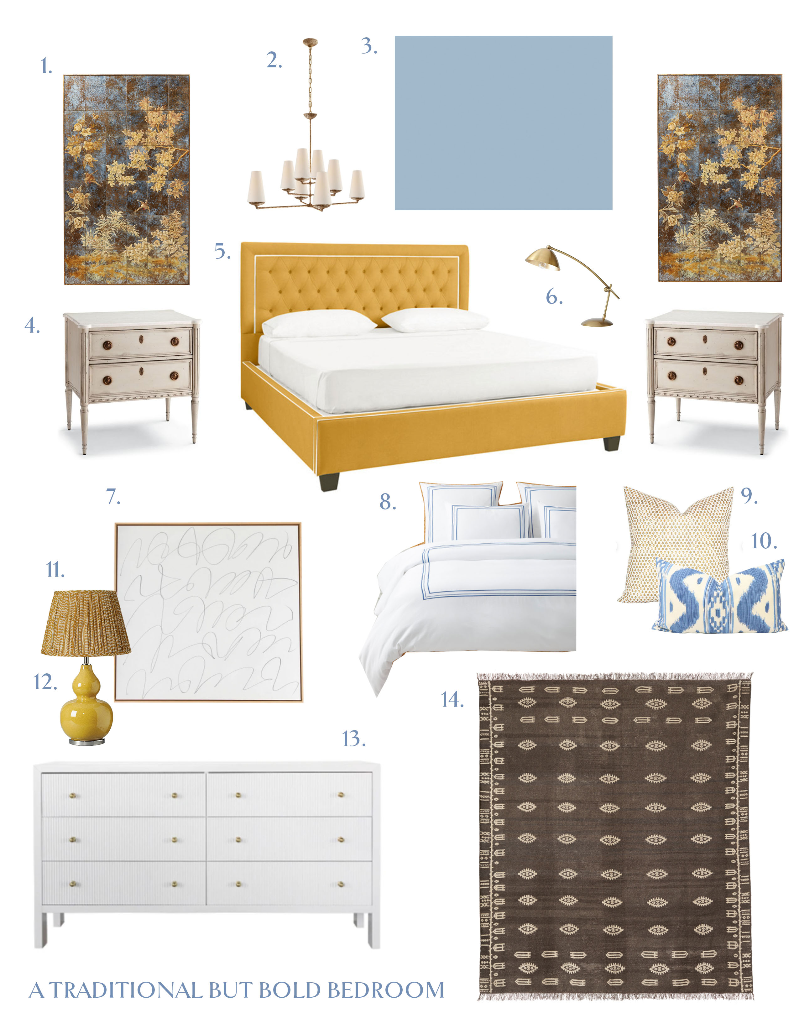
- Patterned mirrors//2. Ceiling light // 3. Wall color- F&B Lulworth Blue // 4. Nightstands // 5. Tufted bed// 6. Bedside lamps // 7. Art // 8. Bedding // 9. Pillows // 10. Lumbar pillow // 11. Lampshade // 12. Lamp // 13. Reeded dresser (check out the detail!) // 14. Rug
This color palette reminds me to tell you, I will be shooting and sharing Emma’s nursery soon – I’m just waiting on one last piece of art! As soon as that’s here I’ll get it done!
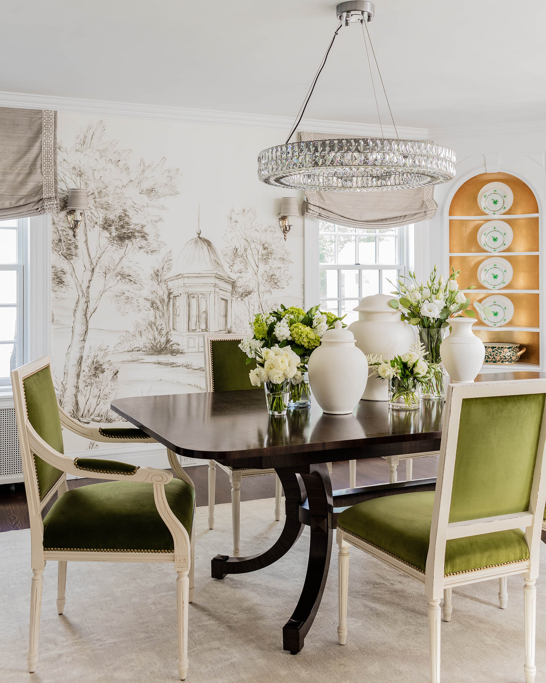

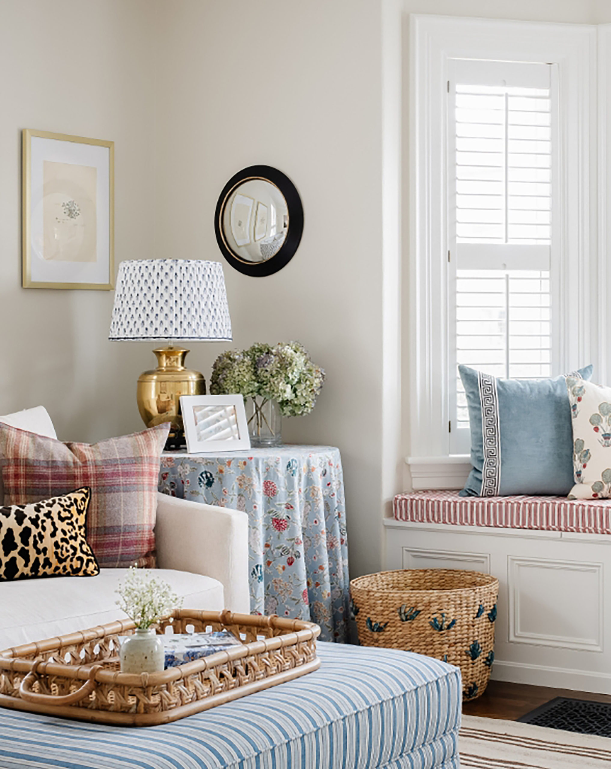

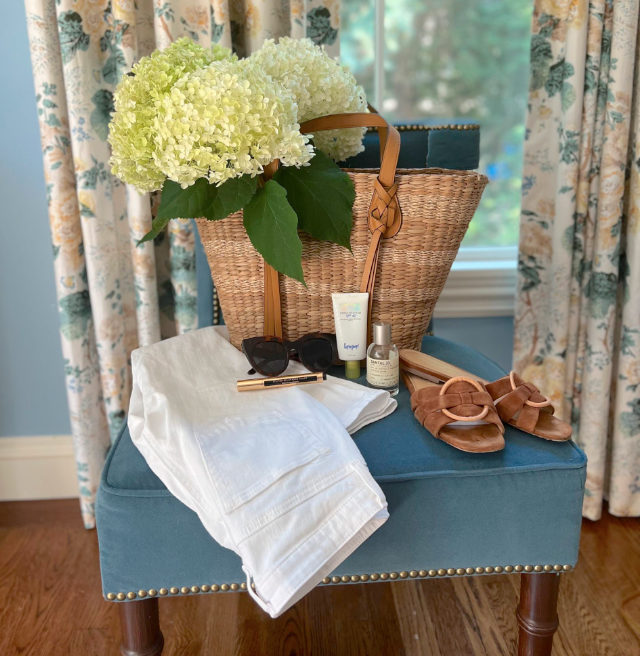
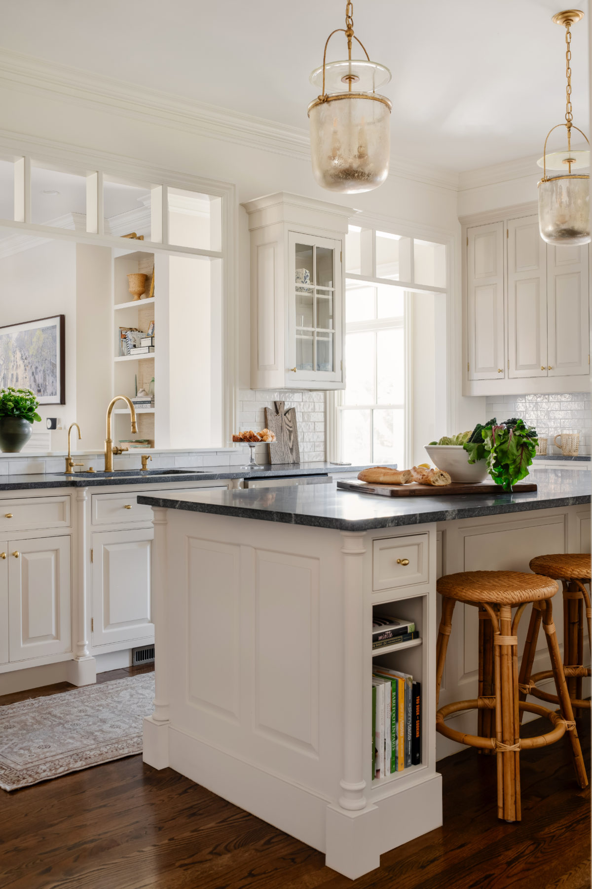
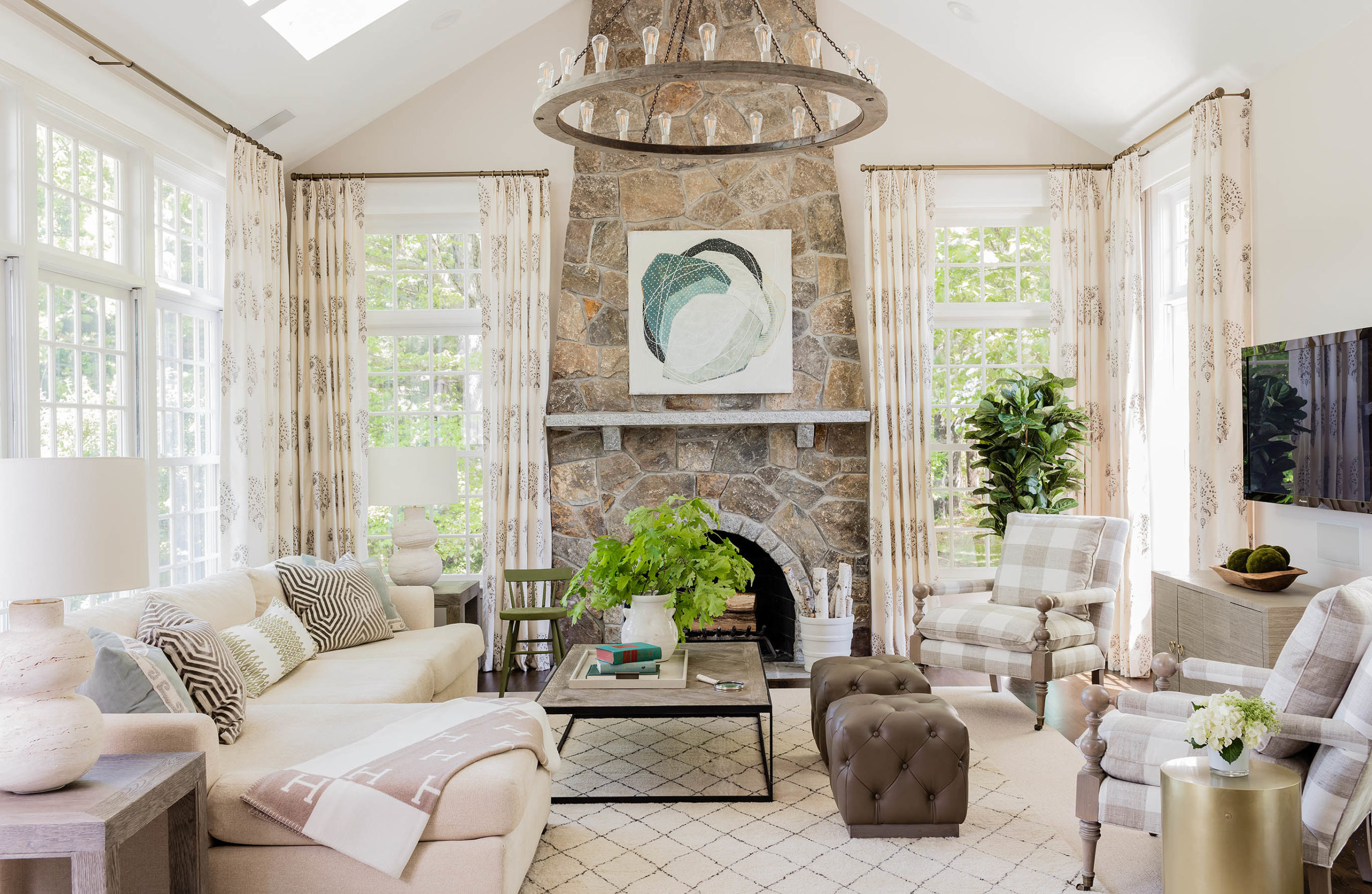
A nice switch if the golden yellow Is a bit too yellow for some? I think camel is super yummy with porcelain blue. Also camel beige is striking with pale pink in a more feminine design scheme.
I saw a wool camel coat paired with a soft porcelain blue trouser the other day and it was absolutely smashing. You can play around to get just the right coolness or warmth from the camel and same for the blue-throw in crisp creamy mouldings and silk draperies and voila!
~Dana, Minneapolis MN
Like your other reader, the mustard gold would drive me to distraction having lived through the “Harvest Gold” and avocado green era once before. Like all of the others, I adore the mirrors you found. I wouldn’t want double of that. I’m not big on “matchy matchy.” Here’s an interesting tidbit (I thought.) I was re-watching “Versailles” on Netflix, and the blue(s) and gold metallic into mustard seems to predominant. Also, I noticed, a dearth of carpets–an occasional Oriental, but this was a period where Versailles was being constructed so no Aubusson, etc….yet. So when I went back to your selections, there is a whiff of France about that room. When I lived in London, every fall the Vogue or Tatler or Queen’s magazines would have an ensemble in mustard yellow and gray. It is definitely a British-French thing, not seen often in this country. I enjoyed viewing this.
Totally agree with you on the mustard…the moment I saw the mood board I thought typical French colour pairing. They love their blues, yellows and reds. Even the night stands echo French style. So to me it’s a modern twist on French decor.
Erin, seriously, you have the BEST taste. I’m probably not this bold, but it’s fun to imagine.
Stunning & sophisticated. Coveting the mirrors!
Dear Erin,
I love this! I am one to always play it safe, but for a young lady, my daughter, who will be living at home for a couple of years now, fun and bold is where it’s at but still traditional. How could one tweak this a bit for a young soon to be college girl? She’s half British (and half vegetarian according to her 7 year old self, HA!) xx
I was JUST the other day noticing that most houses today have white or gray walls with blue accents, and remembering that growing up in the 90s, most of my friends houses (and mine) were yellow and blue. Lots of yellow walls and blue fabrics. Bring it back! Very cheery for a family home.
I’m crying over those mirrors, wish I could find some dupes. They are gorgeous. I am poor.
***Dear Erin***
First of all thanks for your blog, your insta and all the inspiration you give!
I am moving very soon (exciting!) and kind of have a situation: The living / dining area is combined and quite big. So I’d need two carpets, one under the dining table, one under the coach in the living room area. Do you have any do’s and don’s when placing / combining two carpets in one room?
Cheers from Zurich :)
***Celine***
I love it! Yellow is my favorite color, but it’s hard to work into decor. You nailed it.
Those “patterned mirrors” SPEAK to me!!! franki
My living room has this color combo, love it!!
Those mirrors, wow! And love the yellow headboard.
I would love to know what colors would work for an exterior application. I saw an image recently of a yellow house with blue door. The door color looked very similar to the one you posted here.
I would enjoy a blog post about unexpected color combinations for exterior applications. I live in the Boston ‘burbs where almost every older house in my town is being torn down and replaced by a McMansion that is painted either builder’s grey or builder’s beige. SO boring.
Sign me up for all of the above! Love the color combo.
Blue and yellow, and all its variations, is one of my most favorite color combinations. I would totally have this room!
I’d love those gorgeous mirrors if they were the only yellow element in the room (they are the only yellow pieces in the Oka ad). I grew up with a kitchen full of screeching Harvest Gold appliances, so I’m a bit jaded by anything in that color range. You selected beautiful pieces to round out the bedroom. Brava. A resounding YES to the silk dupioni drapes!