Color Crush: Aubergine + Light Blue
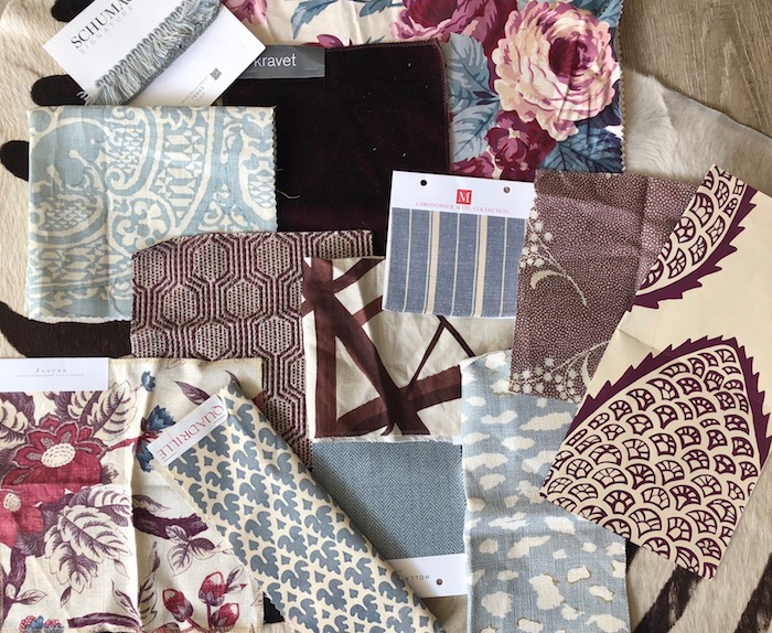
These two colors are seemingly disparate, but a fantastic and unique combination to use in a space (and one I especially love this time of year). I personally am not a purple girl, it’s the color I use least I’d guess, but in this case I do quite enjoy it! I prefer a deep plummy, eggplant tone with undercurrents of red in it paired with a light blue that has a smidge of green in it (think robin’s egg). This room below by Jeffrey Bilhuber is the exact right tones:
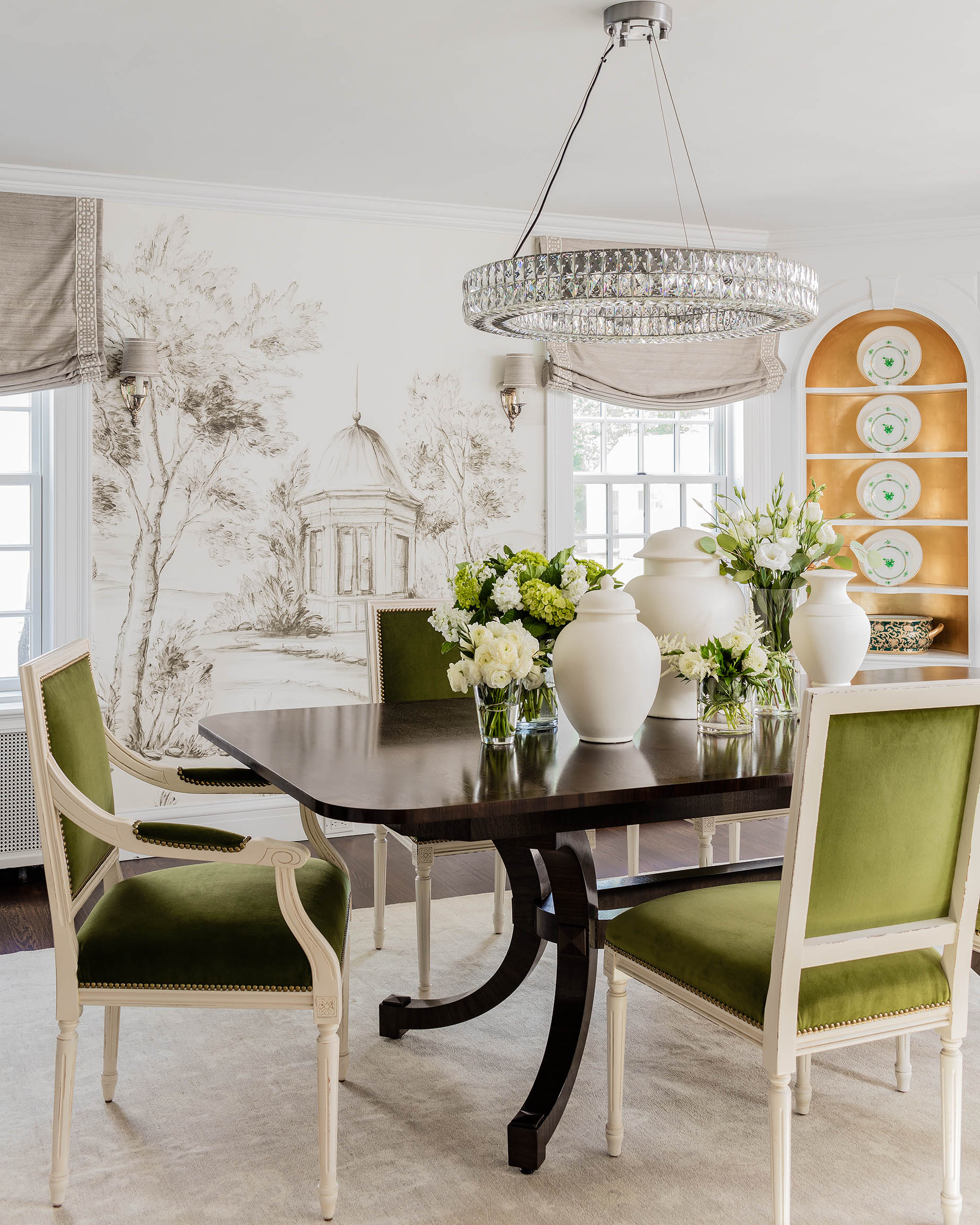
Too cool or bright of a purple can look really teeny-bopper and harsh, while too cool a blue can look too sweet. So you have to get these tones just right for this combination to work. You can even try to go super dark on the aubergine and in a high gloss paint finish, like the room below, to make it extra dramatic and glamorous.
Here are some simple suggestions on how to pair these two colors together in various places int he home! (To be honest, this post was inspired by my body wash- below- while in the shower last night!)
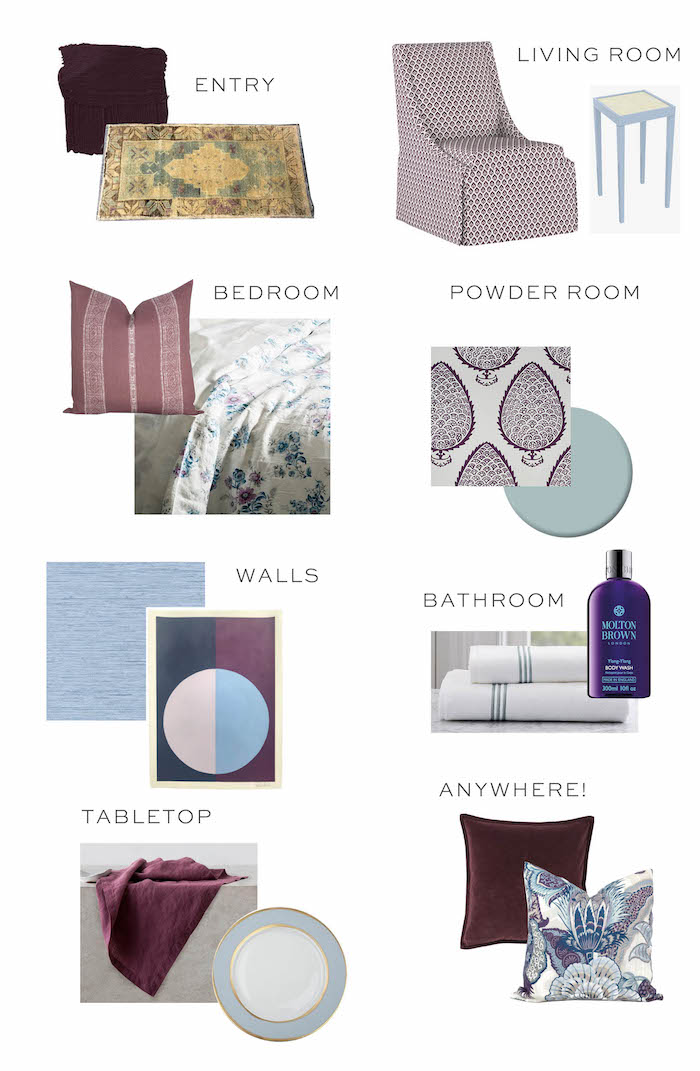
Entry: paint (maybe door color?) // rug
Living Room: chair // side table
Powder Room: wallpaper // paint (vanity or trim?)
Walls: grasscloth // art
Bathroom: body wash (love this for fall- smells so good) // towels
Anywhere: velvet pillow // print pillow
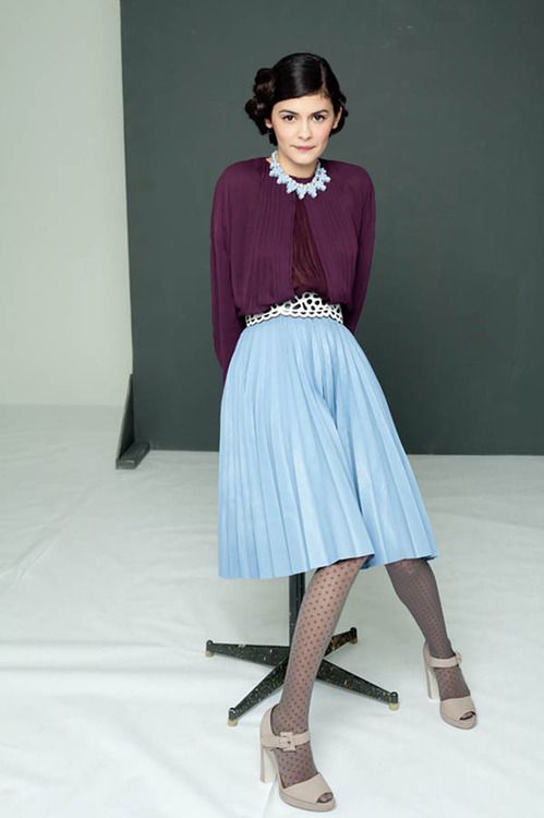
Oh and P.S., this combo work in fashion too :)

This is one of my favorite combinations, especially in the spring. I have a dark plum coat and I like it with my light blue scarf. I also have a light blue sweater with dark plum pants. Looks great with gold jewelry. These colors also work well with navy and light gray. I’m a big fan of dark and pastel colors. Oranges are not for me.
I love it!
Just got aubergine mohair pillow…eeek…luv that color!! franki
Love this post, and seeing how your design-mind works. Here’s to many more similar ones inspired by anything from champagne bottles to shampoo bottles! Although have my doubts that anyone could work Verve Champagne orangey-yellow label and dark green bottle? ….
Obsessed with this combo! So good for this time of year in Boston!
I’m not a purple girl either but this is lovely!
x0x0 caro https://thecarolove.com/
The link for your body wash directs me to Pottery Barn.
So honored to have my original artwork included in your blogpost. The Variation on a Circle: Lilac and Sky piece is acrylic on heavyweight Arches paper, 22×30, available on Charish.com. Thanks for sharing!
Yes, it’s linked in the post.