
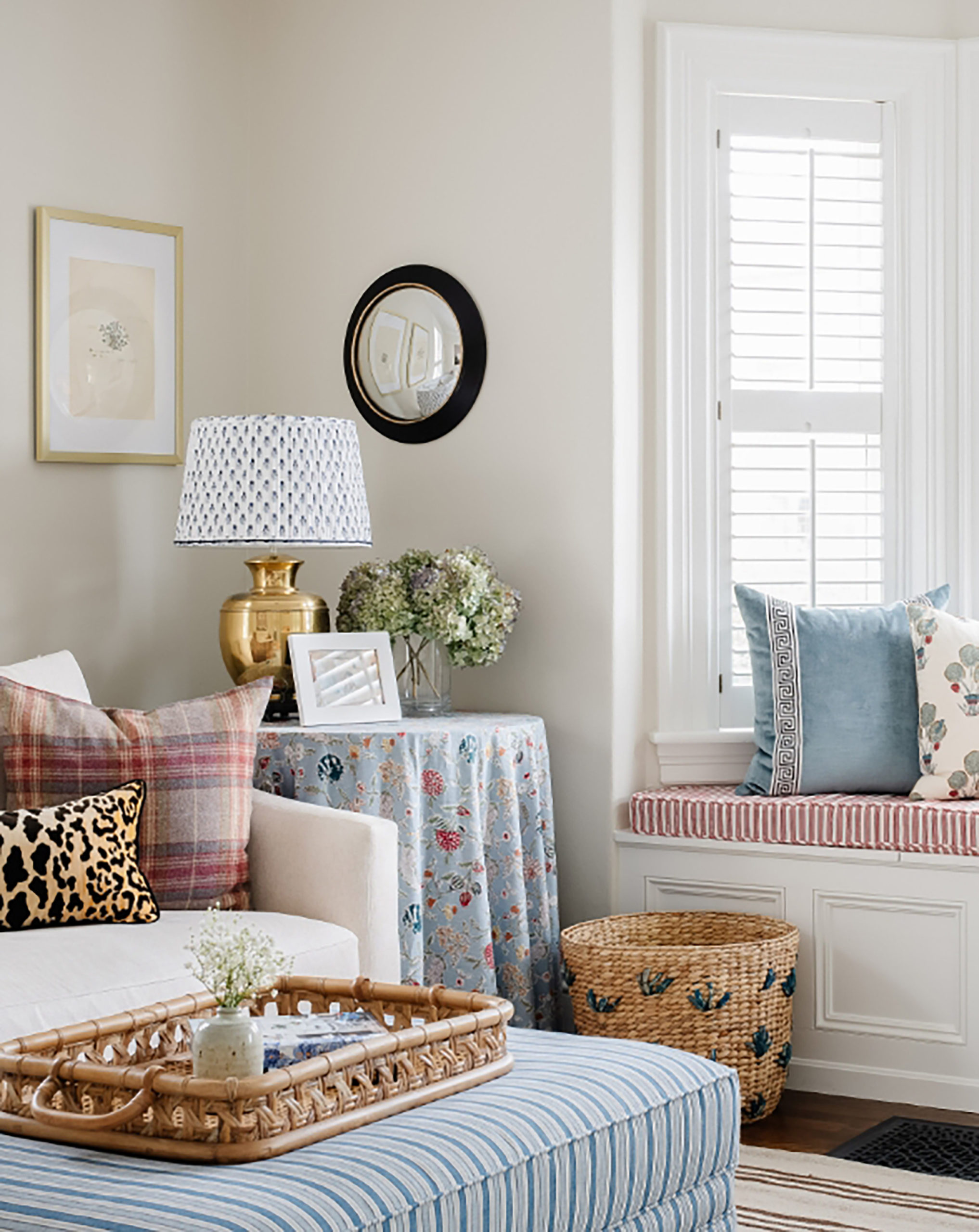
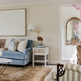
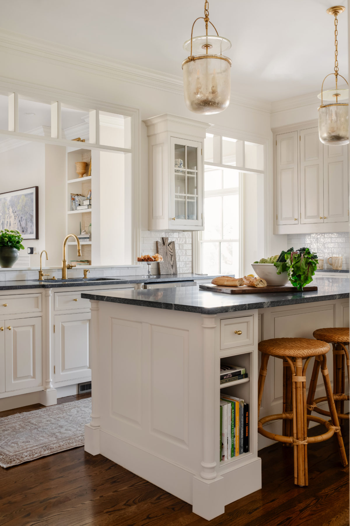
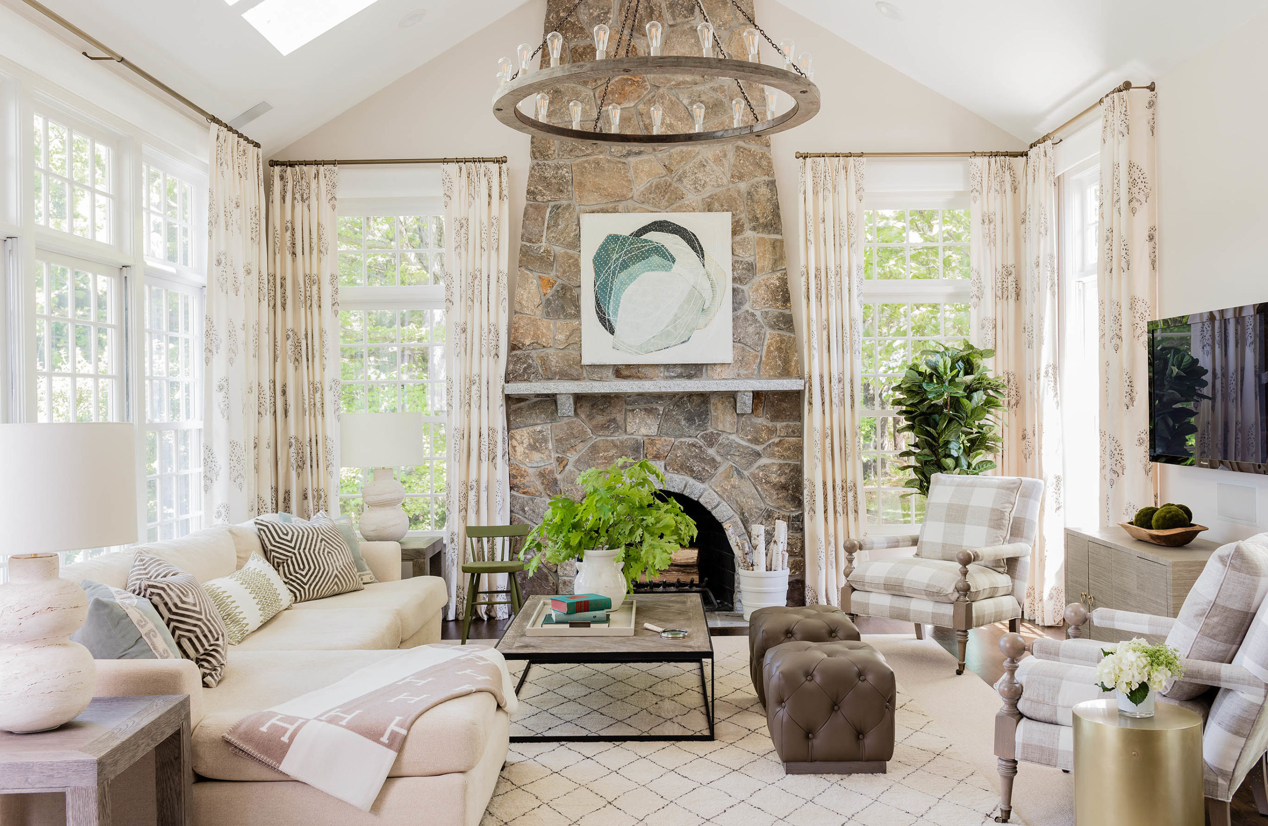
Frequently Requested Paint Colors
There was an interesting debate recently on my Instagram when I spoke about being torn about sharing paint colors. There were a lot of interesting points from various designers and readers (and some snark) and I think that there is a case to be argued that sharing a paint color is ok, as it’s just one piece of a very layered and complicated puzzle that is a full room design. Plus, colors look VASTLY different in everyone’s homes so what looks one way in my house may look VERY different in your house (or even room to room as the light direction changes). People should use imagery as a reference in picking colors, not necessarily the exact color itself. So I’ve decided that paint colors are fair game, but other sources (unless in my own house, which I will happily share) are not. Our clients pay us good money to source items for them and giving it away does not help to maintain our value as a business. And this is A BUSINESS folks, not a fun hobby.
That said, today I’m sharing some of my most requested paint colors from images I’ve posted. I hope you find this helpful.

Browse:

I very much appreciate your sharing your paint colors. I am someone who would never be able to afford an interior designer, so having a direction to go in when choosing a paint color is very helpful for me. There are literally thousands of choices, which is overwhelming. I want my house to be beautiful, too, and this helps me to avoid expensive and time-consuming mistakes. Thanks for your kindness to all of us!
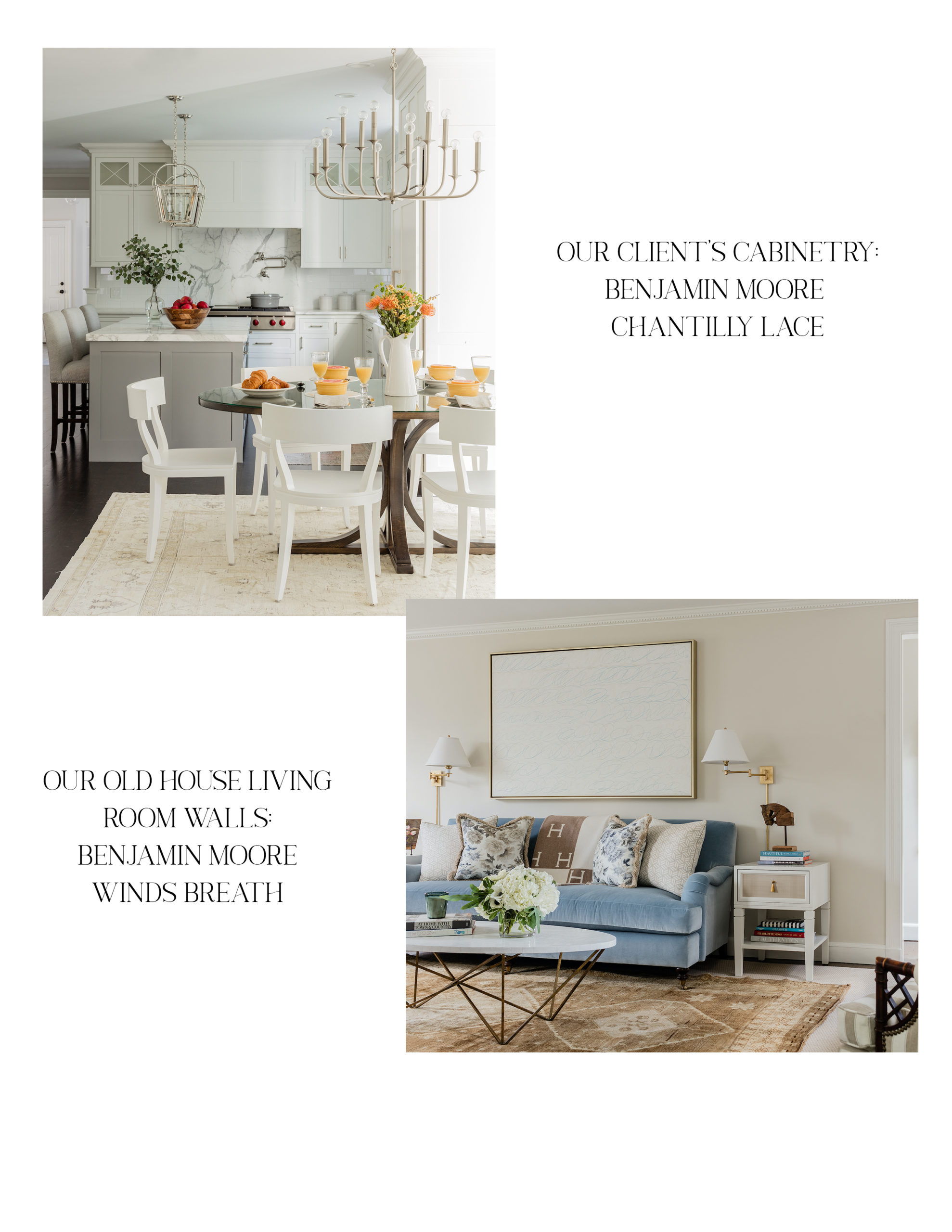
Could you please tell me where to find the chandelier in the 2nd to last photo (where paint colour is chantilly lace)? Thank you SO much!
Lmao
I wonder if there is any other business / set of business owners that is asked to give away the tools of the trade to those that want to imitate their work in the way that interior designers are? And I ask this sincerely, and as someone who decorates her house herself and can’t afford a designer and reads and tries avidly to learn from them. The sense of entitlement to designers’ hard won work, education, and experience can be overwhelming though and so I really appreciated you bringing it up on Insta. And my first question is sincere! I mean, my son is about to have craniofacial surgery again and it’s not like I’m going to be leaning over the surgeon’s shoulder asking what kind of blade he uses and what suture he recommends so I can do it myself at home!
I spent 5 years writing a book and it’s given away for free in libraries which are universally considered a public good. Before that I worked for a law firm that had all of its form of organizational documents for corporations and LLCs available for free online (in the hope that people would be impressed or intimidated enough they’d hire us – very similar to why designers post their work but FAR more work ‘given’ away than a paint color name). My primary care doctor friends spend tens of hours every week responding to their patients emails through the provider’s patient portal, which is not work they get paid for (Medicare and most provider comp is structured to pay for visits, but not for any outside communication). So yeah. Pretty much all of us feel entitled to the ‘free’ work of others, and plenty of jobs require a ton of uncompensated work. Certainly creative work is horribly de-valued (the amount of work graphic designers I know are asked to do as ‘a favor’ is pretty gross), but unless you’ve never gone to a library or logged into someone else’s Netflix account, it’s tough to get annoyed when someone dares to politely ask a designer for a paint color on IG… which likeliest won’t work in their room anyway because of how crazy different paint looks in different places. Just seems like a tempest in a teapot.
Paint colors are helpful to share – but as you indicate, they’re really just a jumping off point because they appear so different in different spaces! The one thing I DO wish designers would more regularly share are wallpaper and fabric sources. I’ll see a wallpaper or fabric on IG or elsewhere, designer will not have tagged the manufacturer (often there are many, many comments asking for source), and then I’ll spend 30 minutes tracking it down. Annoying. The thing is, because the internet exists, I can ALWAYS (unless it’s like, a custom blocked thing from India) eventually find the wallpaper or fabric – it’s a clear pattern, unlike, say, paint. It’s hard to understand what the big deal is about sharing these up front, but designers seem crazy reluctant to. Even if it’s like – Cole and Sons or Schumacher, and a print that’s been around for (very literally) 100 years. It’s not as though the designer ‘discovered’ this, or worked super hard to track it down, or that it doesn’t appear in inspirational images in hundreds of other designer accounts tagged? Often I’ll respond to comments and be like, “Yeah, this is a F&B wallpaper,” or “This is custom Gracie, don’t even bother looking but here’s some dupes.” And I’m a design amateur? I just don’t get the fuss. Interestingly, furniture, especially fancy custom stuff, is far more tagged. I understand if there’s something super unique not wanting to share a source, but with most fabrics/wallpapers that get source requests there just isn’t. In fact, some of the coolest wallpapers REQUIRE a designer to get – especially if their international. Wouldn’t that potentially increase designer business? Is it just that clients want to think they have special snowflake rooms even if they’re using prints that are crazy famous? No comprendo.
Thank you for sharing! I’m always curious when colors are listed if that’s the *actual* paint, or if it was color-matched (e.g., “I took a F&B paint sample to Lowe’s and had them mix the color.”). I would love your take on what you recommend/your experience on matching vs going with the original, especially when *not* Farrow & Ball, as I’ve heard they just have such unique pigmentation. I don’t know if that’s too boring/obvious/something trades-specific? But thank you again for providing us with this inspiration!
Thanks for sharing. Understand your reservations about sharing client info.
Thank you for sharing paint colors . I hope you don’t experience any backlash from it .
Winds Breath is slightly grayer than Edgecomb correct? I was going to paint my hallway Edgecomb but now I am leaning more towards Winds Breath. Need to buy a sample pint, just trying to figure out which one to try first.
Seems like most designers share paint colors, it’s been so helpful doing my own home. it’s so so hard to walk into a BM store and even know where to start! (Ps, i’ve referred to your first book many times for this!) Just recently I was trying to find a good blue for a trim, and must have spent $150 just on samples, then I responded to Nicola Harding’s IG post and asked what she used, she gladly shared, and was far superior to any of my samples. (PS I have hired a designer before, and it was incredibly useful, but just paining a bedroom myself doesn’t seem necessary for that task.) Thanks for sharing, I have used your blog so, so many times over the years for product recs.
I highly recommend using a company called Samplize. You can order a large stick on sheet for about $6. Order online, adhere to your wall to see how the color actually looks in your room throughout the day. Peels off easily without any residue. They carry all the major paint brands. Much less expensive and much less mess. Game changer! samplize.com
Thank you for sharing this info.
Thank you for sharing these paint colors. I agree with you — I could buy all of the same pieces of furniture you used in a room, even all the same paint colors, but the way I put it together and the unique architecture of each room means I’ll never be able to make a room look like an EGD room. What’s the saying? They can copy your recipe, but the sauce won’t taste the same! Thanks!!
Erin, so kind of you to share your expertise. A great reference point for choosing paint colors which is a daunting task in and of itself.
Thank you! So helpful. We just built a house and I did all Simply White for trim and kitchen cabinets because of your posts. I am a long retired designer and love getting the “current” input you provide. Side story. We also have a house in Maine on the water facing east. What a pain it was to figure out what green to paint the main floor. Even the old standby BM Wyeth Blue looked horrible. I eventually went with a sort of mint-ish green that is so twee in daylight but works at night, I hate it. I really want to repaint since it’s been eight years, so I think I’ll try Winds Breath. Water reflection is so tricky. Thank you for sharing so generously.
If you have not seen SNL’s Farrow & Ball sketch take a few minutes to give yourself a chuckle :) It’s years old by this point but I still remember and laugh about it. https://www.youtube.com/watch?v=qtJRJVdUFx4
I cosign this comment. One of my fave sketches!
Love this, thank you for sharing but agree with others you certainly aren’t obligated to! Can’t understand how people got snarky about this. I’m a lawyer and I don’t share my contract language that I’ve drafted for free (doesn’t stop people from asking – “do you just have a template you can send me?”).
Definitely agree the exact paint colors won’t work in every space. We have 2 bedrooms in our house painted the same color (Gray Owl) and they look like completely different colors. But I so appreciate the inspiration you provide.
Paint colors are so personal and vary so much in photography and various sun exposure – I can’t imagine asking for a specific color. Especially a professional whose living is made by selecting them and hunting them down. Maybe I’d the manufacturer, or maybe “hey, is that a gray or a blue?”. Getting ready to renovate/add on to our home so I love inspiration but I’ll be doing the paint leg work myself. (A designer for the rest.)
Thank you for sharing your colors! Very generous.
Thanks for sharing! Fair, I agree, because colors look so different in real life and different light — like you said. I was obsessed with Wales Gray after seeing your new living room. But in my house, it was SO blue and much darker than it appeared in your photos. So we went with Stonington Gray, which gave that light blue/green/gray. I would also 💯 plug SW Heron Plume. It looks kinda beige on the color chip but it’s the most beautiful soft white in my house.
Erin, you’re so generous in sharing this information. Thank you.
I agree, really nice of you, Erin. I am always mystified at people who insist that designers should share paint colors. You still have to do the hard work of trying it out in your own space. Things look so different in real life!