Molly’s New (Old) House: Dining Room
Back again with my plans for our dining room! This space is right off the kitchen, and is the main passageway to/from the front door, front stairs, family room and office. It’s part of the original house (built circa 1880) and is the only space that still has original windows. Also, besides the counter stools at the island, this is the main dining space, so I guess it’s kind of a hybrid breakfast nook/informal dining room.
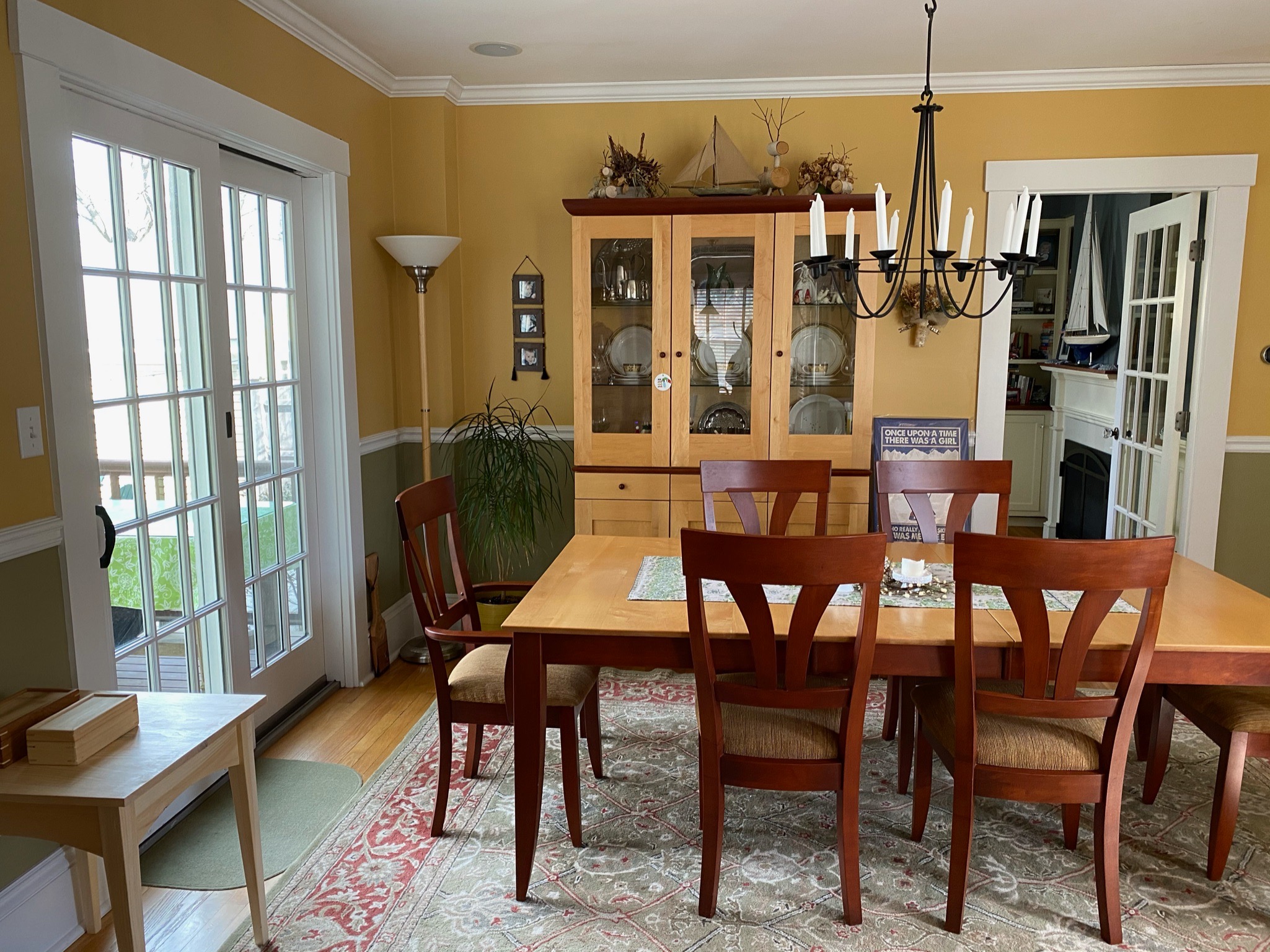
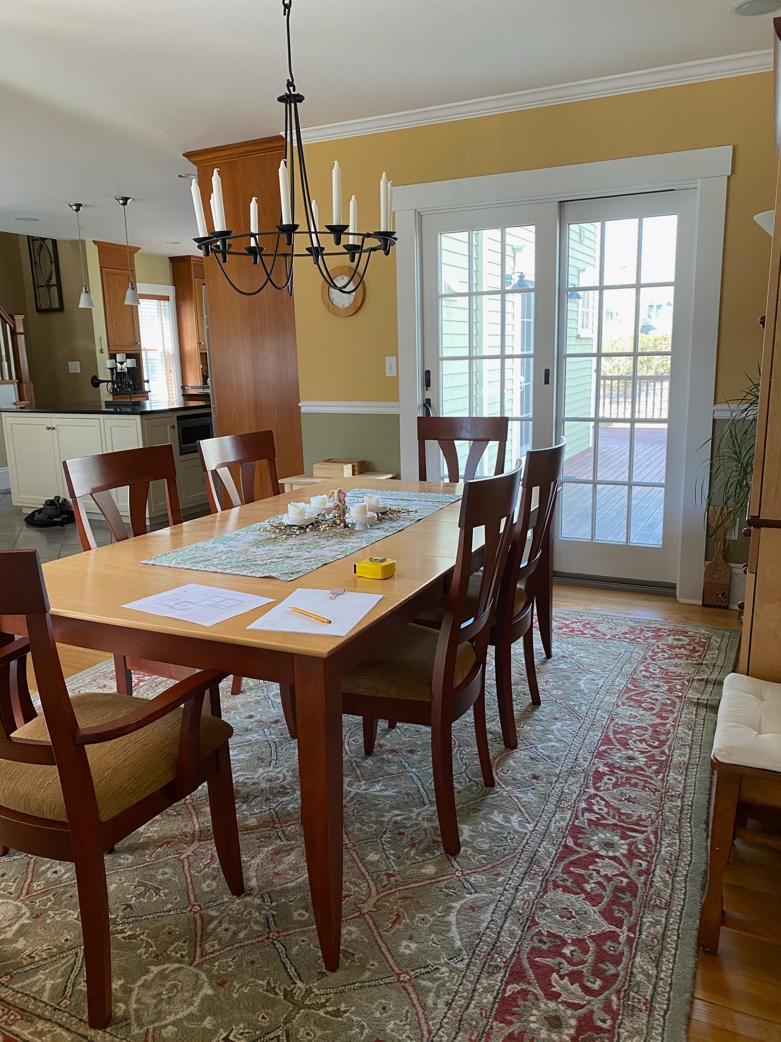
Here’s what we were working with before:

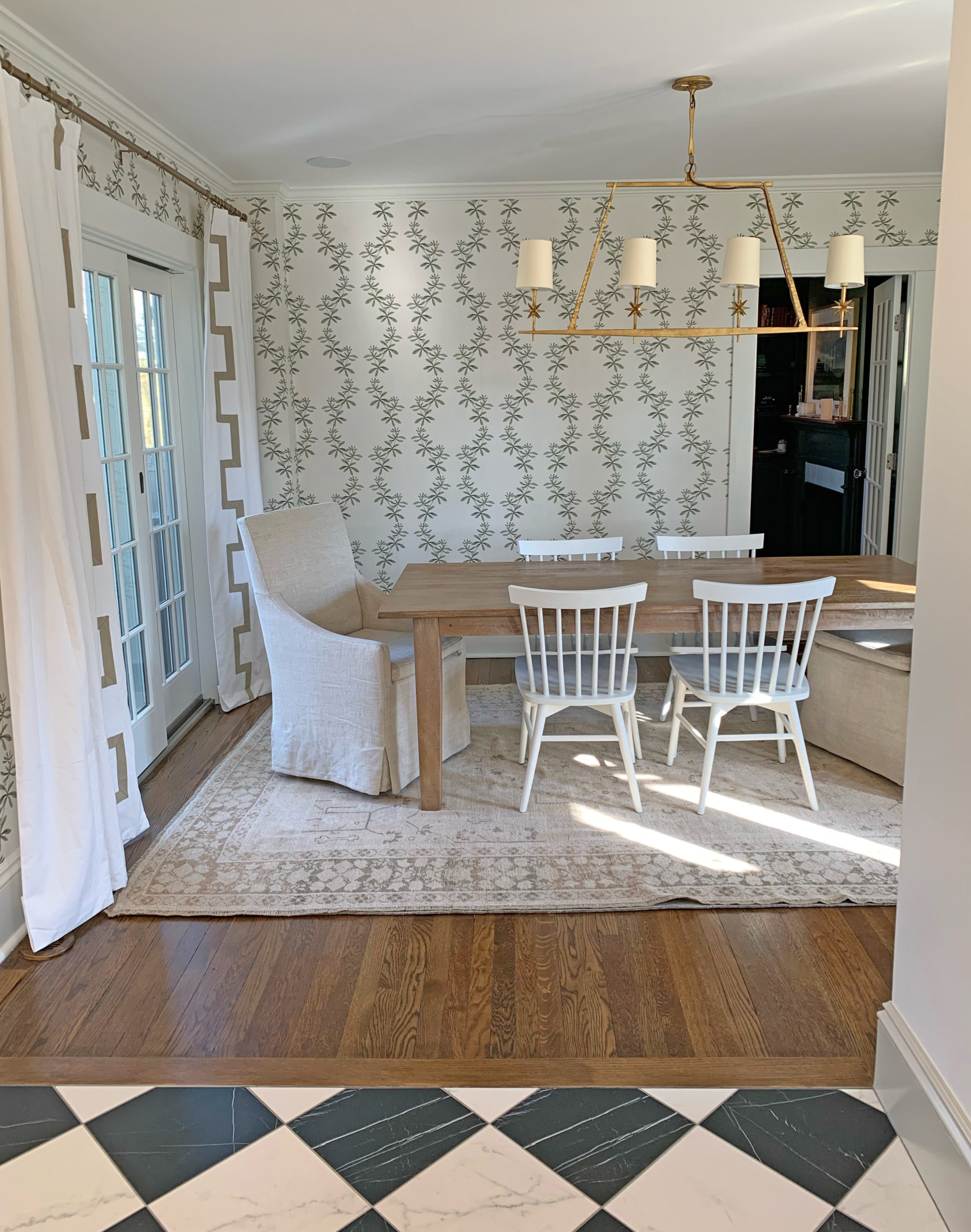
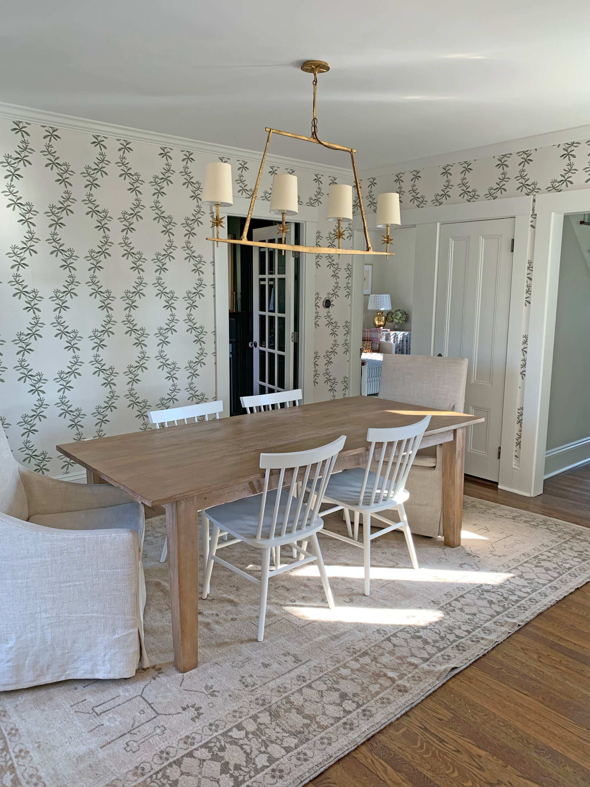
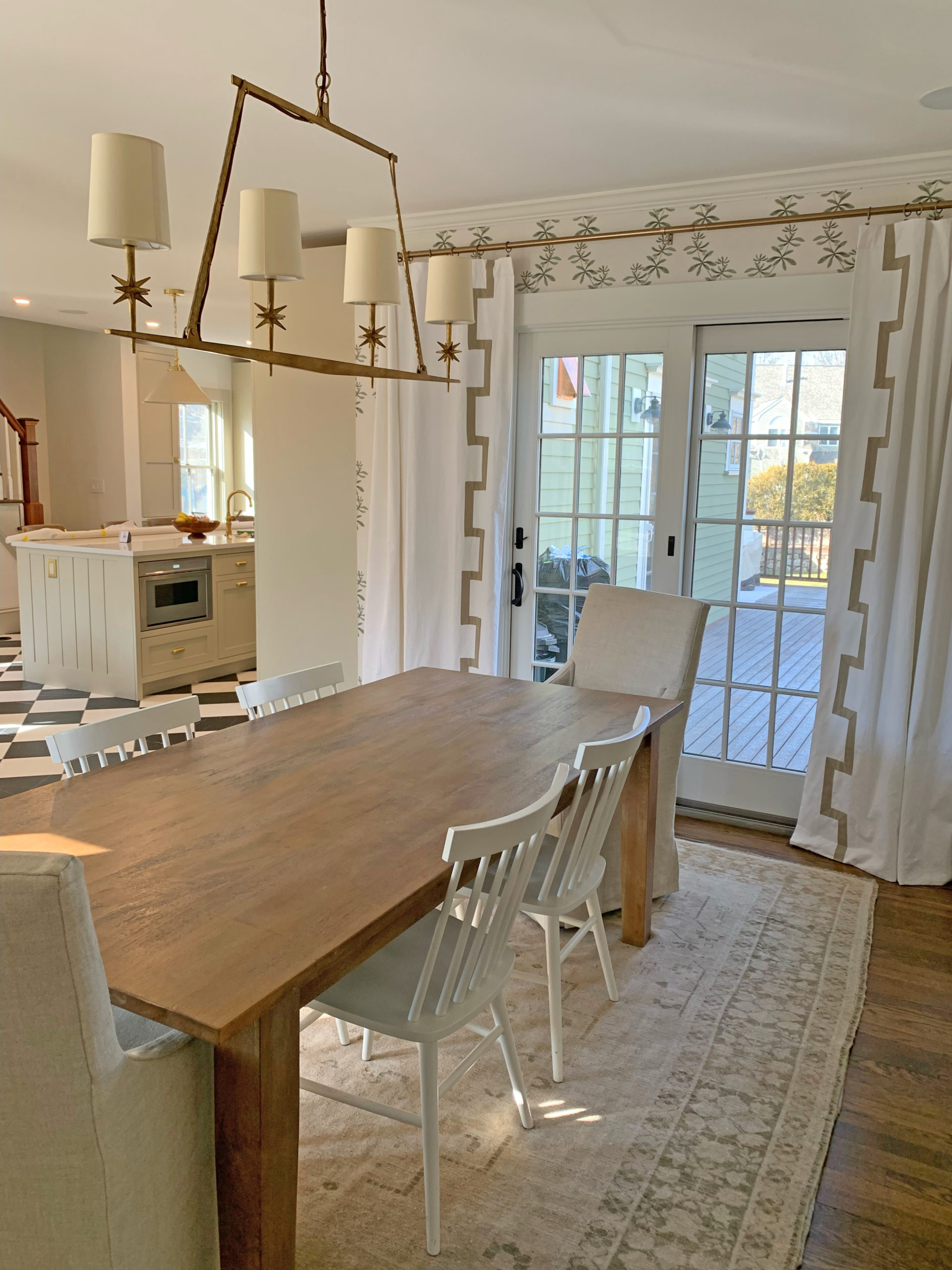
And here’s where we are now! The rug was an Etsy find – it has the perfect (in my opinion, anyway!) shades of green and beige. I haven’t pulled the trigger on art yet, as I’m really just enjoying the wallpaper for now, but I do love this Amy H. Stone piece :)
We also had new speakers installed, along with a Sonos amp, so that we can play the Encanto soundtrack on repeat in every room on the first floor. Links for everything at the bottom of this post!


Lovely updates! I’d love to see a post about the sonos amp and speakers. Are they difficult to install or something that should be hired out?
Love it – so light & bright & inviting!
i’m loving this series! thank you for sharing your home with us. xo
Wow! Stunning. Thanks for sharing!
I don’t like the two long back chairs at the head and foot of your table. They seem out of place. Darker wooden chairs all around would look much better!
What a transformation! The room went from dark and ordinary to light and exceptional. As far as art, a few landscapes with lush tones of blue and green, with highlights from other more vivid colors, would go nicely. Perhaps a small vintage portrait would complete the look. I sell art, so I know whereof I speak.
I’m also very glad to hear a designer speak about original wood windows; those made in 1880 were a quality product and lend tremendous authenticity to a home. It’s heartening to know that you will be keeping them.
Beautiful curtains, may I ask the source?
Love the curtains except the rod looks low/dark.
I absolutely love how pretty this room is given the totally reasonable price tag all things considered. It looks gorgeous in relation to the kitchen.
Wow! That looks beautiful! I’m definitely no designer, but the room looks light and airy. You must be excited to add all the little touches.
So lovely!
Beautiful! Love how the starburst shape on the mall mimics the leaves shapes on the wallpaper behind it!
Looks lovely!
The back of your wood chairs seem too low. I can picture some ladder back chairs as fitting much better. Otherwise present, clean, timeless.
Looks beautiful! How many panels did you buy for the French doors? Wondering if the panels close or you keep them open at all times. We have a sliding glass door and contemplating the same panels. Thank you!!
Love this!! I also have an old home + so appreciate seeing the before/after and how you can really transform and update the space.