New Project Reveal: A Dreamy Back Bay Bachelorette Pad
I am SO excited to show you guys this project that has been complete for a little while. It was slated to be published and then all hell broke loose and instead of waiting even longer for another publication to decide- I made the call to go right to you through the blog. :) This client was a DREAM to work with. She bought this one bedroom condo in Boston’s gorgeous Back Bay with incredible soaring ceilings, giant windows and lots of potential. The whole building had been renovated by a builder- so the kitchen and baths were redone before we came into play, but luckily they did a good job on the finishes. We wanted to take it further and replace some of the items they chose (namely all the lighting!), and because this is a one bedroom, we needed to get creative in ways to maximize storage. Let’s start the tour!
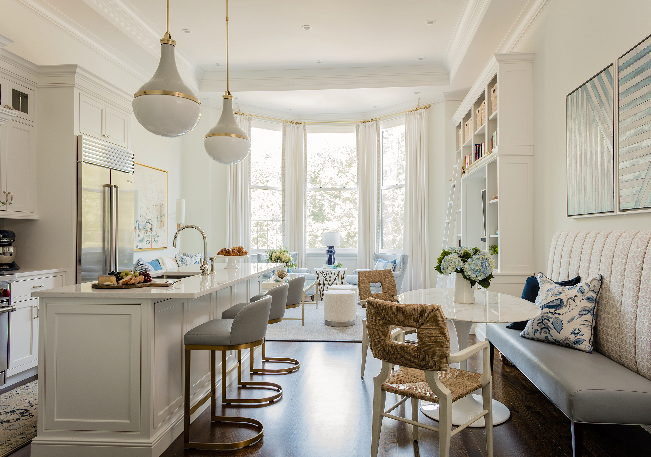
Here is the whole living area- open, bright and THOSE CEILINGS! We needed to create three zones here- kitchen, dining and living. The walls are Benjamin Moore Chantilly Lace Matte and the trim is Chantilly Lace Satin finish. We wanted to keep this room bright and clean and let the furniture and art be the star. The floor to ceiling drapes make this room. They emphasize the height of the space and also add some desperately needed softness to it as well.
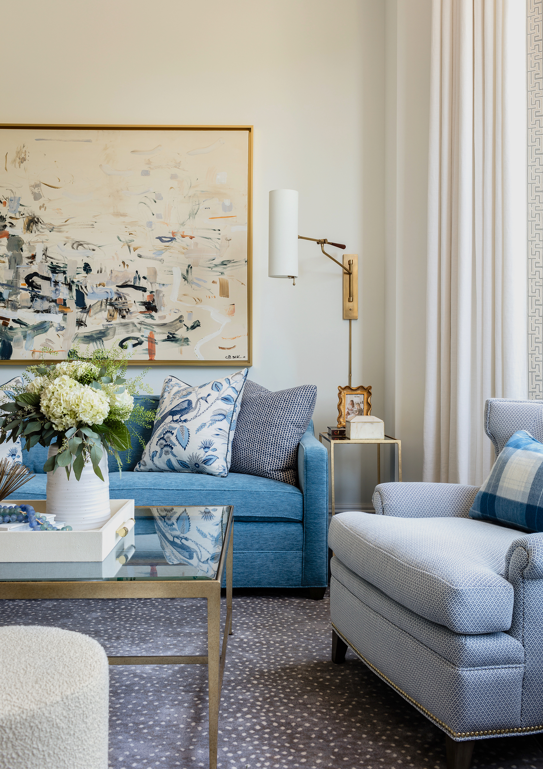
The client loves blue and so we convinced her to do a bright blue sofa in an awesome indoor/outdoor velvet. I was OBSESSED with this huge Kristin Blakeney piece from the moment I saw it and felt it was the most perfect piece for this project. It took a little convincing, but she went for it and it’s absolutely perfect. A soft, super durable rug grounds everything and the large glass coffee table keep the space feeling open but offers up lots of surface area for entertaining. We added two ottomans for pull-up extra seating along with a pair of comfy club chairs.
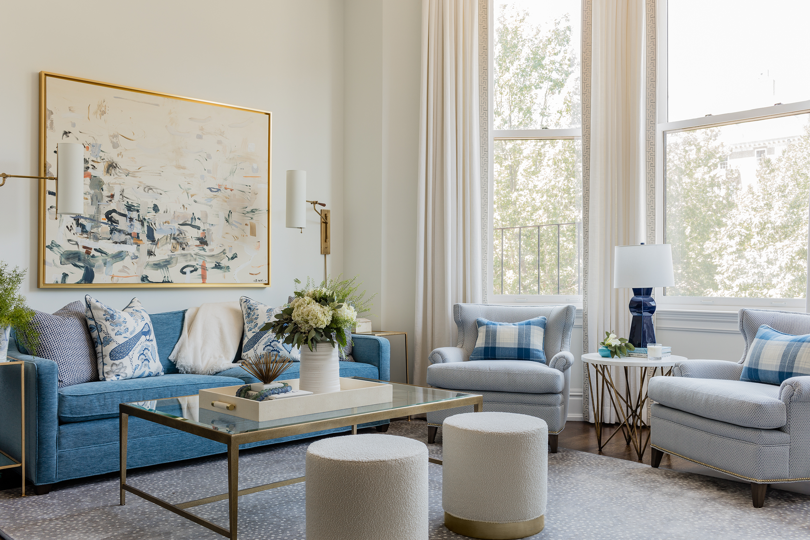
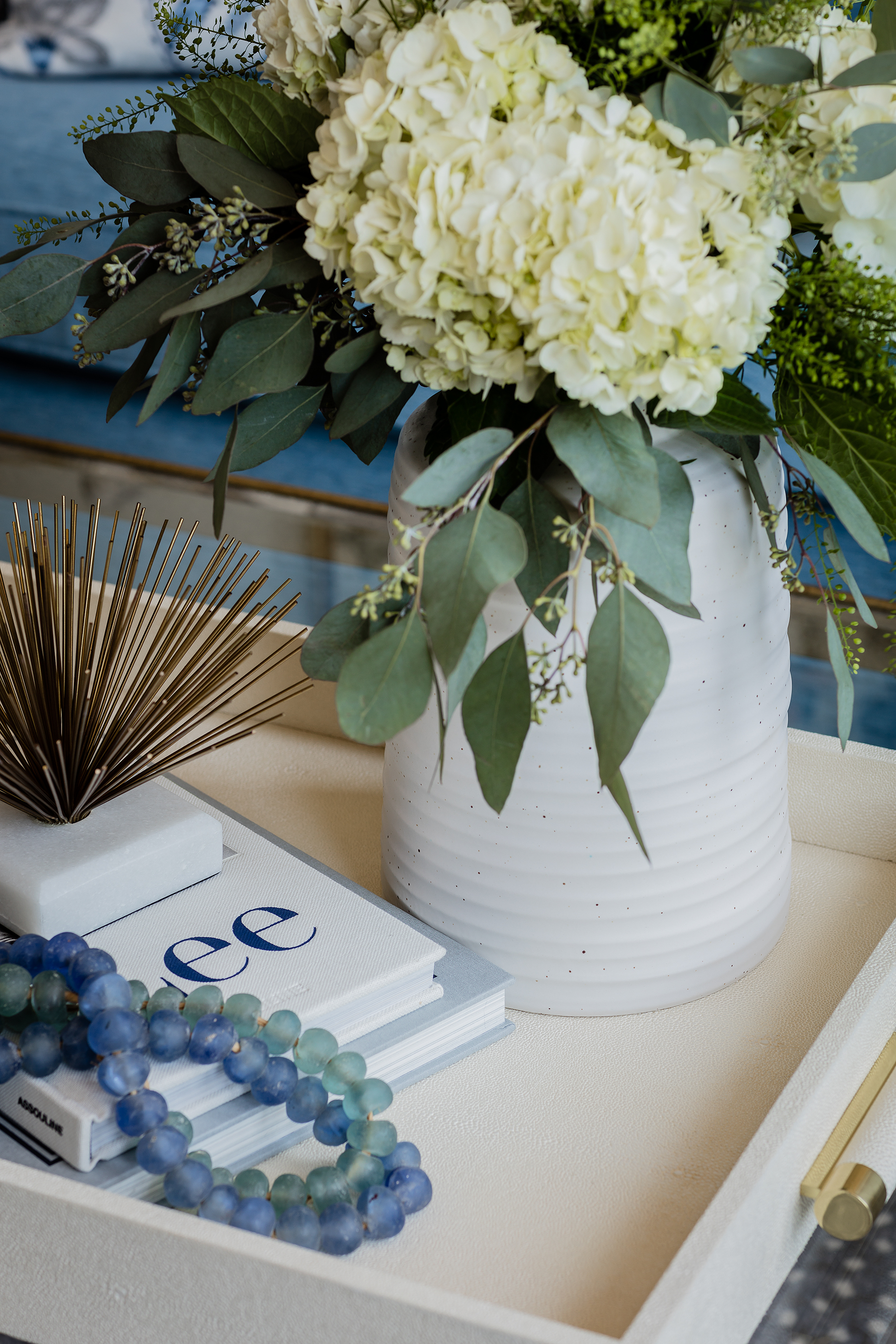
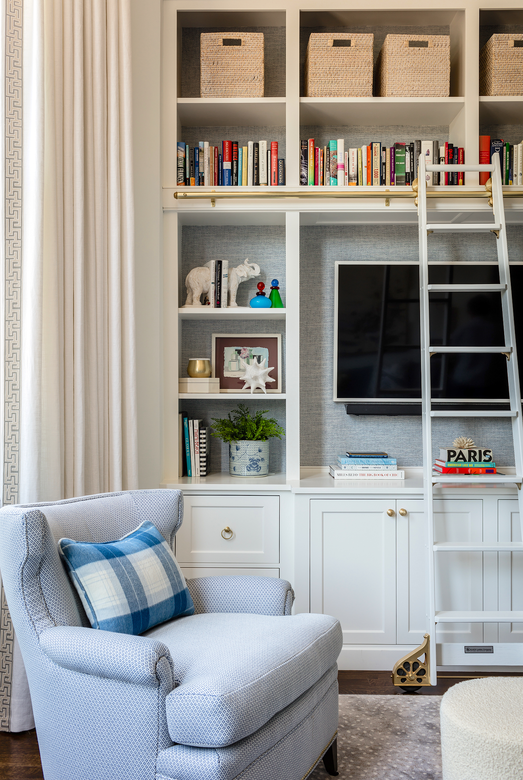
The most impactful thing we did in this space was the built in. We designed it to be a storage powerhouse using the vertical space we had an abundance of. I was SO excited to incorporate a library ladder too, let’s be honest. We wallpapered the back in a gorgeous woven grasscloth in pale blue to add a hint of color and texture. The pair of chairs we have in the bow front window area are done in an indoor outdoor woven to prevent fading from all the sun coming through those huge windows. Those little plaid pillows kill me too- made from an insanely luxurious alpaca fabric.
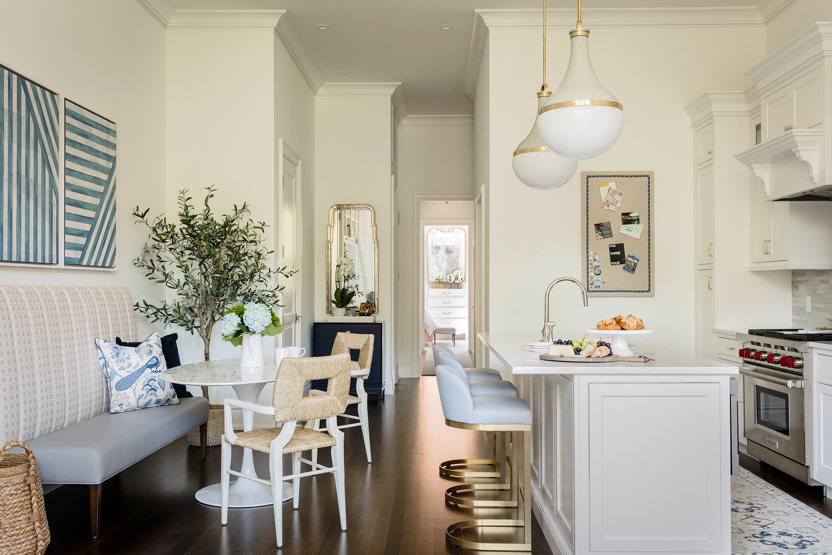
Looking from the living room you can see back towards the entry and bedroom and the awesome little dining area we created. The space is narrow so we thought a banquette and oval table would allow for the most pass through space between the counter stools and the seating and yet offer up enough space to host up to six.
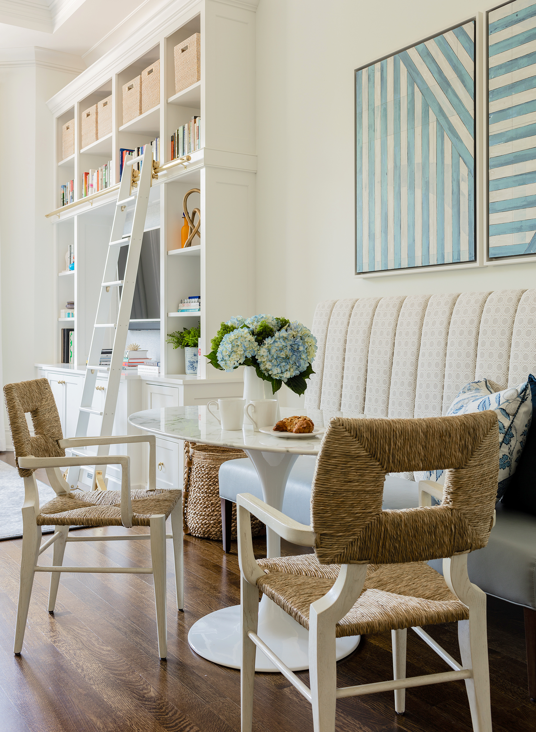
I have been in love with these Peter Dunham chairs FOR AGES. And I finally got to use them! :) The channel tufted banquette was made for us by Bjork Studio and came out perfect.
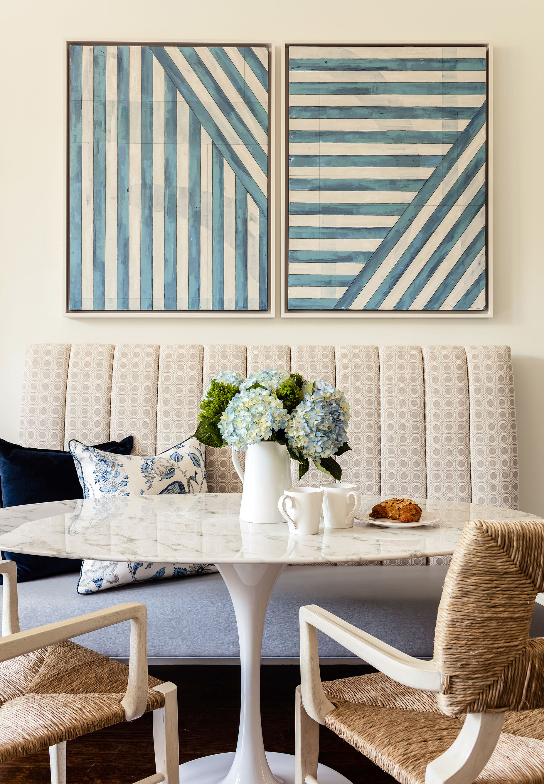
The art was commissioned by us from Erin Clark. I adore the graphic nature of these and how the tones play off the Blakeney painting in the same open space.
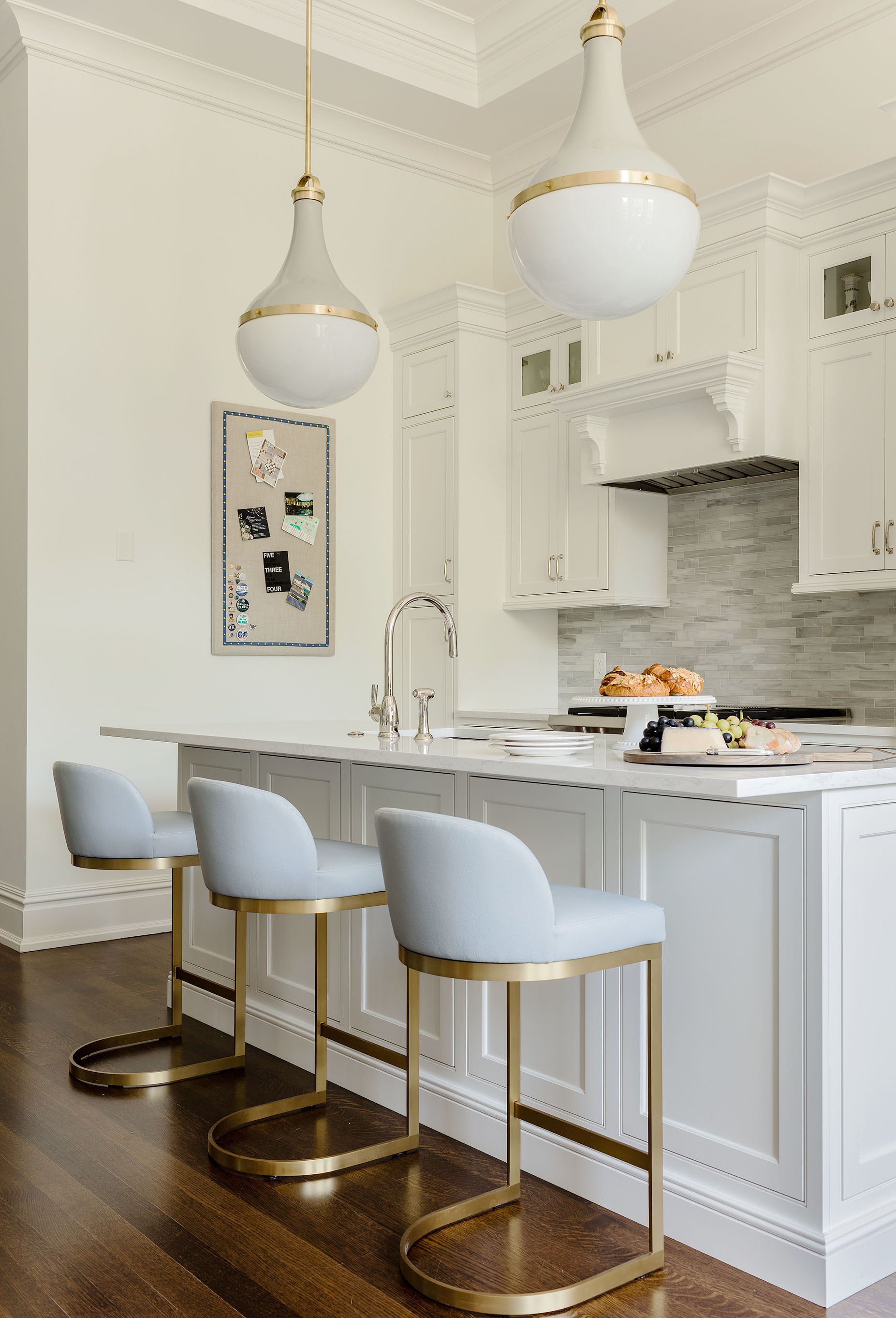
As I mentioned, the kitchen was already done, but we replaced the lights they had with these amazing Urban Electric pendants- there is no other statement lighting in those whole room, so I wanted these to be a showstopper! The stools are actually Restoration Hardware, but we had them reupholstered in the same pale blue faux leather as the seat of the banquette to keep things uniform (and also SO easy to clean). The pinboard we had made to coordinate with the finishes.
The elevator opens up right into this space and we wanted to create a “moment” here, even though it’s a small entry. We also needed some more storage (always, right?) A statement mirror covers the electrical panel (sneaky!).

The powder room was renovated, but we wanted to make it WOW, so we did this Cole & Sons wallpaper in here to really make a statement in this small, windowless room.
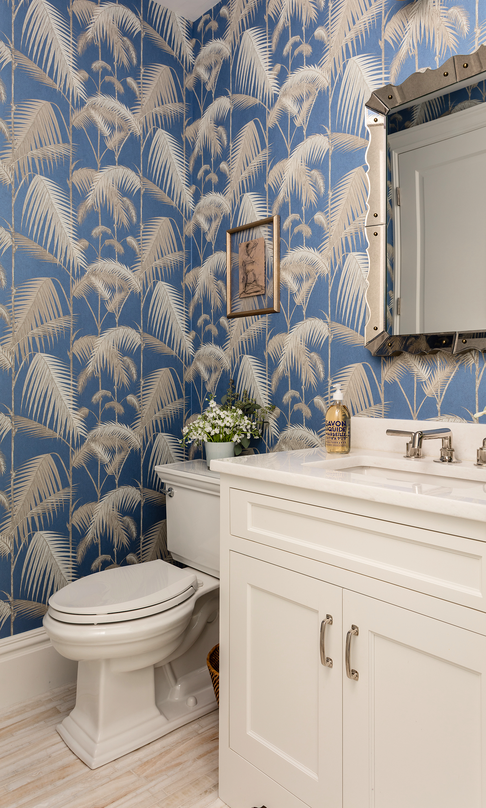
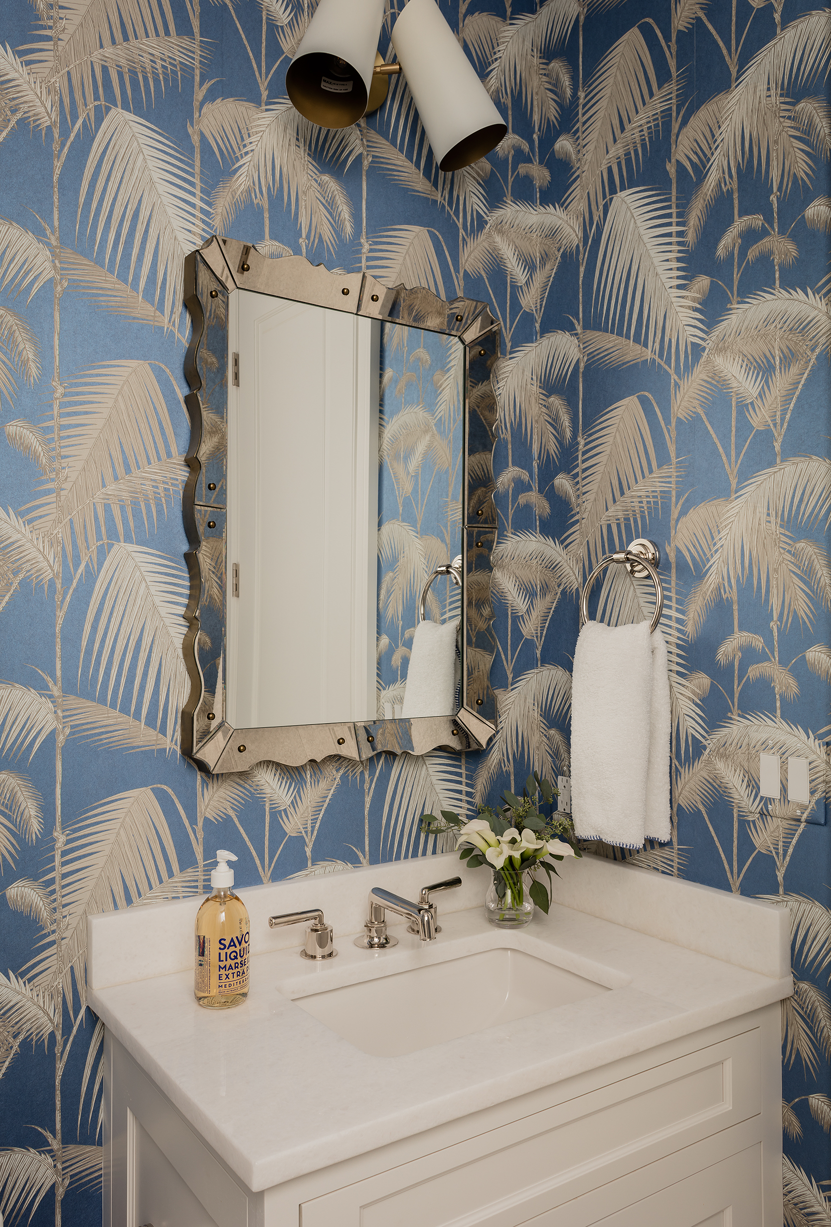
A new mirror and lighting capped off the mini-makeover.
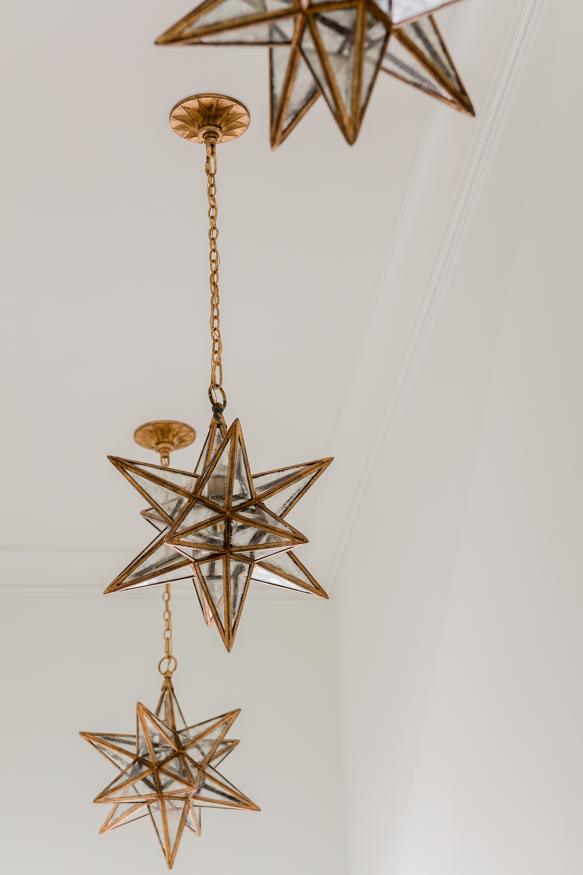
There is a long narrow hallway between the entry and the bedroom and given that the ceilings are SO high, I thought it was a space calling for fun lighting. We replaced the can lights with these star pendants and they make the journey from the living area to the bedroom so much more special. We also hung gallery walls on each side of the hall with the client’s personal photos and special memorabilia, keeping it more private but organized and visually quite stunning.
Looking into the bedroom. Literally feels like a breath of fresh air.
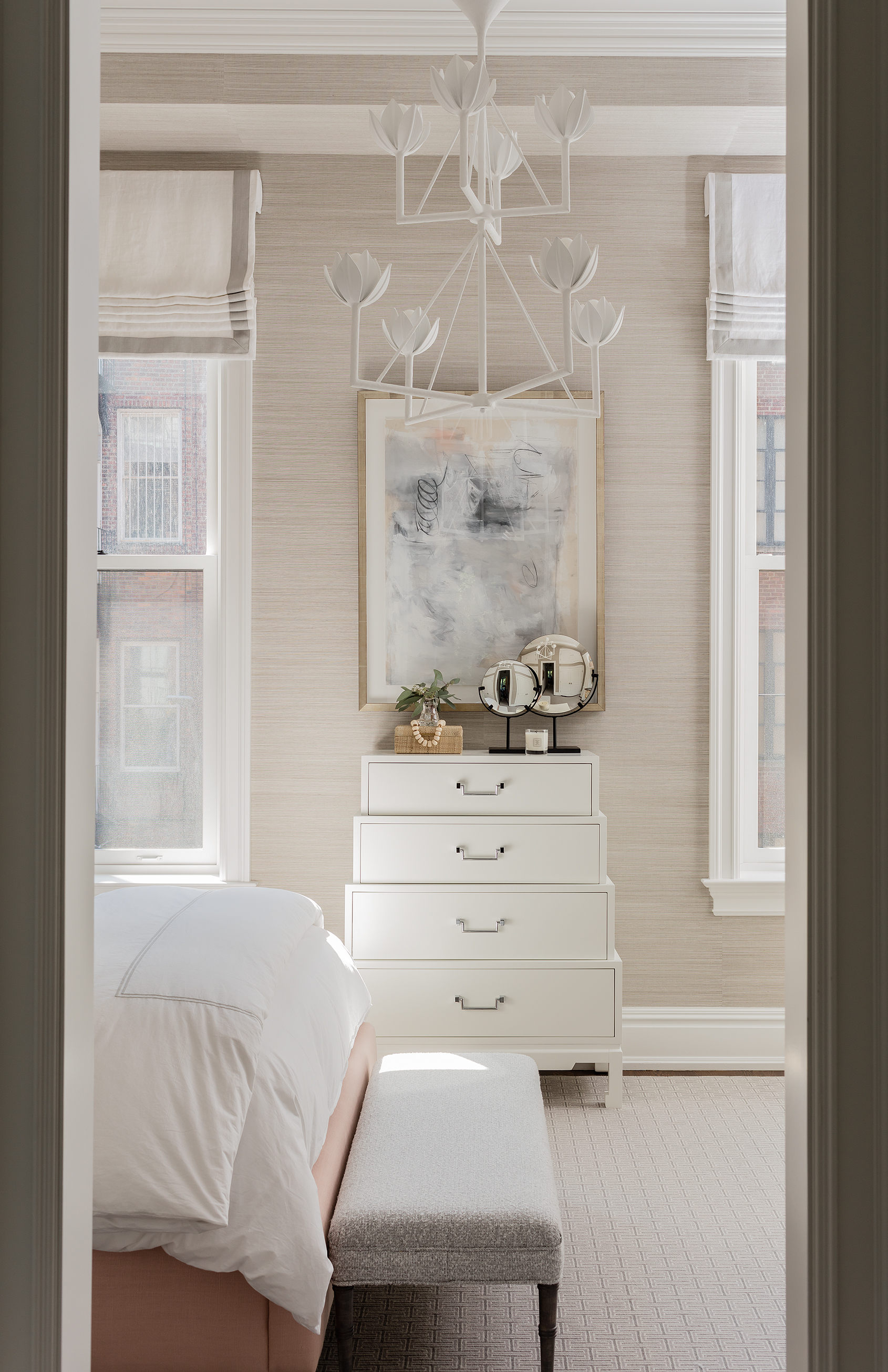
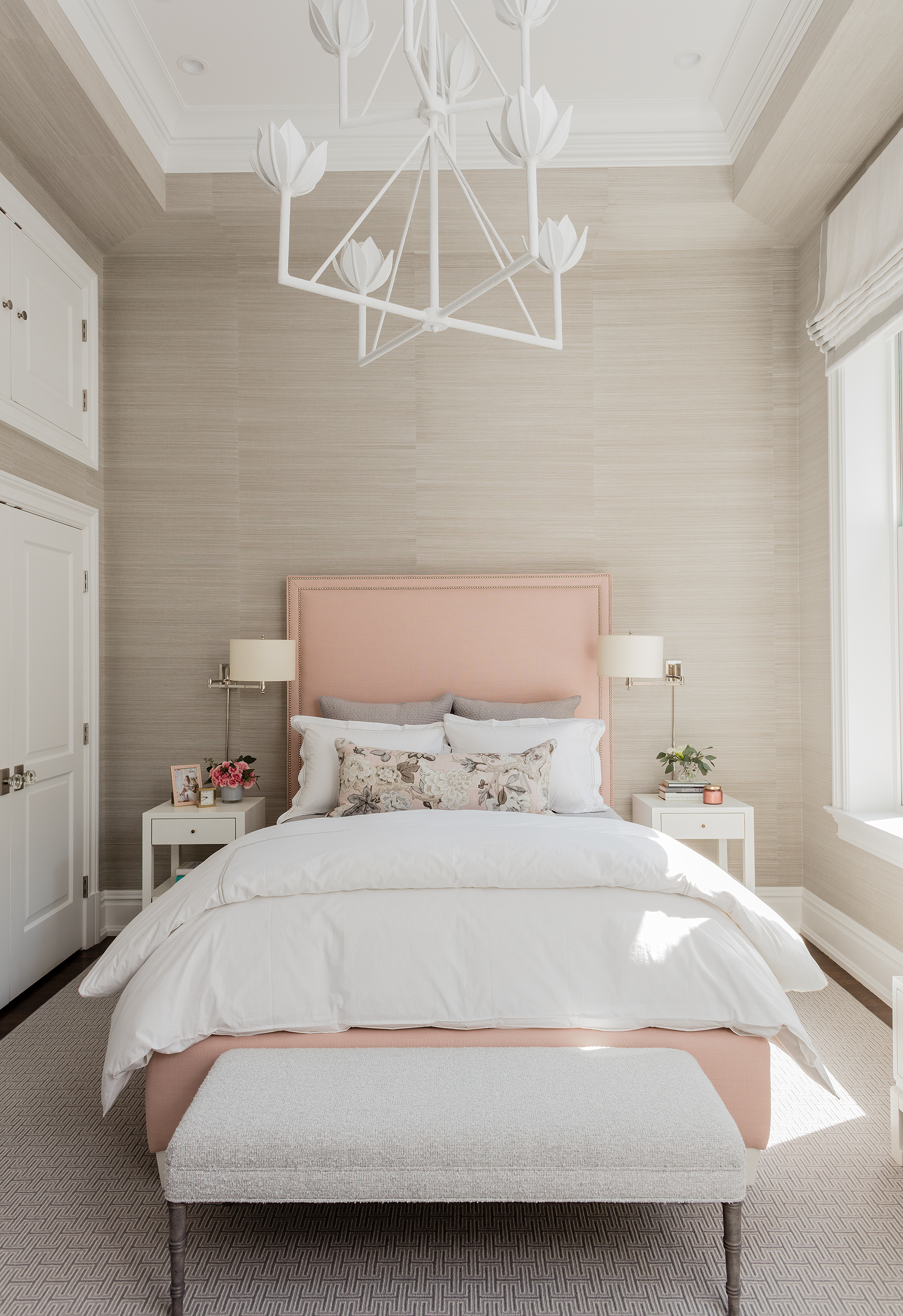
I am SO glad our client let us use grasscloth all over this room, including the soffits (it helps conceal them, I think). It warms up this room SO much. And that chandelier? I literally leapt for joy when it went in. :) The roman shades are motorized (think Cameron Diaz’s bedroom in The Holiday) and the bed was done in the prettiest shade of pale pink.
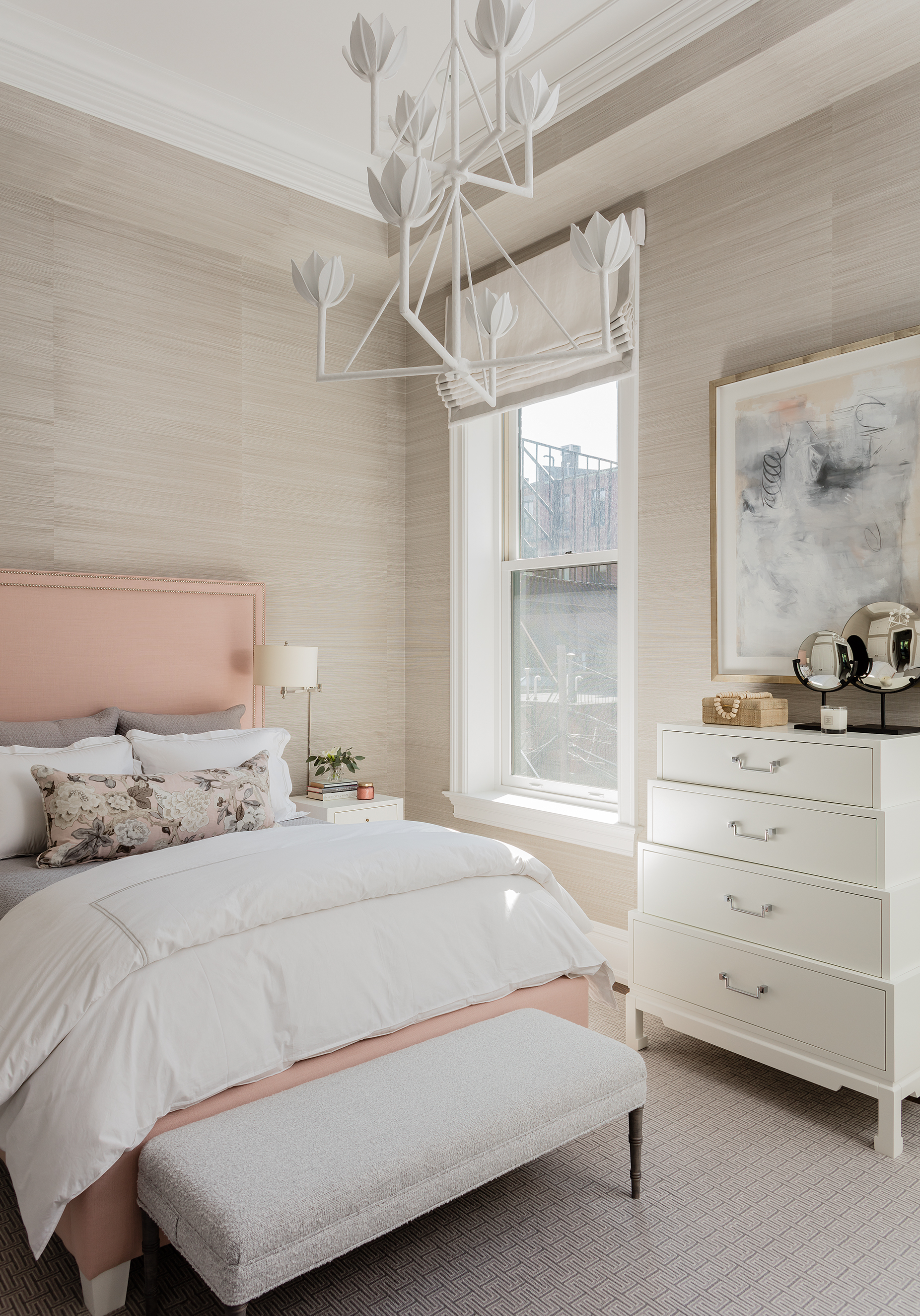
A gorgeous detail shot.
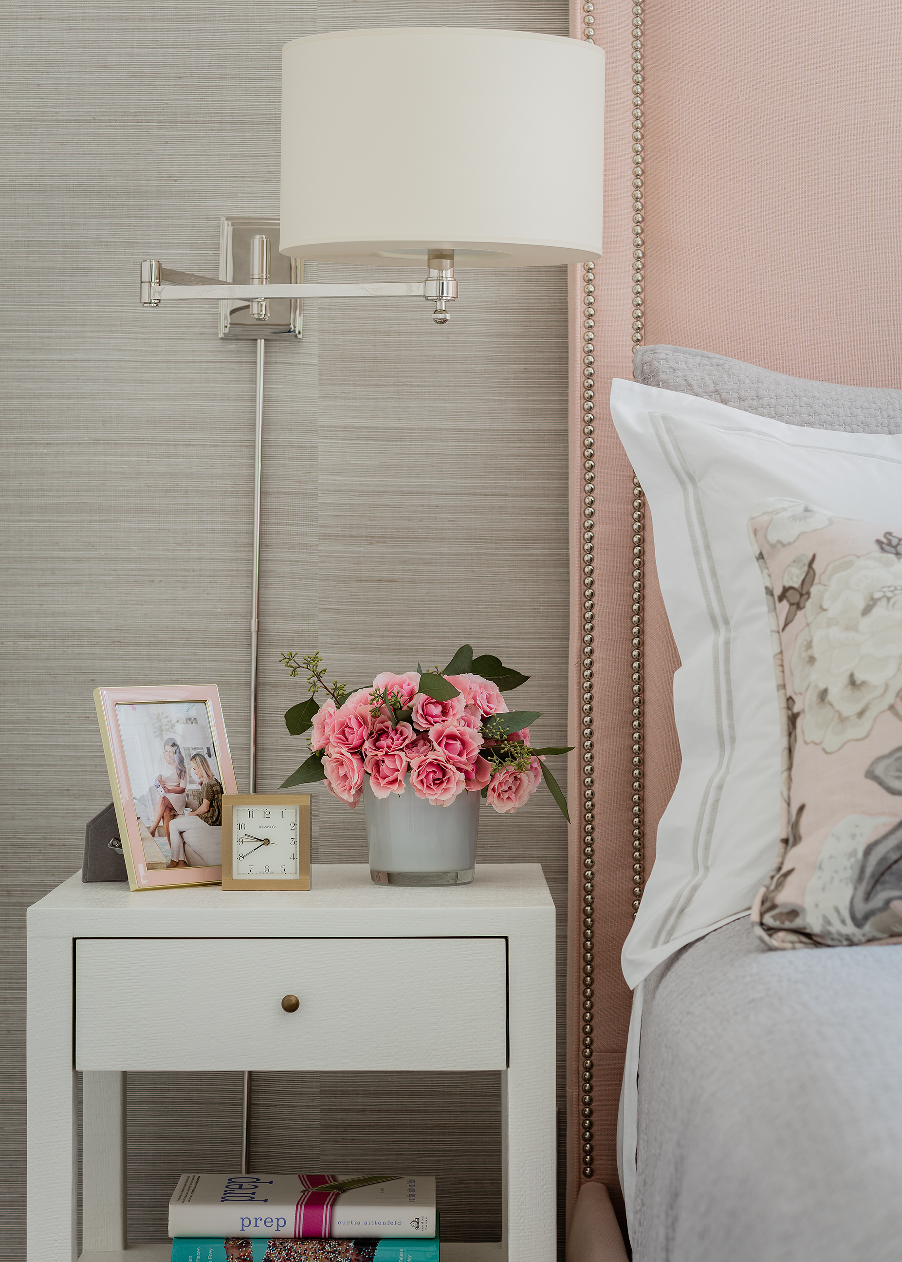
Again, this room is narrow, so wall sconces were a must in order to free up nightstand surface space. As you can see, there is lots of storage space with the upper and lower closets here. And I so love that bench we did in a nubby boucle.
Of course, yet again, we needed more efficient storage that used up the ample vertical space- so we designed on another built in that houses the TV, more “stuff”(including her printer) and acts as a desk too! We lined the backs of this one in a small scale pink wallpaper to balance the pink of the bed on this side of the room.

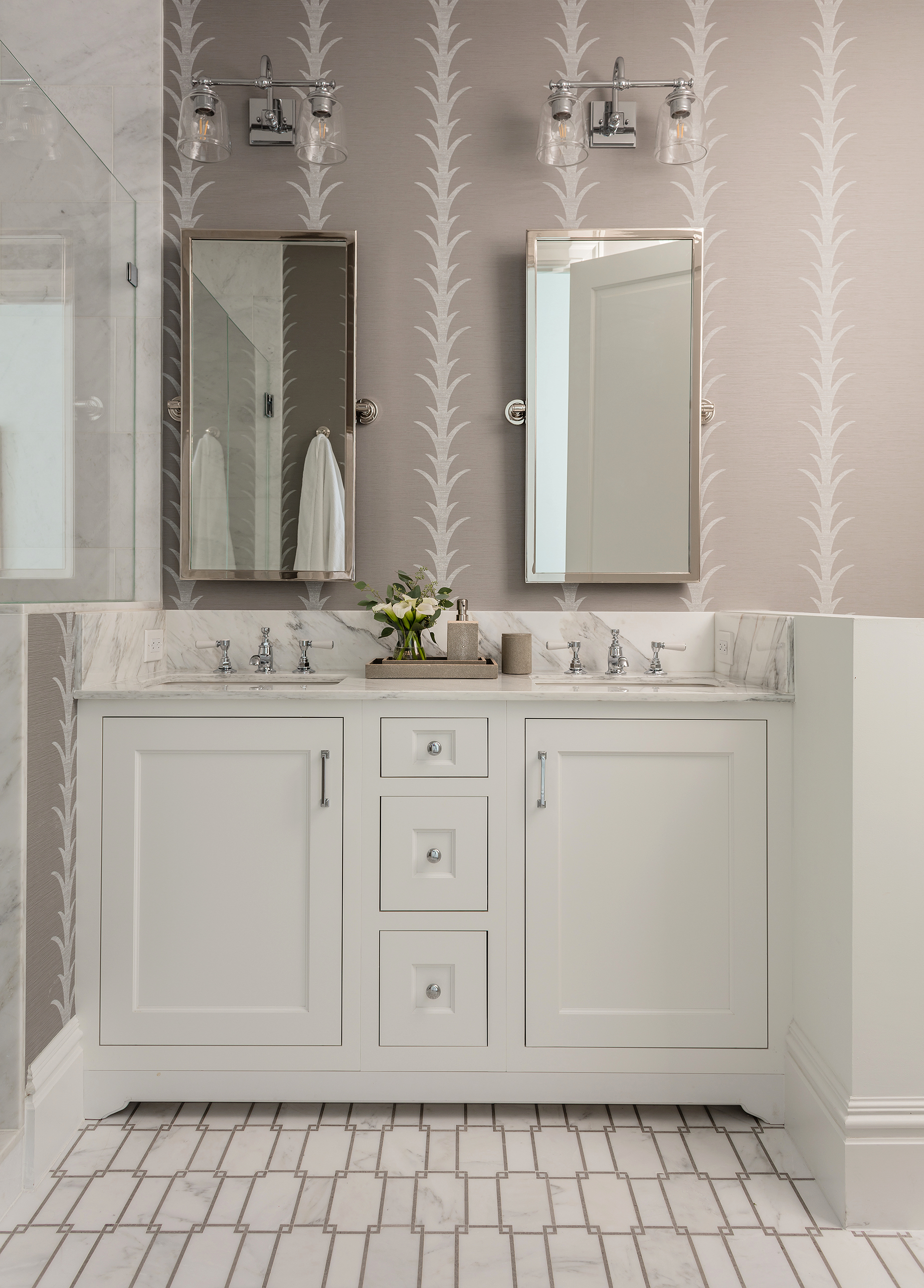
The master bathroom had such nice finishes, but we did replace the sconces and add a vinyl patterned wallpaper to make it more interested and warm in here.
I’m proud of this space, mostly because our client tells me all the time how much she loves it and how happy it makes her. That is why we do this after all, right??
While I’m not sharing specific sources (we have to maintain the value of our services) here is a “get the look” roundup of items that can help you get a space like this!
Photography by Michael J. Lee


WOW. Whew, just wow!
This is SO beautiful!
Hi Erin, first let me say… this is a work of art! Thank you for sharing your talents with us. I just ordered your newest book and have so many pages dog-earred already. I’ll stop fan-girling now but I do have one question about this space – what color/finish did you paint the built ins in the living room? I know the room and trim are Chantilly Lace. Is it the same? Thank you again for the inspiration!
Erin, this is so incredibly beautiful. Perfect layout, perfect finishes, and the ART! Wow.
[…] you may have noticed, I love the work of Kristin Blakeney (her large piece was the showstopper in the tour I shared last week). I have adored these new works she’s been doing so I asked her to do a custom one for above […]
This is absolutely STUNNING. Thank you so much for sharing it. Simply beautiful!
Hi Erin – I am looking for a good place to shop for upholstered chairs like you have in the living space here – do you have any good places you recommend checking out for high quality/comfy? Thanks!
This is really impressive Erin- and you’ve done us a huge solid with the get the look roundup. I wd looove to let you loose in our nyc (top floor of an 1830s building) apt to make it Modern. It was on the cover of a design mag in the 90s and previous owner is still a practicing designer but that was a loooong time ago!
Gorgeous! One of my favorites that you have done. So much white, and yet so colorful and warm at the same time. Brilliant.
Lovely. Thank you and your client for sharing. This gives me the blues in a very good way.
Looking at these images was like a breath of fresh air! Truly stunning! This project is truly perfection.
This is absolutely stunning. Just made me realize how much I want a space just like this and to not settle for less. You did an amazing job. My selfish self would have loved to see the master closet. I bet it is stunning as well.
This is so lovely. I was interested in the trim painted the same color as the walls but with a different finish. I am building a new condo and wondering whether to do this (Ben Moore’s Revere Pewter)? My ceilings are only 9 feet and I wonder if this would make them look higher?
What a beautiful space you have created! I learn so much from your descriptions, as you provide the “why” behind your decision making. Thank you.
To.Die.For. Bravo, Erin, bravo!
So gorgeous! It looks like you took a beautiful space and really made it shine. I’m so glad you decided to go ahead and share the photos.
Oh wow, think this is my favorite thing you’ve ever done. Lots of inspiration here!
Absolutely STUNNING!!!!!!
I want to move in!! Bravo, Erin. So gorgeous. She is one lucky lady : )
For Robin, who asked about the dresser source, I believe I saw the same model or one like it at Cabot House. The one I saw was by Gat Creek and is made in the U.S.
Erin, a lovely job. This is a truly beautiful space.
ERIN,
This is absolutely gorgeous! Thanks for the joy of looking at such a lovely home. So nicely done.
Outstanding.
Just beautiful! Thanks for sharing.
Absolutely Gorgeous!!!
absolutely stunning!! beautiful work Erin & Team!
What a lovely space. Your client must be beyond thrilled, I know I would be!
OH, my favorite is that sofa (the color is perfect!) and the artwork in the kitchen. Beautiful!
Bravo, Erin!! You are SUCH a talent!
You are so good at what you do! It’s stunning. I’m a traditional girl and this speaks to me. You are a master at traditional with a twist to keep things feeling fresh and modern. Just. So. Good. Thank you for sharing!
Stunning! I’m jealous of the Julie O’Neill chandelier, which is a favorite. It’s so dreamy. So good to see client work on your blog now that you’re not saving it all for a book.
Congratulations–cue elbow bump! I love every space. Beautiful, personal and practical and the lighting is the apartment’s jewelry.
Beautiful work, so pleased you were able to share.
Erin, this is beautiful. Can you give me the source for the dresser? I looked in the post (twice) and didn’t see it.
As stated in the end of the post, I’m not giving out sources beyond what I listed. It’s important for designers to maintain their value this way. I know it’s annoying- but this client paid me well to find all these items for her and to just give away sources is not fait. Happy to source items from my own home, but not for clients. Thanks.
Oh my gosh, Erin! You truly are a genius. This is the most beautiful space I have seen in ages. Its no wonder your client feels so wonderful when she walks through her door. Absolute perfection!
OUTSTANDING!!! This is…just…perfect!! The colors, fabrics, LIGHTING (eeek, those stars!!!) Nailed it!! franki
really beautiful, lucky woman
I love this!
[…] love, love this Boston Back Bay project which can be seen on Elements of Style. I could move right in and don’t you adore these chairs? Love the high ceilings too. I […]
Love, love this post! Looking at it gave me some ideas of things I can update in my own home that I’ve been ignoring. Thanks for the inspiration.
Ditto all the above comments! What a treat to see and so inspirational. I appreciate your efforts in sharing.
Love the sofa!! Blue is my favorite color! I was wondering where is the sofa from and what color/shade did you use for it?
Stunning space. Love!!
Absolutely stunning!! THANK YOU for sharing this! I know as a designer you would love to see your work in print, but I think we all can get so much more out of it seeing so many shots and hearing all the details (and things that were changed) like this than a short magazine spread!
This is stunning! Thank you for sharing.
DAMN ERIN. This is INCREDIBLE!! And I’m so glad you decided to share it with us instead of waiting for a publication! This is one lucky lady to have such a beautiful space to retreat to, and now, work from home in! Thanks for the many great ideas in here!
SO good, Erin. Every detail better than the one before. Thank you so much for sharing with us!
Wowza! Stunning!
This is stunning! I have 3 teenage boys and am recently divorced so, this feminine space would be a dream! Can you give me some idea of budget for this project? Thank you!!
You can email [email protected] for more info on our services and budget idea.
Pleeeease source the master bath wallpaper source!!!
Wow – I mean paper.
I believe it’s Schumacher Acanthus Stripe in vinyl
Gorgeous! Every new photo, I gasped. Bravo!
Love the color!! Blue, pink. The bold wallpaper. I LOVE seeing color and bold choices. Thank you!
Wow! Simply amazing. If I had a condo downtown, I’d want this!!!
Just beautiful. I love every single choice you made!!! Thank you for sharing ❤️
Absolutely gorgeous!
Erin, you are so incredibly talented!! One of the things on my bucket list is to have you decorate. Room for me, ha. One day!
Wow!! This is so beautiful!! Just ordered that blue and white light you mentioned too!
Wow, this is a show stopper! I’ve move in tomorrow (if I only could!).
Question about the roman shades – what is the reason you choose to do an exterior mount versus interior mount?
Absolutely stunning! This is such a great example of how to create IMPACT in a space, regardless of the size. Every single corner and nook has a WOW! factor. Love every detail! Thank you for sharing and for being a source of inspiration!
So beautiful and classic! Who wouldn’t be thrilled to call that home:)
Question on recommendations of sourcing for runners like the one shown for kitchens? Etsy?
Yes try Etsy!!!
Absolutely stunning.
Dreamy! Functional, beautiful, sophisticated. Great job and thanks for sharing to brighten up all our days while we’re stuck at home.
This is stunning. So excited to see your beautiful work in this level of detail. Eating everything up.
Sorry Erin!!! I should have read whole post before asking what color you used!! Love Chantilly Lace, used it on our exterior – it’s a bright clean white!
As usual, beautiful and soooo elegant! Love that the wall and trim color in the main space are the same…or at least it looks like it is. Erin, please share the color that you used : )
I did, in the post.
Your designs always have such a pulled together element, but at the same time there are a few surprises (ie, lighting). Really beautiful Erin, thanks for sharing!
Love everything about this!!
Stunning
What a great post today! Thank you. A much needed light and happy space with all of the heaviness out there. I’d like to be quarantined there!
I rarely save an entire design post (usually just a photo or two) but this is a keeper. A magnificent job. Can you source the dresser? I love it.
this is absolutely stunning! feminine, but stately. a true gem. makes me want to move back to the city so badly!
I want to live here! Great job Erin. It’s perfect.
Erin!! Every.single.detail. WOW!! I love all of it, the chandelier in the bedroom, the colors throughout, the sophistication! What a dream!! Thank you for sharing this, you have such a gift.
Drop. The. Mic!
This is such a jewel box of a condo! Perfect in every detail!
One of my favorites as blue is my favorite color- really, really beautiful, warm & sophisticated. I’d love to move right in!
Wow, what a beautiful project! I’m getting so much inspiration from this, thank you!!!!
Absolute perfection !! So warm and inviting…Love it !
Brightened my day for sure-so inspiring….thank you
This space is AMAZING! Thank you for sharing…made my day!
I spy PREP by Curtis Sittenfeld! LOVE this condo.
Two copies too! One in the living room and one in the bedroom.
Just beautiful!
OMG. It’s all so, so perfect. After being stuck at home for 1000 years with my husband and four little boys, all I can think is how unbelievably happy I would be to have a girl pad of my own right about now :)
I agree 100%!!
stunning! i absolutely love it. I love the practical storage tricks, can only imagine how happy she is to be quarantining in such a stunning space.
This has got to be one of my top favorites of your work. I am happy just looking at it. She is one lucky girl! :) Love it Erin thank you for sharing!
This space is bananas! Sooo many things I LOVE!!! It’s so gorgeous – one of my favorites that you’ve done!
I have been DYING to see this pace since you showed a snippet of the banquette area and wow this does not disappoint. I love everything you did!!!
Absolutely stunning. Am so glad you shared it here. Thank you!
Maybe my favorite all-around space yet. It is perfection! Well done.