Pretend Client: A Bold Powder Room
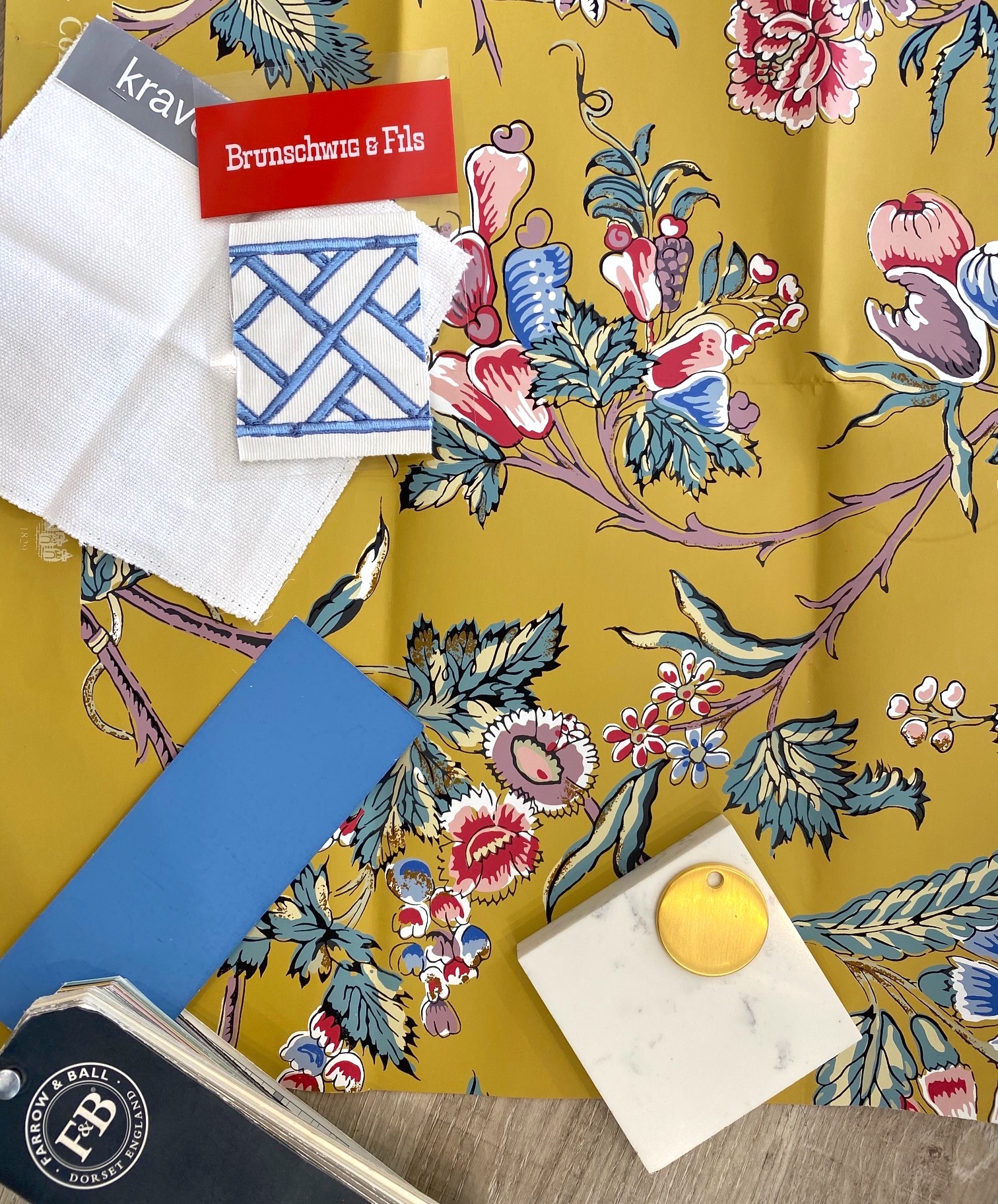
When you’re a designer, you don’t always get to use the crazy, fun fabrics and wallpapers that come through the office. Clients, for the most part, tend to get a little nervous about making big statements or using colors outside their comfort zone (blue, blue and more blue- hahaha!) The one space my clients sometimes go bold is the powder room. But would any go THIS bold? I’ve loved this crazy Pierre Frey paper in this mustard/blue/red/pink/plum colorway for a long time, and the other day I pulled it out and thought I’d put a scheme together – another “Pretend Client” situation, if you will. We decided in the office that this client would probably be a VERY faaaaaaaancy lady with a brownstone in NYC – maybe a little preppy but sassy, in her 50’s, living alone for the first time in a long time and ready to make her space her own!
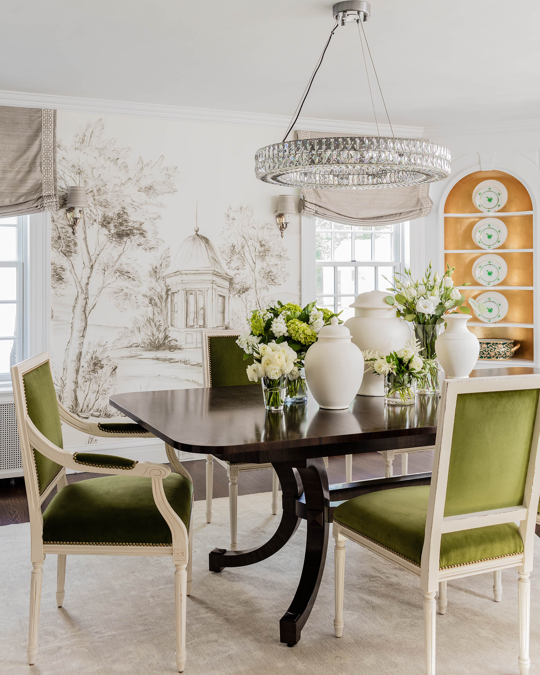
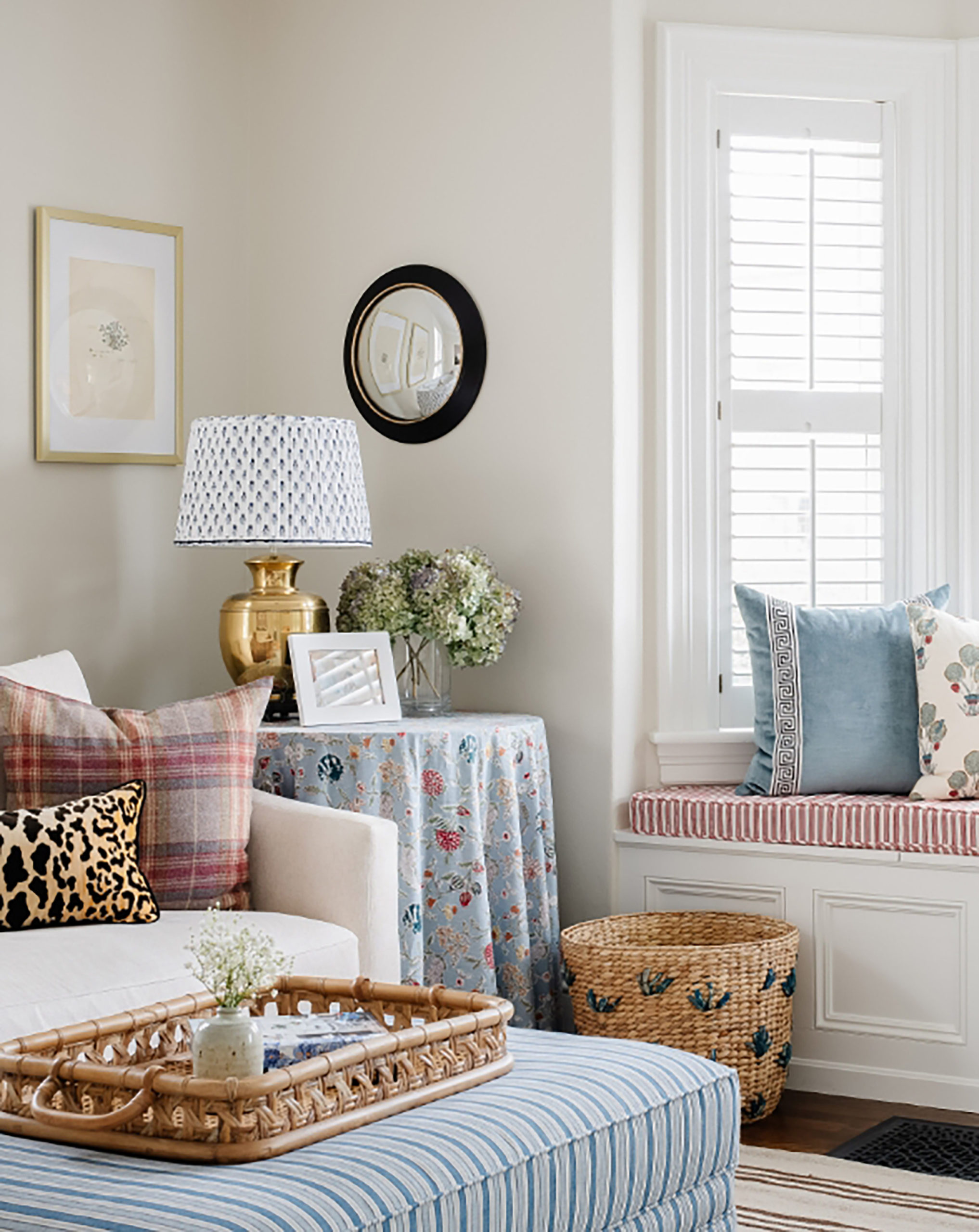
The ceiling would be painted F&B’s Cook’s Blue, with complementing hand towels and other accents. I’d break up the crazy busy paper with a large abstract, minimalist piece of art and install a modern vanity with brass legs. A little hint of raffia/rattan doesn’t hurt either…. :)
Click images for links:


That rattan wastebasket is so pretty!! Thank you for sharing!
https://www.idolworth.com/
I love this because I just recently redid my powder room and used this same bold gold color on my vanity and curtains! With touches of blue and white including a huge cyanotype print of a fern frond.
I am that client!
I’d do that in a heartbeat!
Looks great! Randomly, I had an old shower curtain from Target with that blue pattern runner from circa 2013. It didn’t last too long in our misty NC bathroom, but looked classy for the price.
Gorgeous! If I could do this I would, but I’d probably trade the pink or plum for the blues.
Looks Great!!!!!
Absolutely stunning!♥️
Bright and classic to me. This is so very similar to our dining room curtains 30 years ago with a beige background. Classic with a bright twist! Love it!
LOVE LOVE LOVE This!!! It will be going on my vision board for a future powder room!!! Could you see it in a dining room as well???
I see a wallpaper border in there. Are borders coming back??!
Gorgeous! If I hadn’t just done my powder room I would go this route ( and am in my 40s, married with children, living in a turn of the century house in New Orleans).
That ALL speaks to me…I’ve always gone…”off the beaten path”…luv the fabric, etc. That “Element of Surprise”…yep. franki
I’m obsessed with Pierre Frey wallpapers. We installed La Pannonie in our dining room this summer and it’s amazing. I’m not a yellow/gold person, but I’m digging the paper you picked out and will have to check out the other colorways!
Wonderful! The link to the shade isn’t working. Thanks.
I absolutely love this! And I just so happen to be in the market for a powder room makeover…what about the floor? current tile is black and white, so it would have to go!
Hi Erin and friends. I recently wallpapered a powder room and now want to wallpaper all my bathrooms. Love love this board! Would you recommend wallpaper for a bathroom with a shower? I just recall as a teen I literally steamed the wallpaper off the walls with my extended hot showers!
I would do it in a heartbeat it’s gorgeous!! I wish I had a powder room to go a little crazy… :o)
Demographics- over 70; married. LOVE this plan! If you can’t have fun and go bold in the Powder Room where can you?
LOVE- paper is fabulous & so is color combo!!
Love it!
Your clients are really boring if they think something like this is SO bold! It’s gorgeous.
I am an over 70 single woman living in a Cape Portland, ME. I too have loved this paper forever. I have two full baths that are small, both have a shower.
So, the ceiling blue, towels blue, love the vanity, white(?) shade, what for the floor?
I think she meant white towels with blue monogramming and/or scalloped edges? That’s what I’d do. We have hardwoods in our powder room and master so I’d keep that or continue whatever the flooring is elsewhere in your home. (Not a designer, caveat!)
Love it!
I absolutely, 100% (plus) love this. I’m not into bland and I’m so tired and overly worn out on safe, basic, basic. Give me color, make it bold and let’s have fun!! Bring on the jewel tones and let’s give the whole damn house some pop, PLEASE! Thanks for going bold and daring, bring it on more often if you please. Safe is fine and perhaps long term economical but safe, safe, safe just gets plain ‘ol dull-old in my book. Your on the list for my next house! The current one btw, is full of bold, vibrant but classy colorways throughout the entire home that all pull in and/or work together cohesively from room to room AND the ONLY white in any space are the sinks and toilets, ha ha! Thanks for the lovely, inspiring post, LOVE IT!