Renovation Update: The Finish Line (Almost)
So like with most projects, there was a little delay in finishing up our addition, but this is the week. We are so close! Things are looking amazing, if I do say so myself! Already our house functions SO MUCH BETTER, even with just the extra 600 square feet. In smaller homes (with our addition our house is 1900 square feet) you have to make every square foot count, and I think we did a great job of that.
One thing I enjoy about smaller homes is that you can spend a little more on specific things because there isn’t a ton of space you have to dress up. One area I spent a lot on are the master suite entry closet built ins. Made by a cabinet company here in MA (TaylorMade Cabinets) we needed this space to function as Andrew’s clothing storage and book/ additional bathroom storage. I added the detailed X mullions on the mirrored doors last minute and am SO glad I did. This might be one of my favorite areas of the new space. The master bath is almost done too- it also is very small, so I went ALL OUT on flooring and a custom vanity. Although spatially lighting above the mirrors would have been better, it’s so much nicer to have lighting on the sides for makeup application. So while it looks a little tight, it’s going to function better for me. Also, the medicine cabinet doors are not on in this picture, and clearly not enough hardware arrived!
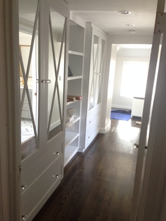
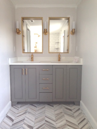
SOURCES: Closet built ins- custom // Closet hardware // Bathroom hardware // Bathroom floor // Bathroom vanity- custom, in Benjamin Moore Chelsea Gray // Faucet- Kohler // Medicine cabinets // Lights- Circa Graydon Sconce // Wall color- Sherwin Williams Eider White (gorgeous light grey- love it).
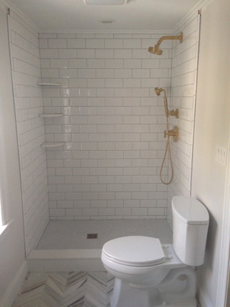
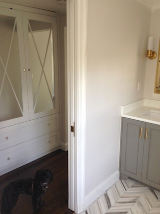
The walk in shower is missing it’s frameless glass door, but the 4″ x 8″ subway makes it look bigger and the grey grout gives it a throwback look. The brass fixtures really pop off this. In the picture on the right you can see the hall in relation to the bathroom- since there isn’t much bathroom storage we’ll probably use one drawer in the hall for overflow/ towels, etc. Also, Baxter decided to follow me around as I was snapping pictures.
The master bedroom is HUGE and feels so ethereal and relaxing! I’m obsessed! To keep the ceilings feeling high we painted the walls and ceiling the same color (Sherwin Williams Incredible White). The window seat is one of my favorite details- it’s big enough for me to lie down and read on but mostly will be used for Baxter and Oliver to keep an eye on every single thing that goes on in front of our house (Squirrel! Dog! Kids! Squirrel! MOMMY!!!!)
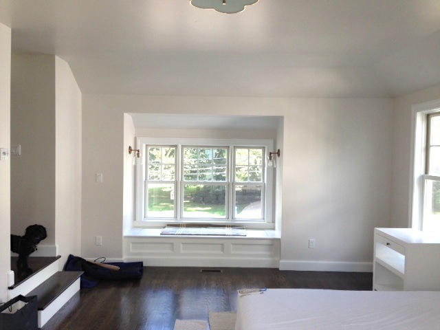
I chose these simple sconces for the space and have some Edison bulbs on order for them to keep it looking vintage. And our Bob-o-pedic arrived. It’s the third one in the house, we’re addicted (despite the bad commercials).
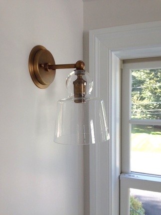
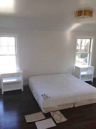
SOURCES: Sconces- C&B // Ceiling Fixture-Circa // Nightstands-Wisteria // Wall Color- Sherwin Williams– Incredible White // Trim Color- Sherwin Williams Extra White
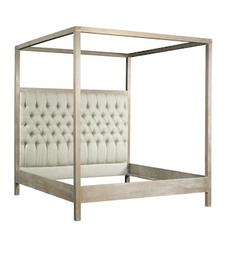
I could not find the perfect bed that I wanted for the space so I contacted Kristin Drohan Furniture about making one for me of my own design. I wanted a limed oak frame with a tufted headboard- a very “California beach house” kind of vibe. She helped sketch it our and figure out the details and finishes with me and now it’s on it’s way here! I did a faux leather in white for mine, but also ordered another one for a client in a gorgeous linen (with a slightly higher headboard). I cannot WAIT for it to get here!
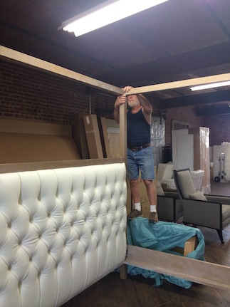
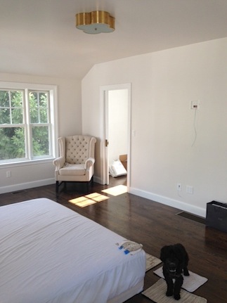
This looks towards my closet and we actually ARE hanging a TV on that wall. And believe it or not, it was MY call not Andrew’s. I just can totally picture us snuggled up in our gorgeous bed with all those windows open watching movies. :) Also, Oliver wanted to drop by to tell you he’s DOWN with his new room. Like, seriously down.

Down stairs is pretty much wrapped! The laundry room is amazing and we finally painted the ceiling a light blue-green and put up the Jonathan Adler light we previously had in the office. It’s pretty adorable in there. Another case of spending more on a teeny tiny space to make it feel special. Also, that coat closet is SO big I may need to order more fall coats. :) It’s a tiny thrill every time I realize I don’t have to go to the basement for the vacuum or a raincoat!
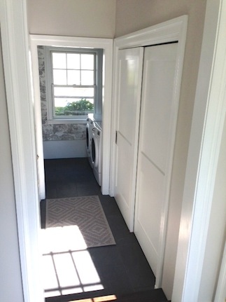
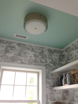
SOURCES: Wall Color- Benjamin Moore Balboa Mist // Floor Tile- Balsatina Tile Showcase // Wallpaper- Cole & Sons // Ceiling Color- Sherwin Williams Breaktime // Ceiling fixture-Jonathan Adler
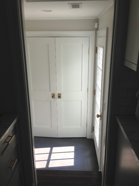
The door is off between the kitchen and the pantry/ mudroom and we stocked the pantry this weekend. Now we can buy food for WEEKS. Also, having a door to the patio right here is so nice for direct access to the kitchen. On the exterior we put up these new lanterns from Lamps Plus (I’m replacing the seeded glass with clear because I’m picky like that).
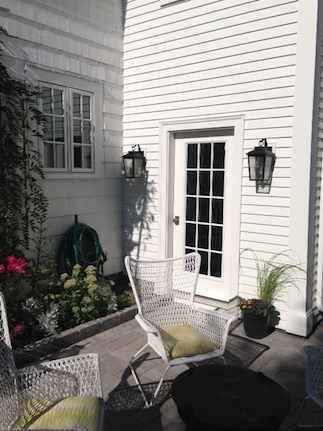
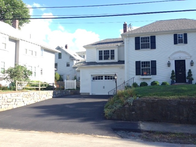
I HAVE A DRIVEWAY! It’s looking a little “parking lot” right now, but as the pavement turns less jet black it’ll be better. Plus, who cares, we can park comfortably, I can pull into my own garage and that stone wall steals ALL the attention (seriously, if you live around here and need stone work done Weston Landscape & Tree is AMAZING. Artists, really). Garage door still waiting to be painted…
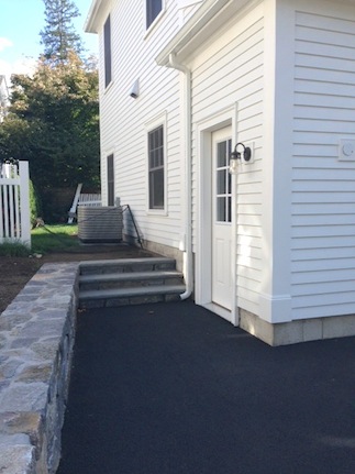
Love the bluestone steps (and the central air conditioning that’s being turned on today-YAY). The side door will be painted black like the garage door and we added this cute little light from Lamps Plus next to it.
Next week our furniture and window treatments should start arriving! Then we’ll be into the REALLY fun stage. :)


A stunning bathroom. Had you gone the route of an over-the-mirror wall-mount light fixture(s), which one would you have chosen?
Wow, Erin! Your class and taste never cease to amaze me! What you’ve done with limited space is overwhelming. That bathroom is perfection! The floor, the lighting, the vanity, the shower! It’s all perfect! We’re redoing our small half master bath soon and I was planning on grey grout with white subway tile but this makes me sure that’s right! What’s your opinion on beveled subway tile? Do you prefer the regular subway tile or beveled?
Can’t wait to see the final pics!
Hi Erin,
Your renovation is turning out beautiful! Can you share which model of the Bob-I-pedic you purchased? My husband and I were waiting for the right time to purchase a Tempur-pedic, but if you are satisfied with this brand it would be a great cost savings! Any information would be much appreciated!
Ann, we’re doing a dramatic tall canopy bed- no room for a statement fixture as well!
Your addition is fantastic and I’m definitely stealing inspiration from your master bath for when it’s time to redo ours (love your vanity). That said- I cringe every time you call your house “small”. I live in a house that is almost identical in shape/size/layout to yours (pre-addition), and there are many days I feel like it’s way too much room. Granted, it’s just my husband and I most days (and a herd of tiny dogs- no kids) but our first house was 1.5 stories with 2 bedrooms and 1 bath, no dining room (let alone space for a proper dining table)… My current house feels like a mansion in comparison. ;) Enjoy your beautiful home!
Erin, that bathroom floor is crazy bananas and I love it dearly. Well done. Also, subway tiles. ::blows kisses at it::
I love it, looks incredible! The master bath is just stunning and the lighting does not look crowded at all! Rather, it looks wonderfully positioned. The only think I’d change…you have this huge master bedroom and a teensy ceiling light fixture, it doesn’t look quite right. You need something BIG and statement there.
The level of detail is fantastic. Everything looks crafted, not just “built”. The grey tones and unpolished brass accents(and choice of clear glass scone fittings) is so fresh. The drive will blend in after the garage door is painted black. Do you have plans for shrubs flanking the garage door? Some green over there would enhance the stunning white and balance the facade. Really like this, Erin. The next stage promises to be exciting!
PS I’ll be a bit sad when your renovation is done. Love love love the project stories on your blog. Cheers from Australia.
I’m also curious why you love the bob-o-pedic so much!
Wow! Amazing output. Everything looks good. Congrats!
Gorgeous, stylish, and yet warm.
That tile in the bathroom!!
I LOVE it all.
Love the way everything has turned out – just gorgeous! Hope you & yours enjoy every minute.
Everything looks AMAZING! Especially love the chevron tiles in the bathroom, the gorgeous bed, the Balboa wall color and the painted ceiling in the laundry room!
BEAUTIFUL! So excited for you! You’ve turned that stone in the rough into a diamond!
OMG!!! That grey and brass….WOW!!! EVERYTHING LOOKS…OMG!!!! franki
[…] loving this renovation and I want to steal all these […]
[…] I think this rings true. I am a big fan of Erin and her blog, and I have been obsessively watching her home renovation over the last few months. As a fellow Bostonian, I think I related a lot to trying to update homes […]
Beautiful home and gorgeous details!
Gorgeous!! I am so excited to see your space finished :)
Wow- I LOVE every single detail! Congratulations on all of your hard work! xo
Looks so fabulous! Love the bathroom!
Ok, you can’t just throw out that you have 3 bob-o-pedics and then not share how that came to be!
Everything looks smashing! Who needs a giant house when you have a perfectly lovely and functional one?! Can’t wait to see the furniture and window treatments. Nice work!!
I have been enjoying your blog quietly for a long time, but I don’t recall ever leaving a comment. This time I just had! Your house is absolutely beautiful! You have a great “eye” for design. I have so enjoyed reading about the renovation process. Amazing stuff!
Wonderful…all of it! Good call on the Incredible White it’s not reading pink or peach on my monitor. Will you be parging or facing the retaining wall at the sidewalk?
Everything looks incredible! So happy for you!
I like the calm environment you have created, using classic styles enlivened with modern touches. After so much brushed nickel, it’s lovely to see how beautifully you have used brass fixtures in your master bath. I think the brass warms the space and adds elegance. Bravo. I am much older than most of your readers and have lived through many decades of trendy decorating. Your style is classic and quite charming.
Lookin’ so so so good! Gorgeous. I wish I could bring over my laundry! :)
Your home is beautiful! The white them around the home makes it simply yet so beautiful! I’m sure the end results will look amazing!!
-Sayeh, The Office Stylist
http://www.TheOfficeStylist.com
Erin, As a longtime blog reader I just want to say thank you for sharing your sources. It is really helpful and generous of you.
@Ashleigh – THANK YOU… I’m having a hard time nailing down even a ballpark of cost – we will start talking to architects/contractors as we get closer, but we’re still a few years off, I’m just curious to know what I’m getting in to – and curious to price out options.
We’re on the north shore in MA, planning on adding two car garage, mudroom, expanding the kitchen, and adding a master bed & bath OR playroom above garage… guessing the kitchen will be crazy expensive so we plan on waiting so we can get the kitchen we want!
As it is we’re planning on tearing down the wall between the kitchen & dining room and that is looking to cost up to $7,000 (supporting wall).
It’s all so lovely.
I do have a question about the shower. When planning it, were the shelves preferred over a built in nook due to aesthetics? We’ll be renovating our 1960 home and have been wondering if there would be mold issues with a nook versus the shelves.
You’re renovations are beautiful! We must have been dreaming up the same kind of space for awhile. We are on the final stages of our master bedroom renovations and not only do I have the same tile/grout in my shower, I also just ordered those bedside tables from wisteria AND we built my husband his own custom closet area with beveled mirror insets. Good luck with everything, it looks beautiful!!
Beautiful! Can you please link the shower subway tile & shower floor tile? Thank you!
Looks amazing! What is the color and brand of the gray grout used with the subway tile?
Erin – This is stunning. The bathroom floor tile looks amazing, I love that window seat in the bedroom, the laundry room is bananas good! And those built-ins – gorgeous!
Ali – We just finished building our house, and now are in the process of finishing our attic. I’m happy to share info re: basic costs (though so much varies depending on your location and even more importantly your choice of finishes!).
love love love. beautiful.
Absolutely STUNNING!!!! Your home is beautiful!!!!
Bathroom floor tile…pure perfection!
Congratulations, Erin!! Luv it all! Thanks for sharing. . .
Love it!
every.single.thing is perfection. You make this look easy and I have no doubt – it was not. Genius!! Thanks so much for sharing. I love all your posts but these are my favorite!!
The master bath flooring is SPECTACULAR! I love it!
Hi! Your house looks beautiful! Must be a great feeling to see it all coming together. I would love to hear which Bob-o-pedic you like? The low profile or the standard? We have been looking at getting one, but I wasn’t sure if they would be good. Glad to hear you like them and would love to know which one you have enjoyed using. Thank you!!
It looks TRULY STUNNING. Absolutely gorgeous…
Curious, when all is said & done, will you do a cost breakdown for us? As I’m thinking about a future renovation/addition I would love to know the actual cost of doing something like this? mostly just the construction elements/materials/paving driveway, etc — don’t need to know cost of cosmetic pieces but would be nice… I know the building plans were done by your Dad too, but how much does an architect cost and how involved are they with the contractors?
totally understand if you don’t want to make the costs public though.
sorry, so many questions!
Looks beautiful. Love the little details like the window seat and the ceiling in the laundry room. Enjoy your new space!
Did you already have the duct work for the central air? We tried to get quotes and they said cause we already had the duct work without insulation, it’s not up to code and they’d have to rip down the dry wall, insulate the ducts, then install the central air unit onto our furnace. Did you run into this?
So gorgeous….really. Thank you so much for not only sharing your space with us but the resources. You are the best. :)
Everything looks amazing! The bed looks so good! Can’t wait to see the furnishings!!
Love love love those closets down the hallway, genius! So exciting that it all came together so well, wow!
Looks amazing! The bathroom is to die for!
Is it sad that I have been waiting for this post? Everything looks amazing Erin, and I cannot wait to see the final product!
Everything is beautiful. The custom vanity, the laundry room, custom bed. You are very talented!!
Any issues with climate control over the garage? How did you handle that? Extra insulation? Struggling to fix our too hot/cold guest room over our garage. Would love your insights!!
Everything looks so amazing! I love that floor!
It looks amazing already! I cannot wait to see all the finishes and design details and furniture that you add in…you’re so right, that’s the real fun part. Great point about being able to really go all out when it’s a small little space…I’ve never really thought about that but it makes a lot of sense.
Your reno looks amazing! I especially love the way the Laundry room and Ensuite came together. Such fun, small spaces! Great job, Erin
It looks amazing!!! Can’t wait to see it furnished and styled. It already looks so beautiful though. Good work, girl!
Gosh, it looks SO GREAT! All the little details are fabulous. Happy for y’all!
That bathroom. I die.
gasp, it looks SO amazing erin!
that laundry room is a DREAM…
It looks amazing!!! I want more photos of the laundry and pantry!
It’s stunning and amazing; in other words, just what I expected from you! You’re a great designer and a great space planner with a clear strong vision. You’re really making this house a home.
I’ve seen several homeowners in our area updating their driveway with the “parking lot” style blacktop. Is it just a new thing, or is there a function to it? Inquiring minds wanna know!
*It goes without saying (but I’ll say it anyway) the rest of the addition is incredible.
ag
Absolutely fabulous! Can’t wait to see the furniture come in!
Wow, jaw dropping. Love it all!!
Oh my god! It looks so beautiful! I am totally in love with the new addition and the exterior. So going to buy your book so I will have a little bit of the Erin Gates vibe in my own home too :)
Love the space. The laundry room ceiling color is the bomb! Can’t wait to see more.
Because of the smart way you designed the space, I think you gained much more than 600 square feet. Everything is beautiful – love the bathroom, the built-in closet, the window seat, and that bed is going to look stunning in the space. Thanks for sharing. Enjoy!
Absolutely gorgeous! Love all of this :)
Looks beautiful, Erin! I can feel your excitement through my screen! Thanks for sharing your sources, too. Looks like you’re considering some rug samples – can’t wait to see what you do there. Always looking for good rug/carpet sources. Plan on checking out the place on Needham St (or is it Newton St.? Same thing, right?) that you used for your stairs.
SO beautiful! Enjoy :)
A-M-A-Z-I-N-G!
Well done!! It looks so clean, crisp and relaxing!! Such a beautiful space!
It looks gorgeous, I have been waiting for this post for weeks! I love the basil flush mount in your bedroom, I have been dying to use that in our new house but I lost the battle with the hubs of ceiling fans vs. flush mounts.
You have a beautiful home….the details just blow me away. Every place you look you will gaze on something lovely. Congrats and enjoy.
Love absolutely everything!
It looks AMAZING, Erin. That bed kills me! Can’t wait to see it all together.