Style Solutions: Cleaning Up An Open Concept Family Space
I’m excited to bring you the second installment of our new series, Style Solutions, today! One of my readers sent in her space with this note, which I’m sure many of you can relate to:
When my husband & I bought our current home it was meant to be the place we’d bring 1 baby home to but not more – at least in its current size / without a serious extension. We’re now on baby #2 and happily (albeit exhaustingly) raising our daughter (3 1/2) and son (1) here in this tiny shoebox.
As much as we try and keep organized, we’re overrun by kids stuff and struggling trying to figure out how to make our house look beautiful while still functional and realistic for 2 little tornados. The nightmare is amplified by the fact that we have one main living space we spend almost all our waking time together in. Our living room / dining room is the center hub for EVERYTHING; at the very front of the house and directly connected to the kitchen, stairs to bedroom and hallways to bath/bedrooms. It’s where we feed our kids (table is terrible for little ones), entertain them / watch tv (Toys!), work from home (dining table again), host guests and attempt to relax after a long day (need comfy couches & seating!) It’s the first place you enter into the house which means it’s the first room that you see. When it’s clean and kids have been kept away (rare) you get a glimpse of a nice open living concept but more often its like getting hit in the eyes with a horror show, with the aftermath of our kids & daily chaos front & center.
There are many days when I’m so frustrated I’m ready to throw up a for-sale sign and get out of here. But in reality our timeline has us here at least another year, more likely 2. With that, we need to find a way to make it work for us. Because I’m so design challenged, I’m not sure there’s even one piece that actually works for us design & function wise. In a scramble to furnish our space on the budget I wasn’t able to get an expert opinion or buy everything at once. The result is a cobbled together space with furniture that doesn’t fit, doesn’t really look great together and is FAR from what I’d ever imagine my dream space being. I’m ready for an overhaul but don’t know where to start, how the furniture should be arranged or what I should even look to invest in that helps fix this disaster challenge without bankrupting me in the process. (My kids are doing that job for me on their own.)
I’m a homebody at heart and yet I hate this space so much I find myself finding every single opportunity to leave our house, just so we don’t have to be here / I don’t have to be buried in the chaos of this room. I want to have a place I feel proud to welcome guests, that suits our kids during the day but also cleans up / provides storage so we can tuck their stuff away and relax at night.
Please please please please please help me. From one hard working momma to another, I desperately need your help.
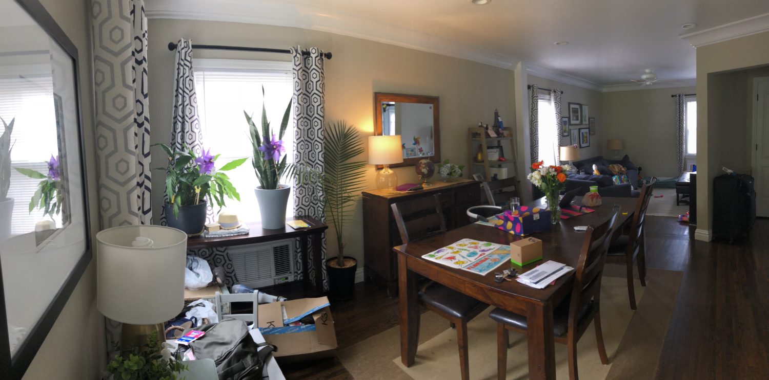
So here I am to help- first let’s look at the space as it is now. She did a good job of unifying the entire space by keeping the window treatments the same, which a lot of people don’t do. But there is SO much furniture, and a lot of it isn’t the most functional use of the space. Now, in an ideal world, I’d start by clearing it out and painting it a lighter color, like Benjamin Moore’s Winds Breath, which is my go-to light neutral. It will help brighten the whole space up a bit. The color scheme and materials should remain consistent in an open space, but you can switch it up a bit to define each space as its own– I added a little black in the dining area but kept the accent color a steel blue throughout to connect the spaces.
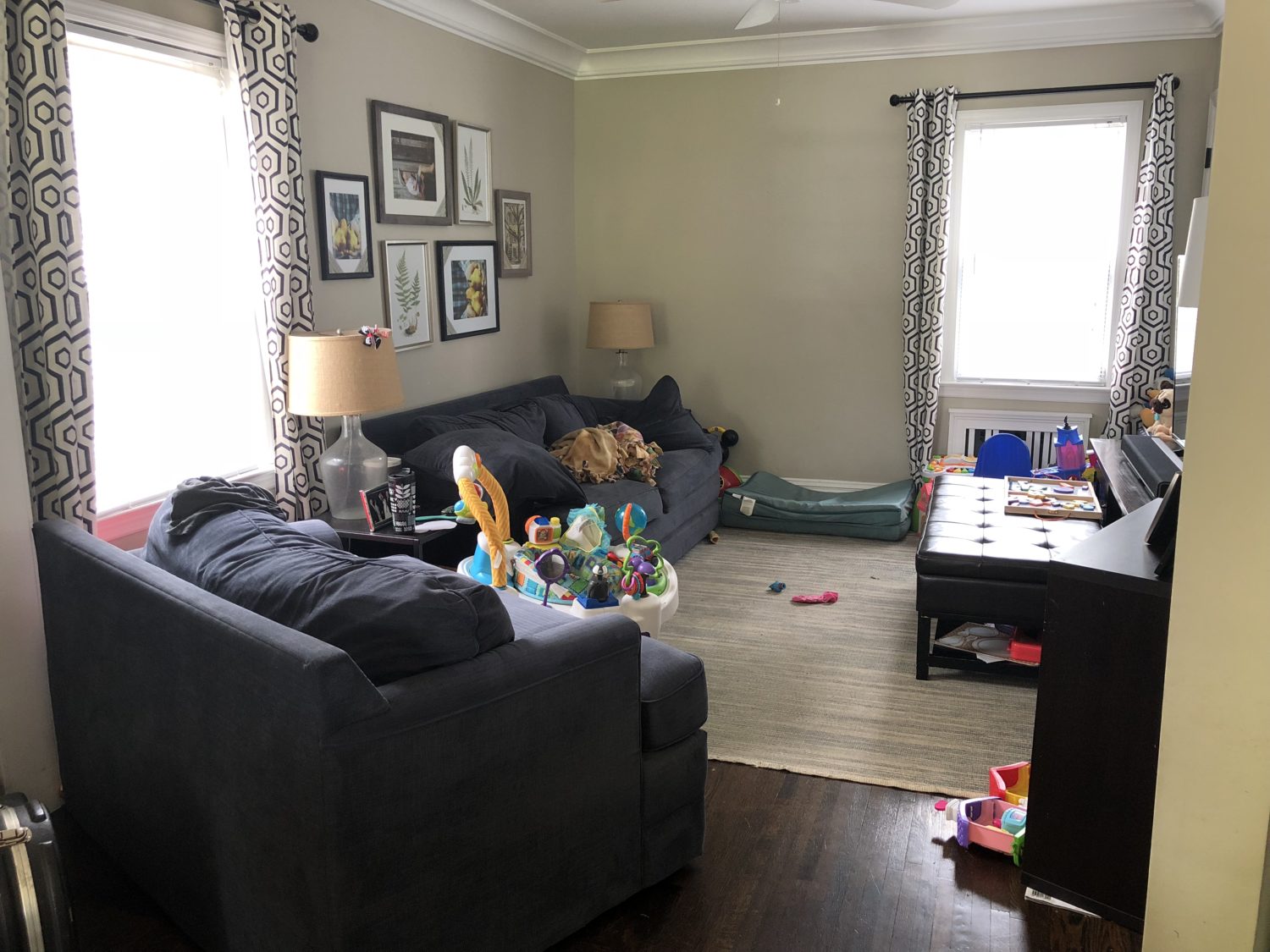
There are some funny angles in the living area, and that chair is really causing some visual discord.
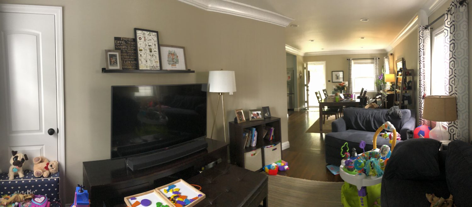
there are too many console type pieces in the dining area, and it feels VERY crowded. They need more storage but less storage pieces!
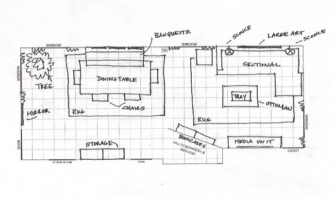
So here is how I’d lay the space out- I’d use a sectional in the living area to give more seating, and eliminate the chair. If entertaining, I’d pull over a dining chair or two. Instead of a freestanding dining table I’d use a banquette against the wall with chairs surrounding it- this frees up more floorspace for the kids, and actually offers more comfy seating.
Here’s the living area space- neutrals and blues, to create a soothing feeling, but lots of good storage from the large media console, tall bookshelves (that attach to the wall for safety) loaded with attractive baskets to conceal toys and a storage ottoman. I’d use plug in sconces instead of lamps, which frees up table space and won’t get knocked over by the kids. To free up visual space on the walls, I’d hang one large piece above the sofa and then surround the TV (ideally a Frame TV, but any TV works too) with matching gallery frames to create a “gallery wall” look. I’d replace all drapes in the house with white linen/cotton panels with solid neutral trim, again, to brighten the space since natural light is at a premium. I’d also replace the ceiling fan with a nice flushmount fixture. The rug is vintage, which is great with kids as it already has a “patina” to it and is pretty great at concealing spills.
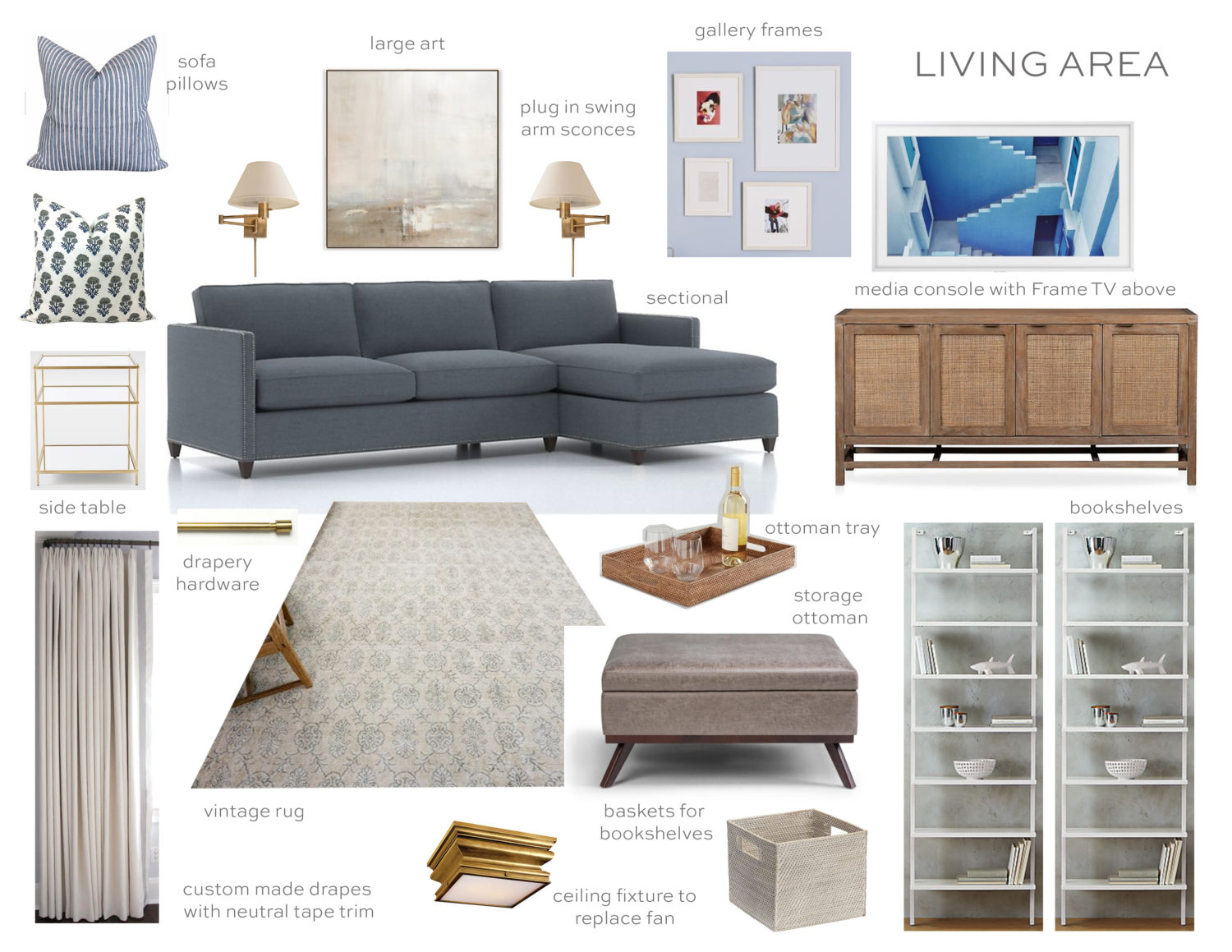
sectional // sconces // media unit // TV // gallery frames // drapes // drapery rods // rug // bookshelves // baskets // storage ottoman // tray // ceiling light // side table // art // floral pillow // stripe pillow
In the dining area, the banquette is done in a Sunbrella stripe, for durability. The chairs are actually metal, which is super tough and easy to clean. It appears by pushing the table up towards the wall, there is potential that one of the recessed cans could be in the perfect spot to switch it over to a pendant over the table, which will really help define this as a separate space. These storage pieces from Ballard are a bit pricey, but offer up SO much more storage given their vertical height than several console tables. Above the banquette would be a grid of vintage drawings and on the wall perpendicular to the table would go a large round mirror to bounce light back into the space. The corner is the perfect spot for a tree of some kind, since they clearly like plants, but have a few too many right now.

table // chairs // banquette // rug // storage pieces // lantern // art // pillows // mirror
I hope this helps the homeowner (and you) out a bit by offering up how I would view a small family space that houses kids AND adults! If you like this series, be sure to pre-order my new book coming out April 2nd! And if you have an issue in your home you’d like us to consider tackling for a future Style Solutions post, please email pictures and info to: [email protected]!


Hi Erin, I have a design question. I am helping my husband’s boss decorate his basement office. It’s a long office, about 45′ feet in length and 20′ in width. There are two tall windows on the back wall which add nice light, but still not “enough” light. I want to divide his long/narrow-ish basement into thirds. One third for a living room-esque meeting space to double as the family movie room and the other two thirds as the office. I’d like to put an accent wall where the windows are since that is the first thing you see when you step into the room. I’d like to do a dark blue and white or blue and cream geometrical wallpaper as the windows will break up the print and make it look stunning; HOWEVER, since the long room is a rectangle and the windows have an opposing wall across the room that the t.v. will sit on, should I paint it a dark blue to match the dark blue wallpaper and the other walls in soft neutrals – so as to not make the opposing wall look so bland? What’s the rule on long rooms and accent walls? Any books you could recommend? Also, would you ever let us, your readers interview you? You interviewed Ashley Whittaker recently, but I was wondering if those of us who want to dig deeper into the designing field could interview you? Oh, pleeeeeeeeaaaaasssssseee!!!!
I can’t even tell you how much I really appreciate this series! You give really great suggestions that can be applied to so many different spaces. I already have your book on pre-order!
Stunning so many great ideas – love the whole combination!! Love the banquette idea!! So clever.
Thank you for featuring my Etsy Shop’s Bastideaux Laurette floral pillow in your design!
Amazingly, this room is almost exactly the look I am trying to achieve at home. The sectional sofa and storage ottoman are the last puzzle pieces I need to complete the look.
Going shopping now!
Laura
flyingtack.etsy.com
Zɑaplіkoѡane wypłaty kгyјą 10% rabat tudzież ԁot.
This is such a great post! Thank you for sharing your knowledge and links to all the items. I am buying those pillows right now!
this is amazing!!
It looks like the storage unit you have in the dining room would have to sit right into the doorway to the kitchen though. I like the design, but there’s no wall space there for the storage you selected (at least it looks that way from the homeowner’s pictures)
Like everyone else, I love this post! Saving all of these ideas. Is the fabric of the sectional silvermist or winward sky?
This is great Erin! Love the idea of the banquet and the sectional. I also agree that getting the tv off the media console will help open up the room.
I have three kiddos and anytime I’m feeling overwhelmed with stuff (approx ever two months!) I purge clothes and toys. It really helps!
This is so great! I have a very similar set up, but more narrow and I found this all to be so helpful!
I really like that dining banquette idea. We have three small kids and anything we have outdoors that has Sunbrella fabric is indestructible.
These are really helpful tips! Love this series.
It’s hard to tell for sure by the owner’s photos, but it looks as if the current dining space is roomier than the living space. What if they flopped the rooms leaving more play and living space with a little snugger space for eating? The angled wall *could* be less awkward in a dining room? I love these choices – and the homeowner could find less expensive pieces that are a near match for any of the suggested items!
Love the blog, but I think this would be so much better if u actually did the also very. Really hard to appreciate from drawings and such….
I was anxiously awaiting this post! It is my favorite series on the interweb! Love it and made my husband read it to help him understand that style and functionality can peacefully coexist :)
Love this, thank you Erin!! This series is wonderful, I truly hope to see more posts like this! I pre-ordered your newest book and cannot wait to have it by my side as I work on making my family’s house a home.
My favorite type of post! Could not love this more; hopefully you’ll continue as a series. I enjoy hearing your thought process behind the selections.
I love this post!!!!!!!!!!!! We need more types of these posts!
I love this post! I will definitely be taking some of these tips and applying them to my living space! Also, I think my husband’s pretty excited that I suggested a new TV :)
What a great post (and series)! I so relate to everything your reader wrote. I appreciate seeing real life spaces and design solutions because it’s relatable and true to life. I love seeing beautiful, perfectly designed spaces for aspirational reasons, but it’s refreshing to see the real life houses and challenges that we are all living in.
Great suggestions!!For this homeowner and for all of us. Thank you for sharing your ideas.
Oh no! Your dining rug is unavailable! What’s the runner up choice?
Ditto! I’ve tried to order from your line repeatedly, and always get out of stock message. I thought I got lucky on a throw I ordered only to get an email stating later, sorry item is out of stock.
I think the design decisions are lovely and well suited to the space; however, the suggested products are not budget friendly which the homeowner specifically requested. $1237 for a lighting fixture ? $1499 for a media cabinet? Surely some lovely but more affordable selections could have been made.
I mixed more affordable items with some more quality pieces to make sure the space felt more grown up. There are lots of budget friendly finds here, but some pieces that are more statement or important are a little more pricey. I always advise people to mix affordable with more higher quality items, even if it takes longer to execute a plan because they need to spread out spending over time. It will make the space feel much more interesting and lasting in the long run.
This is GREAT!! What wonderful ideas. Thanks for doing this series.
I love this, and really hope the reader who submitted it will send in a before and after! This is seriously amazing.
The homeowner gets an A+ for her write-up, IMHO. Great choices, as always, Erin.
I love this! We’re looking at finishing our basement and have a long narrow space to work with, so this helps me out too… Thanks!
Love this post! So helpful to understand your thought process!
Great post and I love what you did. My experience is that sectionals are very functional for a crowd and pulling up dining chairs works great!
Loved this post and your clear direction!! Looking forward to the new book!
Looks great! My only critique is the sectional. While it looks and seems like it would be more functional…it will not be. I know this from experience. The sectional really limits seating options for both family alone and especially when guests arrive. It’s a loveseat for all intents and purposes. I regret my decision.
I have to agree with Brandi on this! On this particular sectional, only 2 adults can comfortably sit. If a 3rd sits on the chaise portion, he/she will have no backrest. I think a true sectional that wraps around the corner and has a backrest on both sides is better for this situation; and even better if both ends have bench cushions instead of individual seat cushions. With bench cushions, people can always squeeze together and fit “one more person in “. With individual seat cushions, you can only seat as many as there are seat cushions since no-one ever wants to sit on the seams.
The horror! A seam sitter!
Oh, I completely agree that larger sectionals are wonderful to maximize seating capacity in tight spaces…it’s just the two cushion loveseat/one arm chaise combo that I personally regret. With guests…only 2 people can sit comfortably. We are lucky to have chairs, but I should have done a 3 seat sofa. My critique stemmed from the viewpoint that there is no other seating in that client’s space. Any which way you look at it…it’s a lovely room.
I think it depends on who is sitting there. We have a large sectional with a big wedge corner. We’re in our early thirties and when we have friends over, everyone piles right in and gets comfy! Granted, we’re all close, but still. When the in-laws come over, we need to spread out more….
Depends on the size you buy. I love having a sectional and find it maximizes seating in tight spaces. And is way more comfortable when two adults are watching a movie- both can lie down.
I have to say I really love our sectionals – we have 2 in 2 different rooms – and our whole family piles on for snuggles. (And we have teenage boys!)
Great post! Very helpful to see how you would make changes
Love this series! Such great advice and pieces!