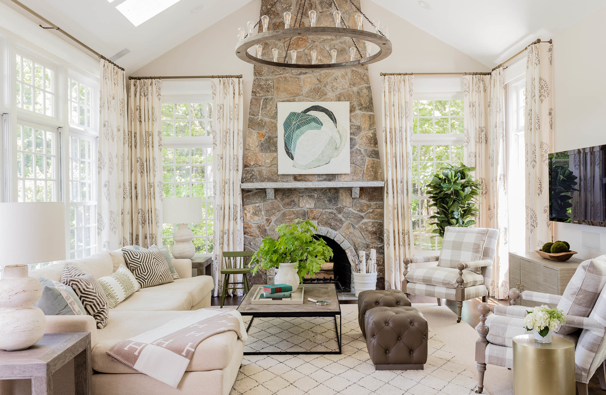
Warming Up Your Neutrals
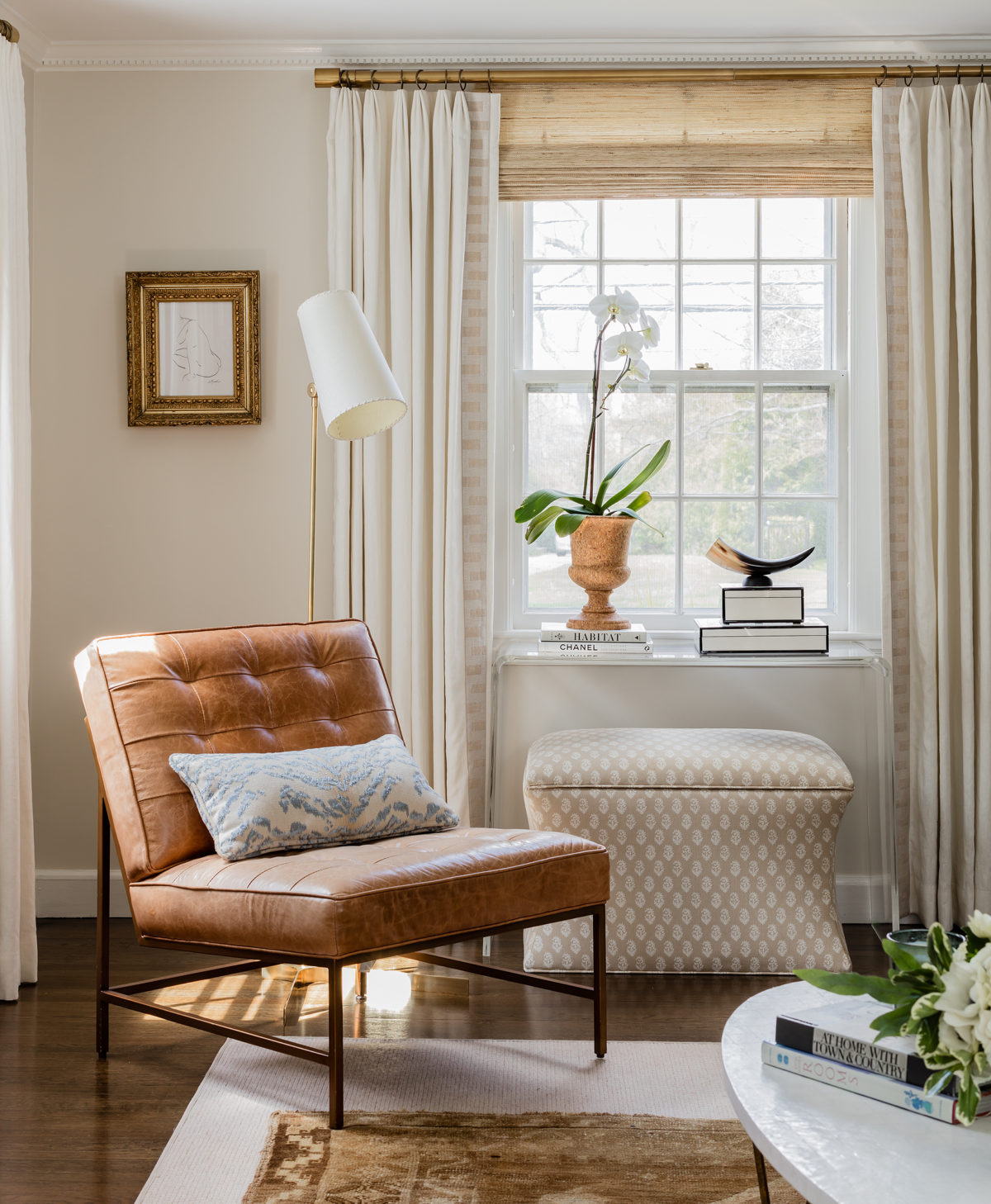
Image by Michael J. Lee for Elements of Family Style.
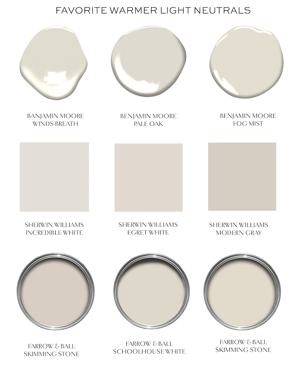
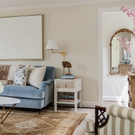
It’s clear that for 2020 the go-to neutral is much warmer than what we’ve been seeing the past five years. I, for one, am delighted. I always find warm neutrals to feel much more livable and more expensive feeling than colder greys. Warmer woods, natural materials like jute and linen, and brass all are wonderful accents to have in any home- and don’t feel as old-fashioned as you may think. I think my living room is a good example of this. The walls are Benjamin Moore Winds Breath (the perfect pale color in between grey and beige), the woven roman shades add nice natural texture (similar here). The natural leather chair with brass, brass window hardware and antique gilt frame all add a deeper tone of neutral, but it’s balanced by the ivory drapes and white coffee table top. And judging by the comments on Instagram over the weekend, I think that warm toned Persian-style rugs are going to be really hip now, as well (I sourced this brown one from Linda’s Barn on Etsy and it’s awesome).
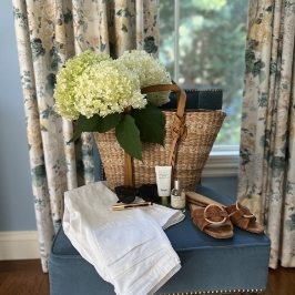
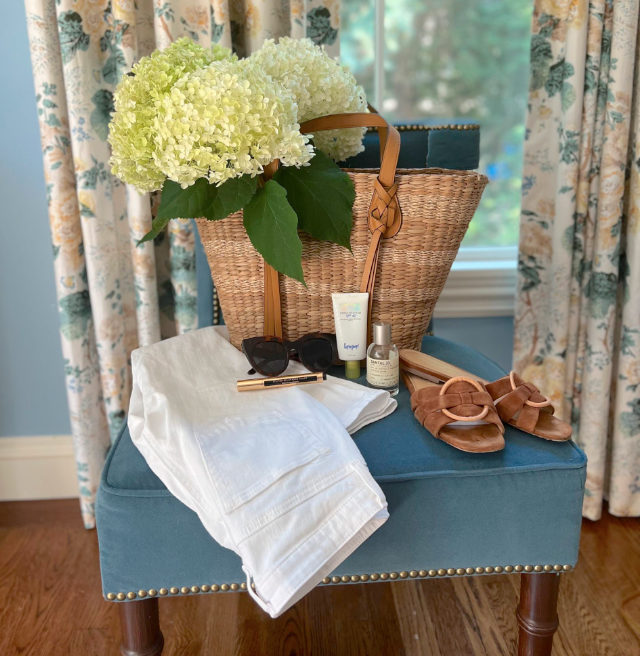
Some fresh new items for spring (even though it’s the dead of winter) that can help you bring a little neutral warmth to your space. Click images for links.
I also did a quick SAG red carpet recap on Insta Stories today!


The brass floor lamp with the narrow shade is beautiful. Please tell me where you bought it. Thanks!
P.S. Loved your first book!
Any tips for finding a quality chest of drawers like the one in your living room?
Love this! Do you know where the natural Roman shades in the photo are from? Looking for exactly that!
Beautiful! Do you have a source for your drapes?
My decorator talked me into using Pale Oak in an all white master bath and in the garage. She referred to it as the “perfect” gray. It’s so light that I can barely tell there is a color on the walls. And it doesn’t read “warm” in either place. On the other hand, I’m going to look at Wind’s Breath for the guest room.
Love this! These neutrals tick all the boxes that make me happy.
Thank you for all the paint and furnishings information, I find the information very useful.
But could you please clarify which of the Farrow and Ball colors is actually Skimming Stone : the name is listed twice.
BM Pale Oak is beautiful online. I saw several pics of rooms in this color and I loved it! I ignored the few reviews of people who thought it had a pink undertone. I enthusiastically started painting my kitchen this color and was horrified! It looked like a pale mauve against my SW Alabaster trim. I left it for a couple of days to see how it played throughout the day(light). Ultimately, I had to repaint again. I would definitely say beware.
Love the warm neutrals. On the color charts above are the bottom right and the bottom left both Skimming Stone? They look different. Love the post and color recommendations.
We used BM Balboa Mist through out our entire house- love how warm it is-
Love these neutrals and all your interiors posts – BUT really hoped for a SAG post! Mainly because then the comments are also part of my coffee break. Your take on the awards seasons are one of my favourite parts of the season….
(this isn’t a complaint, it’s a compliment I promise!)
I have the $349 table! It’s the perfect sized desk in our den /office. Love it!
Oops! Just realized I did this wrong1 Sorry!
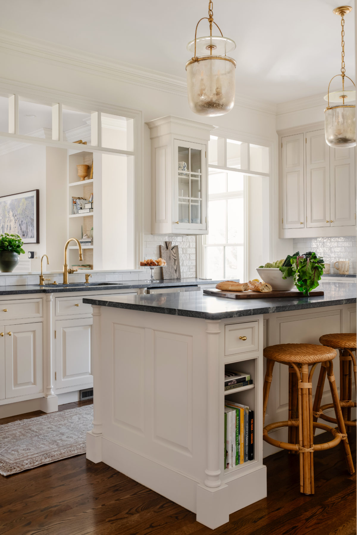
I love that barstool! It’s exactly what I’ve been looking for at my house!
Paige
https://thehappyflammily.com
I love everything about this post! I’ve always preferred warmer neutrals. So glad to see they are trending again. I really enjoyed your second book and have marked several pages for project inspiration!
Just ordered your second book! Everyone commenting on it says how great it is. Can’t wait to read it. :)
I’m thrilled to see warmer tones return, as I strongly prefer them and it makes it easier to mix and match things with my other interior items (which tend toward warmer neutrals).
Do you mind sharing source info for the wonderful tufted leather armless chair in your photo?
It’s Mitchell Gold’s Major Chair
Thank you!
I have ALWAYS gone warmer regardless of the grey trend…so classic. Current fave is BM Feather Down. A nice change from BM Elephant Tusk which was deeper and more gold but still just as lovely.
Is your kitchen in the below post also Winds Breath? It looks a tad darker…
Not my kitchen but a clients- I recall this was Balboa Mist at maybe 75% strength if memory serves me!
Is the BM Winds Breath on your walls toned down by a percentage?
Nope!
What color trim would you use then with these warmer tones? Thank you!
I like Ben Moore Simply White
This is just the style and color scheme I started to go with last year after lusting at many of Mark D. Sikes room designs in his California homes. I love the touches of black too. It’s certainly so much more comfortable and inviting than all grey schemes!
Yes! Thank the Lord, I’m sick to the back teeth of seeing grey everything in interiors.
Your SAG comments killed it. I didn’t mind Zoe’s long gloves. To me, that made the look more of her own statement instead of what everyone else did. And please help Jennifer Garner. She’s too pretty and funny and smart to look like she got asked by the wrong guy to prom.
I’ve read that beige is back! You also layer in prints and texture, both which add interest. It’s all about the mix. Now heading to insta-stories!