Jenna Lyons 2.0
Today i thought I’d take a break from all things holiday and talk some decor!
Recently the New York Times showcased Jenna Lyons new SoHo loft. After having one of the most Pinned/shared spaces of all time previously (which still looks beautiful and stands the test of time even though it launched 1,000,000 copycat designs, by the way!) Her new space, designed by the Myers Davis firm, has a similar feel to her old one, and uses a couple items from it too, but overall feels more modern and eclectic I think.
The living room is a palette of icy blue and coral with lots of brass accents. I think I spy the Moroccan rug from her last living room in use (or at least a similar one) and another bold sofa choice in coral velvet. Also there is a mix of traditional antiques and mid-century styles, which I love.
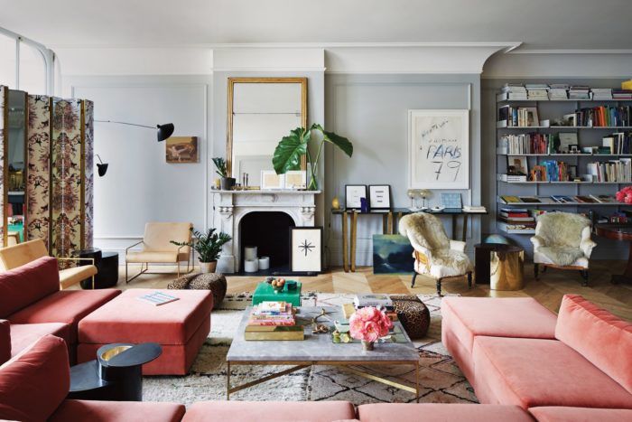
However…..
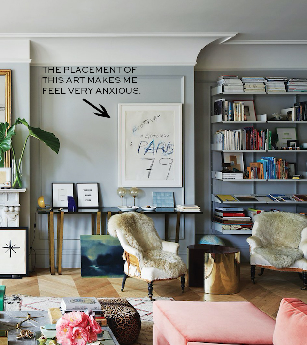
Like, I cannot deal. CANNOT DEAL.
Ok, I’m going to let this go and move onto the kitchen. Lots of marble, brass. All good things.

The bedroom appears to have her old living room chandy in it. I love the iron windows into the bathroom and the big photo above the bed.
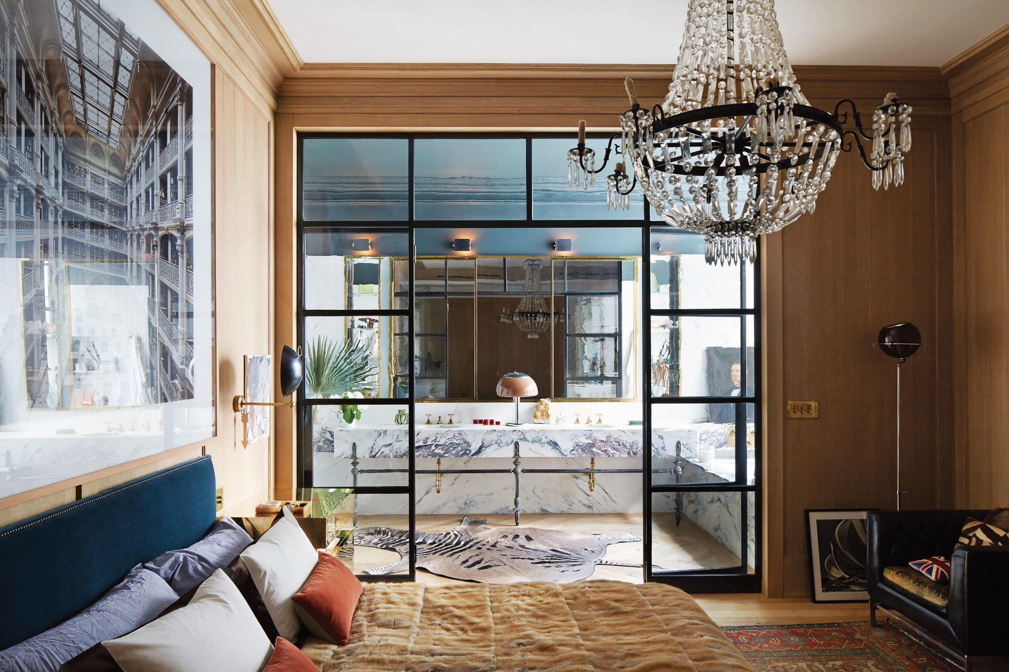
But the rest of the space is a bit 70’s for me.

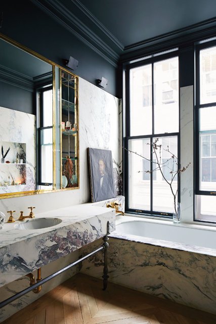
The bathroom is my favorite space I think. Simple lines, but stunning materials. That marble is a showstopper, especially when paired with black walls.
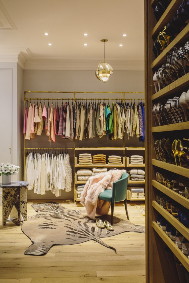
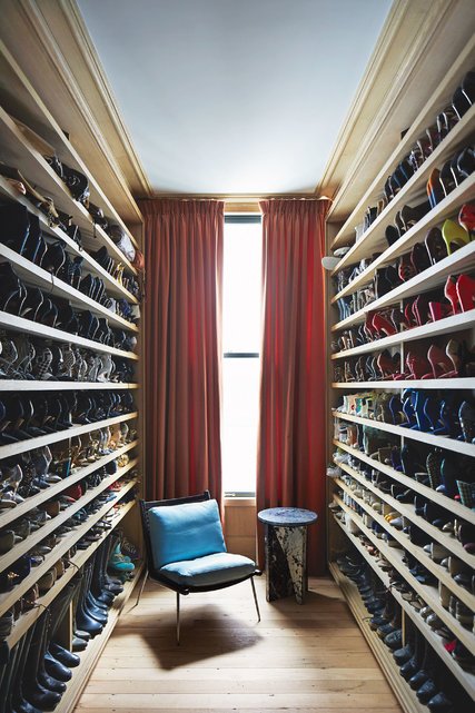
Her room sized closet (of course).
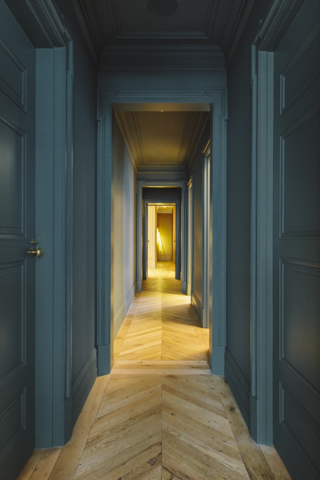
Adore the dramatic paint color in the hallways. It’s so delightful.
If you watch the video you get a way better view of lots of the spaces. P.S. Whats with the TWO different flight suits?
And here’s a quick roundup of items that may give you the “Jenna Loft” look…
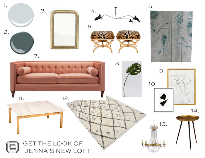
- Benjamin Moore Blue Lace is similar to the pale color in Jenna’s living area.
- Farrow & Ball Inchyra Blue is similar to the dramatic color in her hallways.
- An antique inspired mirror like the one above her fireplace.
- A replica Serge Mouille light.
- A cool painted folding screen.
- A touch of leopard in these vintage benches.
- Coral velvet sofa.
- Faux Monstera leaves (the real ones look pretty fake already so…. just be sure to put water in the vase to help it look more real!)
- A big modern sketch.
- A small geometric abstract.
- A modern marble and brass coffee table.
- A Beni Ouarain style rug.
- A vintage style chandelier like in her bedroom.
- A modern brass side table.


I am a fan overall – especially after seeing the Before!
Erin – I would love a post from you about hallways! I have a (much more boring and modest) version of Jenna’s – long with lots of doors, no natural light. Right now it’s painted white, but the colored version is really intriguing… I’ve been tempted to go dark with mine, but it also opens up to other light-painted rooms, so worried about flow.
I love the bathroom. But I wonder what she’s going to do about shades on the bathtub windows?? Similarly, wouldn’t she want to block light coming into the bedroom through the gorgeous iron/glass bathroom doorway?
I adore that blue paint on the walls! wow! :D
https://www.fine-alchemy.blogspot.com
I fell in love with the kitchen! My favorite part of her loft!
Its interesting how different the space was when it was photographed for Meyer Davis vs. NYT. That off center art is actually placed better originally.
Those black kitchen cabinets are da bomb!! LUV!!! franki
Do not like placement of art either, but think it is there because a tv pulls out behind the mirror and goes to the left of the art!
Perfect blend of glamorous and funky- Just like Jenna.
It’s definitely a different and interesting style. The only thing that catches my eye that I can honestly say I love about this space is the area rug!
I like this new space overall – always fun to see how people are decorating, especially Jenna Lyons after how internet-famous her previous place was. I think the Soho loft is a little less accessible to copycats but you’ve pulled some great pieces as a reference.
PS I feel the same way about the art. I love things that are a little bit off or a little bit out there against a traditional backdrop but that art makes my heart race (and not in a good way!). So funny how small little things can set off that kind of physiological response!
Meh!
And I am not into this partly-upholstered furniture trend. Those chairs in the living room just do not do it for me. Am I alone? I like worn but I don’t like completely worn-out or broken looking! What’s next? Exposed 2X4s – who needs plaster? Let’s be edgy! lol Good bones are fantastic but for the love of Christmas, get that furniture covered!
I usually love spaces that are a little daring and make me feel slightly uncomfortable because they seem to be the trendsetter spaces that, a few years down the road, feel timeless somehow but… I don’t think that is the case here. I love the sofa, the kitchen, the windows and other architectural details but really feel kind of grossed out by the 70s gold and black accents and, ugh, that whole bedroom. Yuck. Is that from the set of Boogie Nights? There are some trends that don’t need a comeback… Not that Jenna or her team are taking notes from me! That’s just how the space makes me feel!
I love the art placement. It’s not meant to make you comfortable, straight up. The placement begs you to look at it, exactly what a Twombly should do. If it was centered, it’s be boring and perhaps overlooked. It also reminds me of Jenna’s fresh take on the J Crew style and how she turned catalog fashion on it’s head with unexpected stylings and designs. Bravo!
It smacks of “I am way cooler than you” – not my jam. People have really drunk the KoolAid with Jenna. Warm and inviting it’s not. But to each their own. It’s what makes the world go ’round.
What about the art in the kitchen above the green leather chairs…? It doesn’t fit inside the moldings and adds to the disjointed look. That said, I basically live in J. Crew (especially the old stuff), so clearly she did something right in my mind! But I agree that it needs to be picked up…
Love it.
Hallway is F&B Card Room Green.
Jenna Lyons has an uncompromising and fabulous sense of style. She is amazing.
The bathroom is my favorite! With all the light from the windows, the dark walls do not make the room look bleak. The marble is stunning and I love the brass mirror. The bedroom is my least favorite–too much of the same color wood for me.
I’m kind of surprised people don’t like this place. I thought it was amazing! Warm and unique, but still utilizing furniture from her former home. Nothing is safe or boring or pointlessly over accessorized to death. It actually looks like she lives there (more so than her previous home even). I think its especially amazing vs what the raw space looked like when she bought it (https://streeteasy.com/sale/733198-coop-112-mercer-street-soho-new-york). Beautiful as the Brownstone was….about 70% of its beauty was already in place when she bought it (mouldings/floors/cornices etc). Here they seemingly created it out of nothing. So much of what we see on pinterest/shelter mags is the same thing over and over again w/ diff fabrics/colors. This apt takes some big risks and I find it wildly inspiring!! The off center painting does give me agita though!!!
Not a fan of any of this space. Well, maybe the moldings.
I looked at that video about 8 times. Maybe more. I have 13 foot ceilings, just like Jenna, but even with a long cord the chandeliers aren’t as low. I kept trying to find shots that would explain how she did it.
How many outfit changes did she do in that video? Of course I loved every one of them. I guess baggy coveralls, especially monogrammed, are the new must-have. At least that’s a trend that is practical.
While the art drives me crazy as well, I honestly am not handling how few pillows she sleeps with :) just 2?!
I’m not loving this new look but maybe I’m not avant- garde
I agree, that bathroom is absolutely gorgeous, but the rest of the space is just meh. It comes off as trying too hard. I don’t know if I can put my finger on it…
I do love the floors too!
Love the space. Love the art. Love the girl.
The FIRST thing I noticed was that art …I just can’t stand the placement! It’s distracts from all the other goodness. Not a big fan of this house, but I do love the herringbone floors, the marble, and the coral color is one I will never tire of!
I much prefer her previous home, although I love the icy blue in the living room and the darker blue/teal in the hallway. I love the Cy Twombly, but dislike the fact that it’s jammed against the woodwork.
This all seems very Kelly-Wearstler-70s-glam and a little disjointed. But conversely, I get that pushing different ideas is also how design grows and expands. This is just not my thing. Everything about this space makes me want to pick up or clean or straighten. I also felt this way about her designs at JCrew towards the end.
Art discomfort alert! If I were Jenna (if only) I would’ve insisted on a smaller piece of art that didn’t need to be pushed up against the trim in order to accommodate the TV.
the picture frame not center is bugging me as well, but makes sens since the tv is coming out from the fireplace on the side.
We once had a coral sofa, albeit, canvas, but I never got tired of the color…it was so fun and went with many other colors.