My Guest Bathroom Mini-Renovation
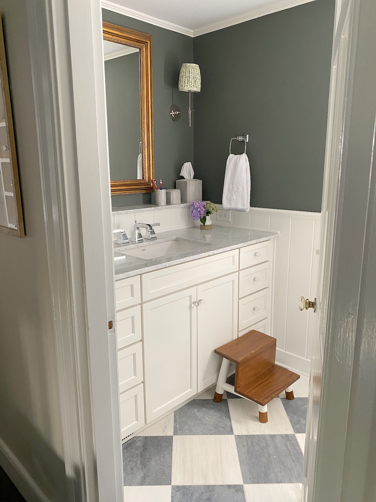
This post has been a LOOOOOOONG time coming, as we finished this project in March, but then COVID/ pregnancy/ childbirth and, you get it, I just had not found the time to shoot it. I still haven’t (properly with a real photographer) but my iPhone pics are gonna have to suffice! We renovated this bathroom when we bought the house in 2012- it was original from 1941- expanding it into the hall linen closet to give us an extra foot of width, moving the toilet (SO expensive to do) and redoing everything…. except the shower/tub. I was having sticker shock from the cost to renovate this tiny bathroom and decided to take a shortcut and keep the cast iron tub and wall tile and just re-enamel it. HUGE mistake. Cut to last year and the tub and tile paint was coming off in huge chunks. And you can’t re-spray a re-enamel job so we decided to suck it up and redo the tub and tile, which meant redoing the floor too…. which then meant redoing the beadboard. GAH!!! It spirals.
This is how it looked when we bought the house.
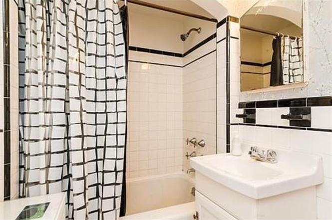
This is how it looked after our first renovation:
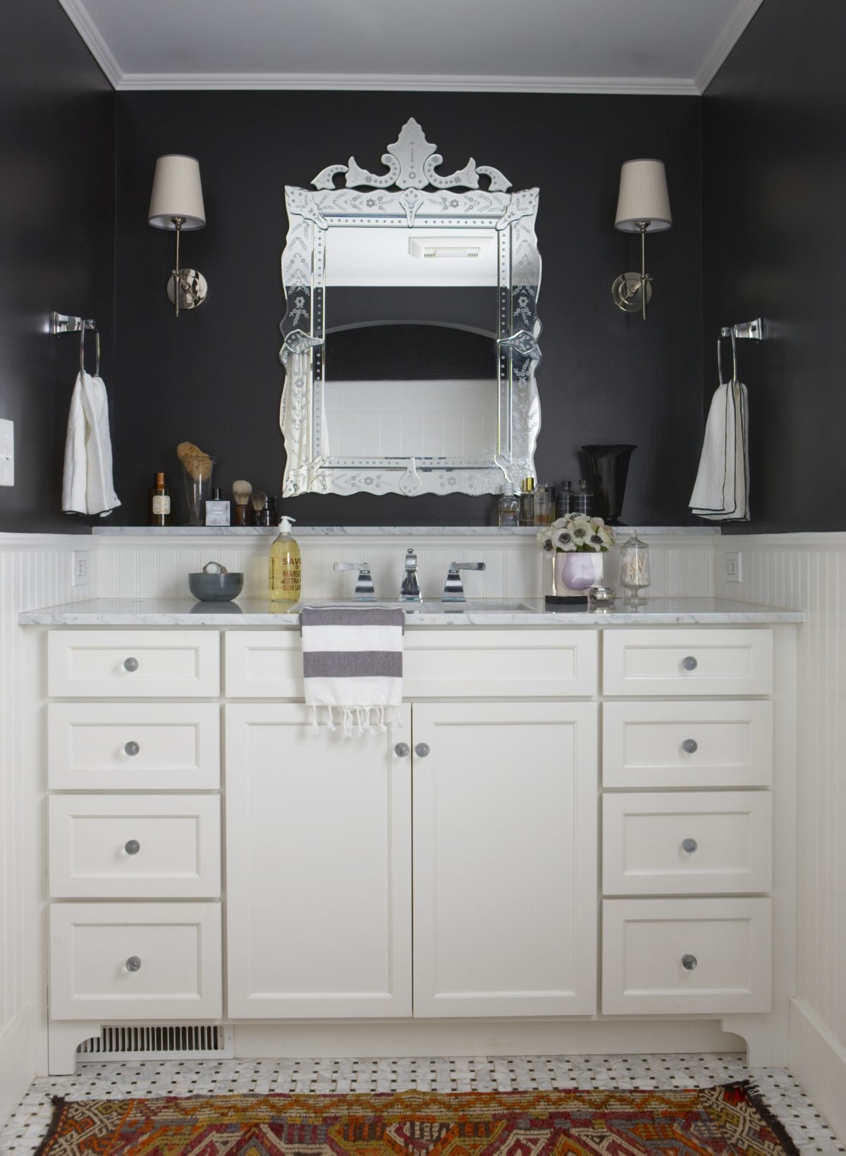
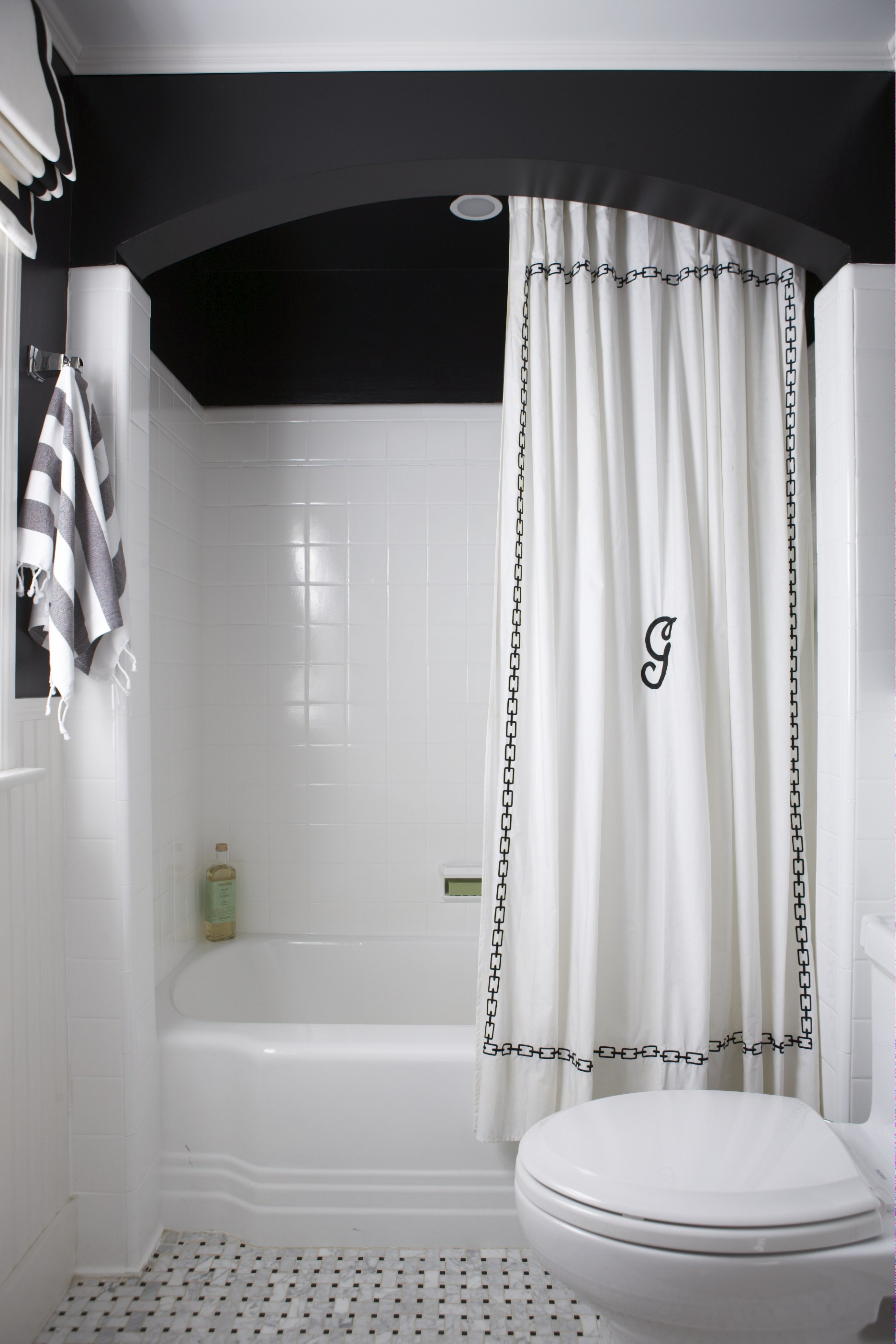
Photos by Michael J. Lee for my first book.
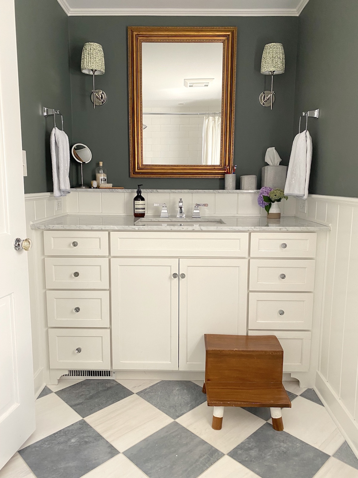
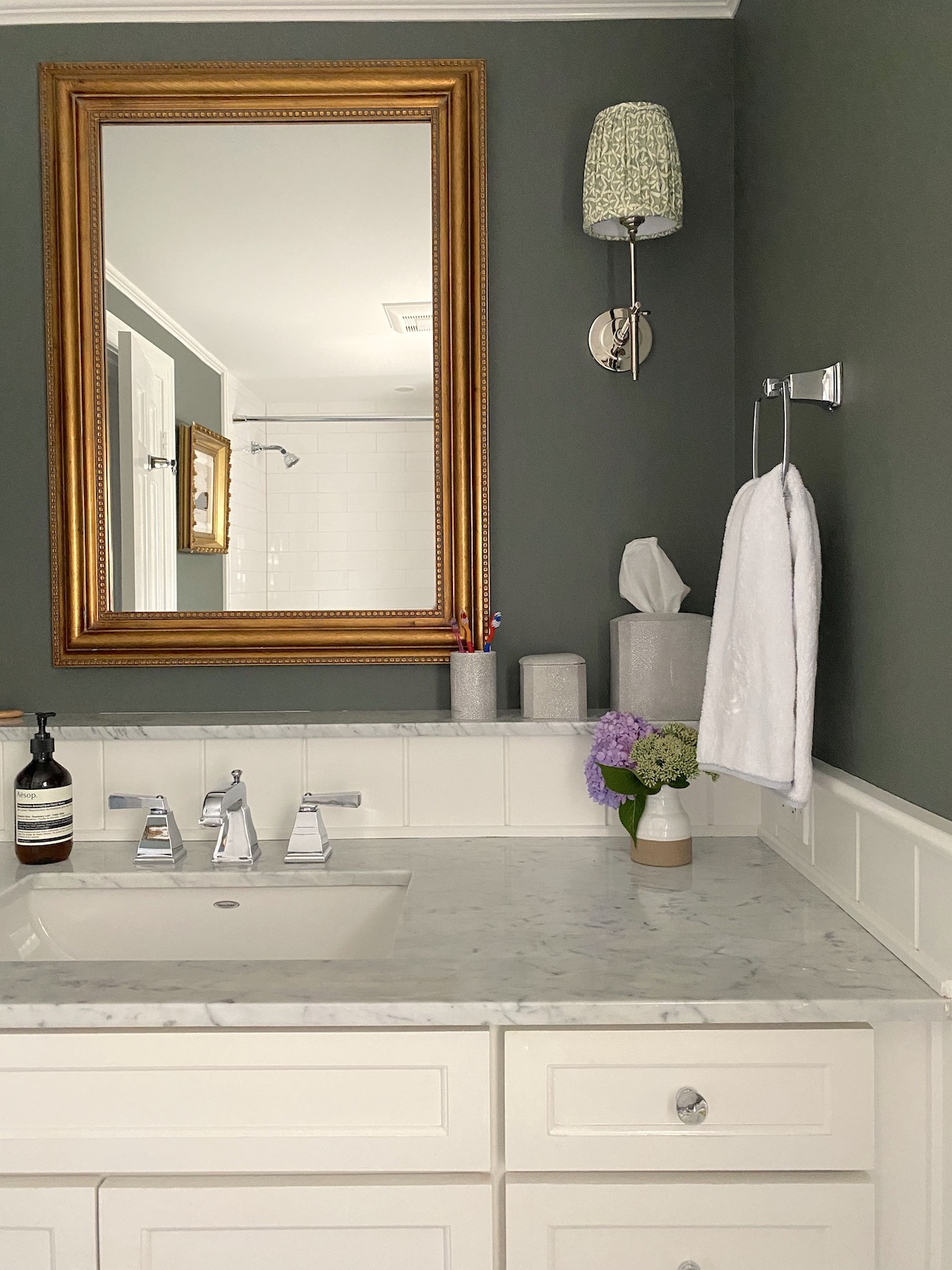
And this is how it looks now! We replaced the beadboard with V-groove, but left the whole vanity and sconces the same. I changed the mirror to bring a little brass into the space (yes mixed metals are ok!) We also painted the walls Benjamin Moore Rainy Afternoon, which is SUCH a good dark/mid-tone green.
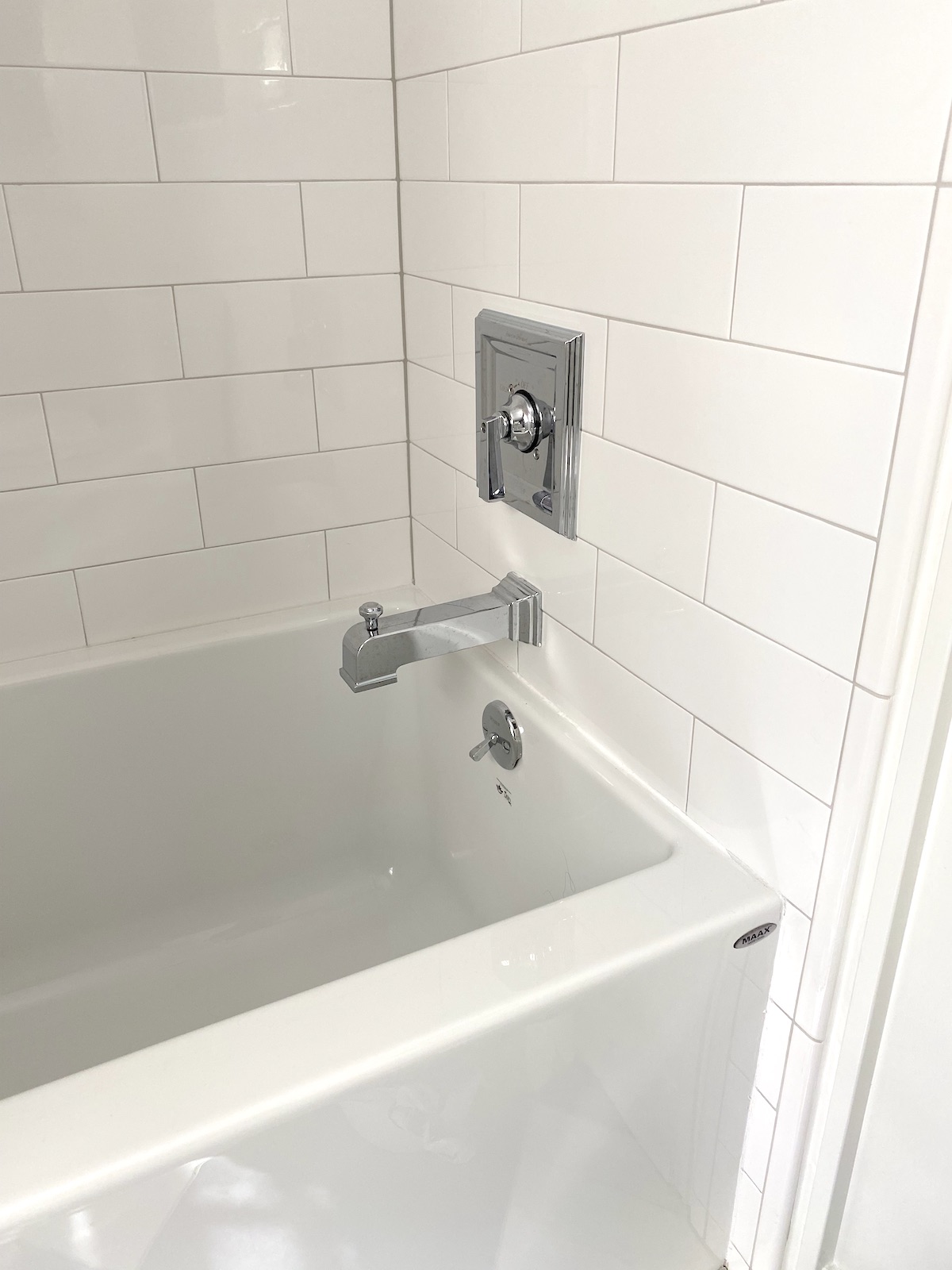
We got a new alcove tub by Maax from Designer Bath and it really is so much more modern looking – and deeper too! This is the only tub in the house, so it’s nice to be able to actually take a real bath now! The wall tile is Essential subway in Cloud by Akdo and is a great scale- 4″ x 12″. We kept our American Standard shower fixtures and faucet as well as the sconces to save money. I considered changing all the plumbing/ hardware to brass because it would have looked awesome, but I really didn’t want to spend more money and the polished nickel IS classic.
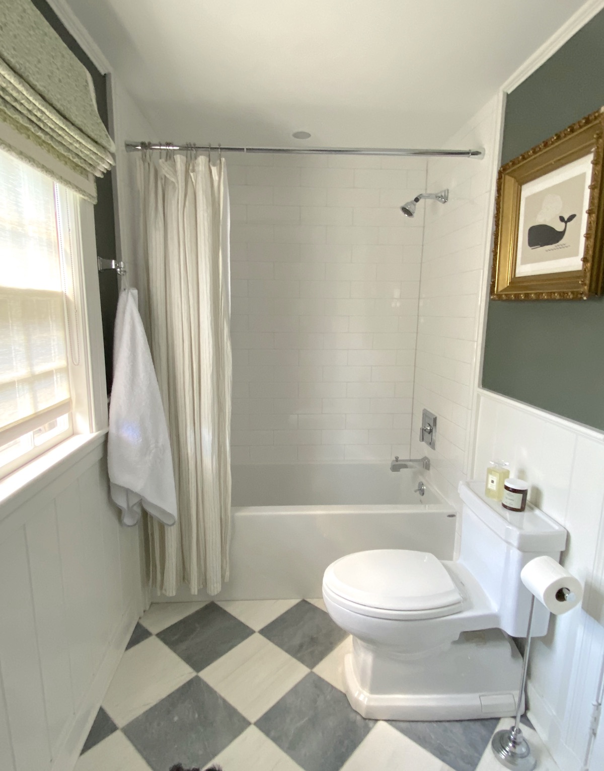
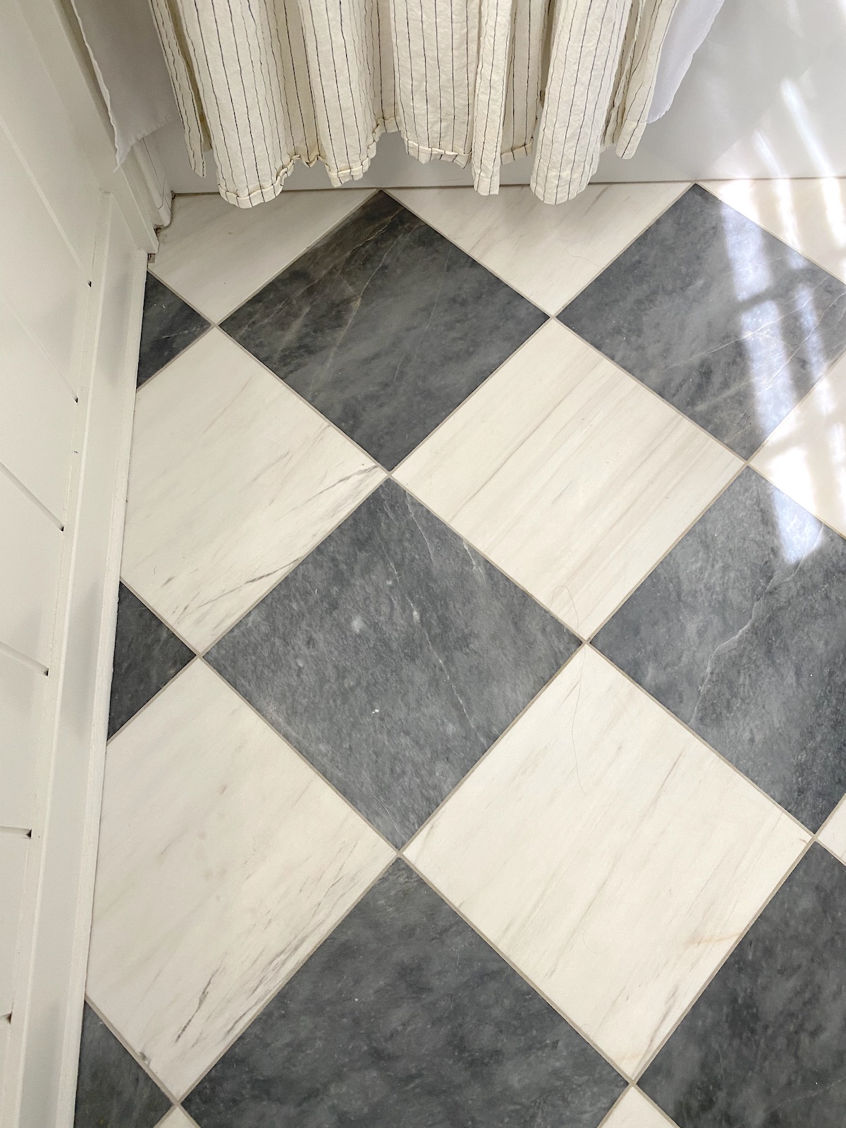
Oh yes, and the FLOORS! Oh, the floors. I love them so much. They are also from Akdo, and are Turkish Grey and Dolomite. We got the 12″ x 24″ and cut them to 12″ x 12″. I just love this classic pattern and how it makes the bathroom feel SO much bigger.
The mirror is by Pottery Barn- sold out, but similar here (I actually like this one better).
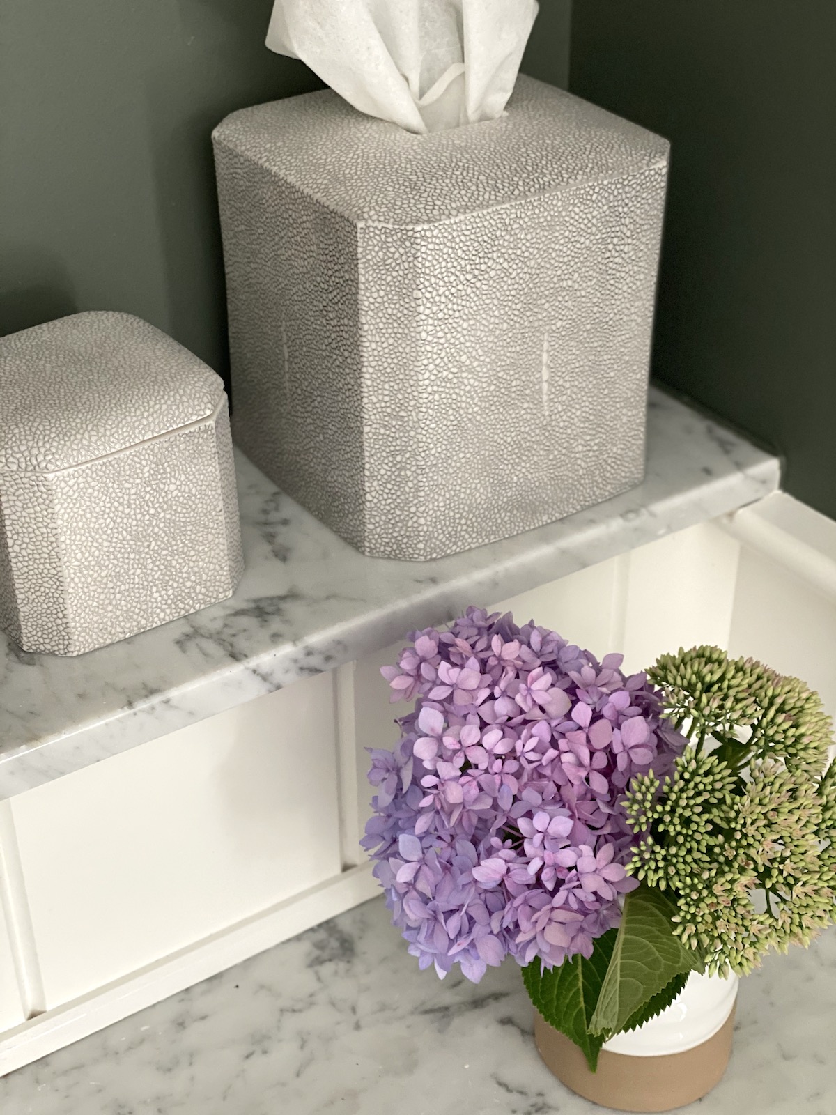
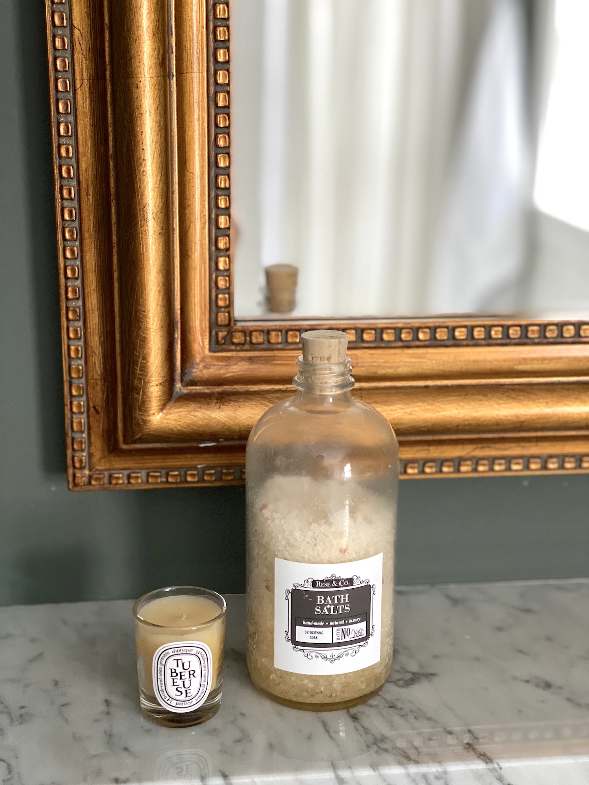
I found these great faux shagreen accessories from Kassatex.
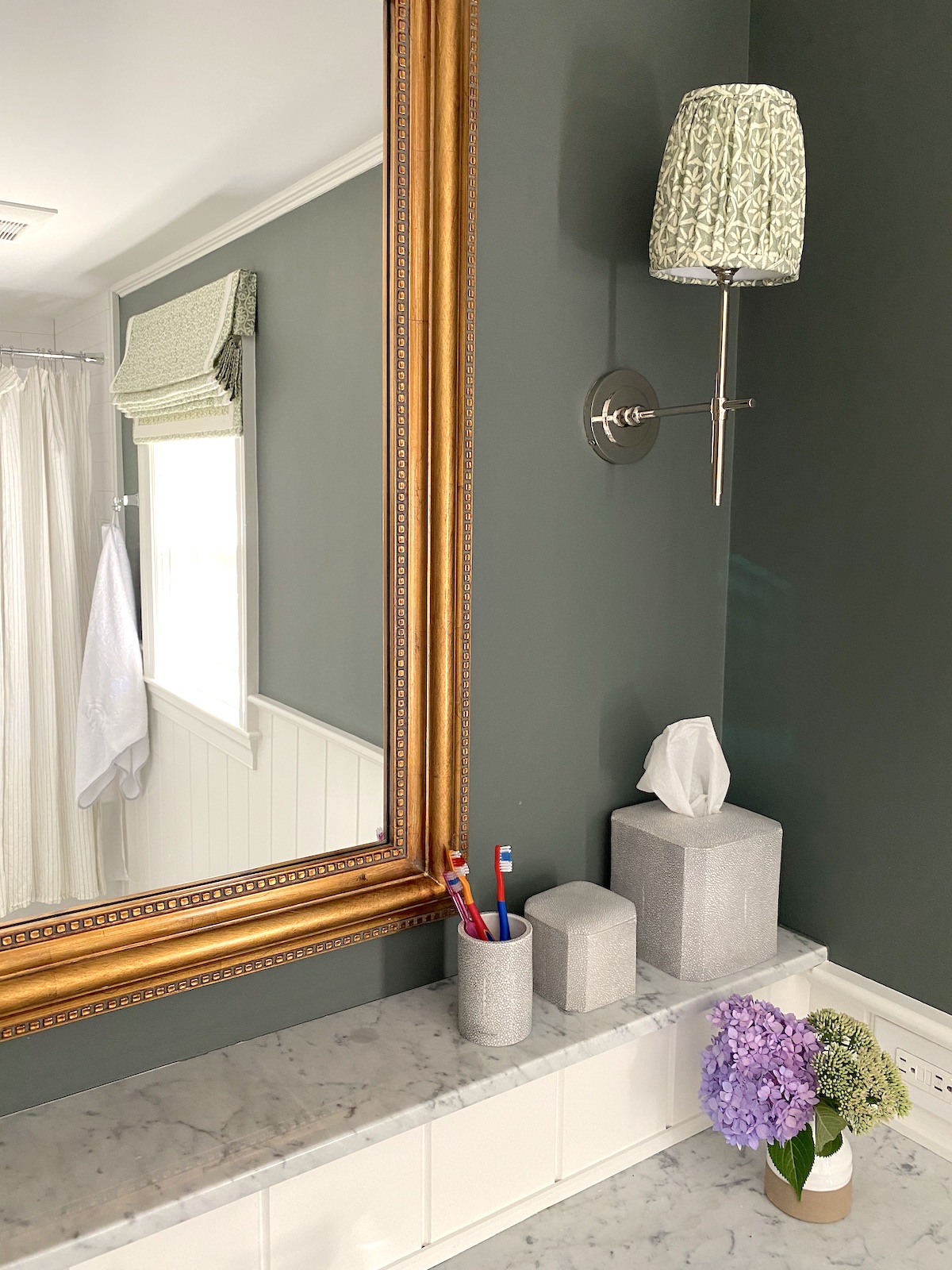
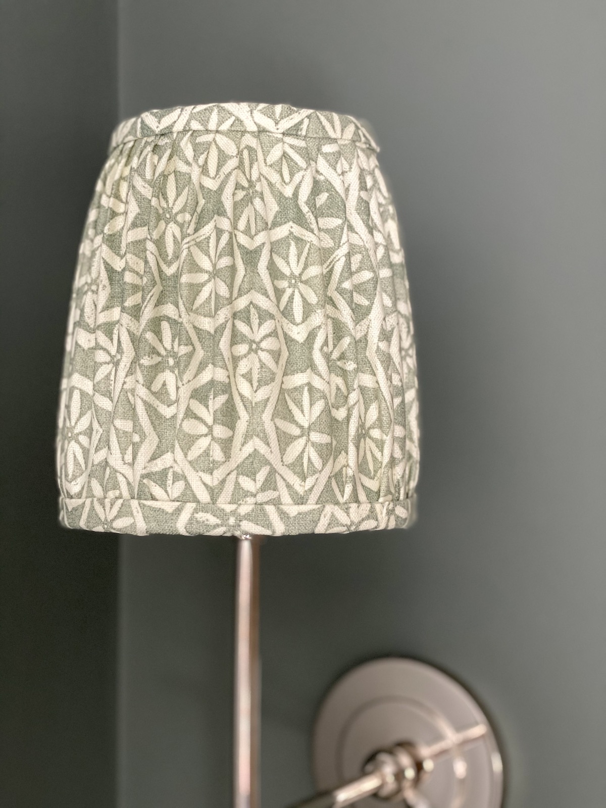
I picked this Carolina Irving fabric for the faux roman shade and pleated sconce shades because it felt neither too girly or too masculine since Emma and Henry share this bathroom.
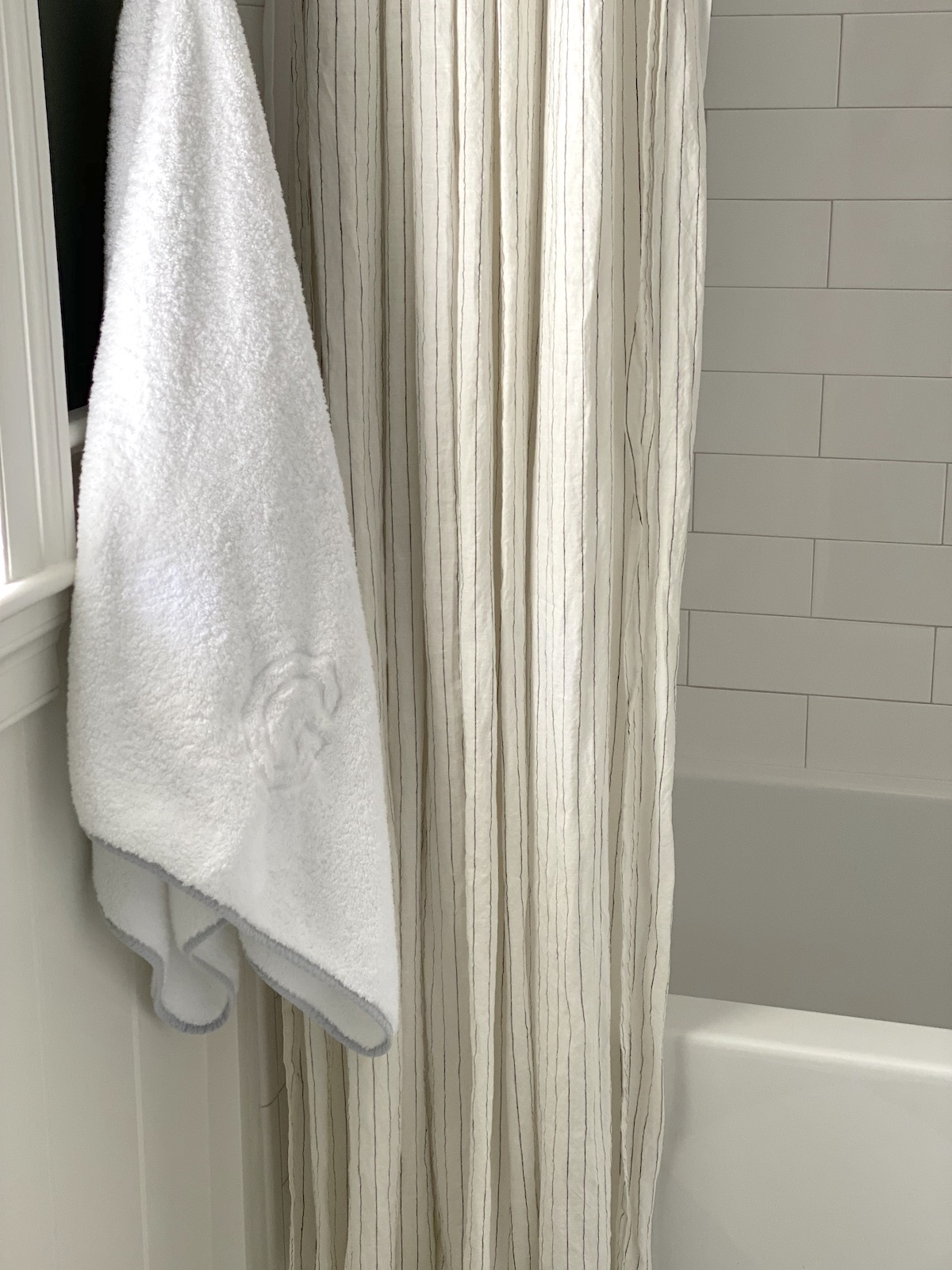
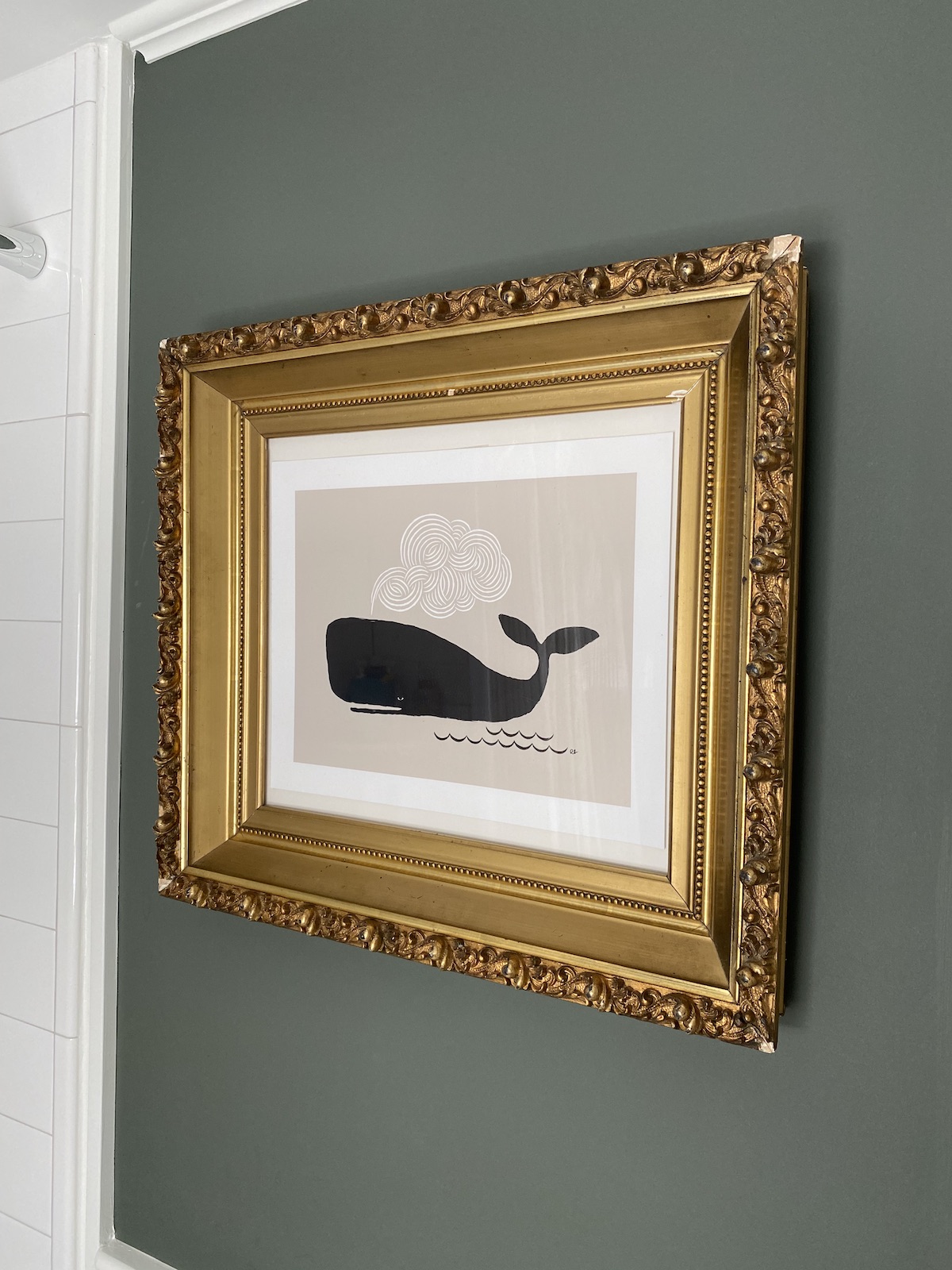
Other accents include this cute pinstripe linen shower curtain from CB2 (out of stock but this is similar), amazing towels from Weezie (love them so much I need them for my own bathroom now) and this art print I put in a favorite old, chippy gold frame I found at an antique shop.
I’m super happy we did this, but of course wish we had just done it the FIRST time around….
Here are some links to shop the look:



Did you ever re-center the bathroom window over the front door at some point over the years? I know that was on the to-do list originally. Reno looks great Erin, congrats on your sweet new girl.
Looks very pretty! Would you mind sharing who made the faux roman shade?
Thank you
The black and white tile coming about 3/4 of the way of the wall, bathtub, and floor in your original bathroom appear in a lot of older houses. I’ve also seen same tile in like a light pink and other colors. Wondering if you have suggestions for a bathroom refresh that keeps that tile, bathtub, and floor (assuming it is in good condition) but provides an update to modernize the look? I would love to read that post and think it would be helpful for people who have that style and can’t tackle a full fledged reno for whatever reason. Or, is does this look just have to go?
I LOVE your style. I’m not very crafty so I’d have to get other people to do the sewing tho.
Argh! We are going through this RIGHT now so your post is extra timely. What we thought was a leaky toilet turned into an almost total gut of the bathroom, demo of the kitchen ceiling, and a potential squirrel problem. We managed to keep the floor and some wall titles in the bathroom. I finally got the new vanity/sink I’ve wanted for over a decade, but it’s been a long process; not done yet. I’ve had more contractors in the house in the past two months than the last 10 years and am freaking out about COVID germs. Never knew there were so many different ways to wear face masks. By the way the toilet is fine. Turns out it wasn’t the source of the leak. And luckily no squirrels! 😳
Looks great! I love that little ledge at the back of the vanity.
love the old mirror … where is it from?
I love it! What’s the material for the vanity counter?
So classic! I have been waiting and waiting for this update post! I almost went with the sprayed enamel and I’m so glad I didn’t. Congratulations on your new addition! Stay well and have a good week.
I remember your first renovation from your book! I was inspired by your marble basketweave floor tile. Did you regret having that for any reason because I am coming very close to choosing that for our bathroom reno? What color grout did you choose for that?
Thanks!
Cry now or cry later… It hurts to have to replace the tub. We were lucky in our old house that the 1930 bathtub was still in good shape. Ditto the toilet. The pedestal sink however … but that’s cheap compared to what you wound up doing.
Looks great and will last decades. Decades!
Hi, Erin! I love both iterations of this bathroom and am saving this post for when I’m ready to redo my boys Jack and Jill bath. Would you please share your thoughts on the decision to remove the arch over the bathtub/shower?
Amazing! Where did you get your V-Groove?
Thank you!
So pretty! The color scheme feels really different right now. Can I ask you how you handled the window treatment please? Curious about the shade under the Roman. I have a bathroom that needs privacy but also light and I’m struggling. Thank you!
I have the same question about the shade under the Roman! Xx
Agree- would love to understand this better- thank you! Gorgeous renovation- fresh, modern, classic & family friendly 😍